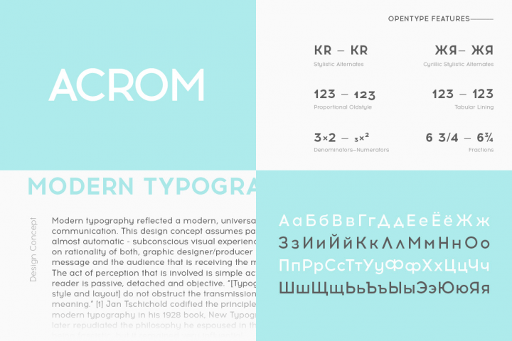
Acrom is a geometric sans serif typeface with a minimal stroke contrast. It was designed with a modern, contemporary context in mind. Acrom is not merely mechanical, it can also be recognised as a natural typeface with subtle geometric aesthetics. The humanist quality of the font aid’s legibility across both text and display work. Acrom’s main characteristics lie in the injection of stylistic forms which enhance it’s individuality without overpowering the fonts functional purpose and integrity. The font can be tamed utilising the set of alternative characters available within the typeface. Details include 500 characters, manually edited kerning and Opentype features.
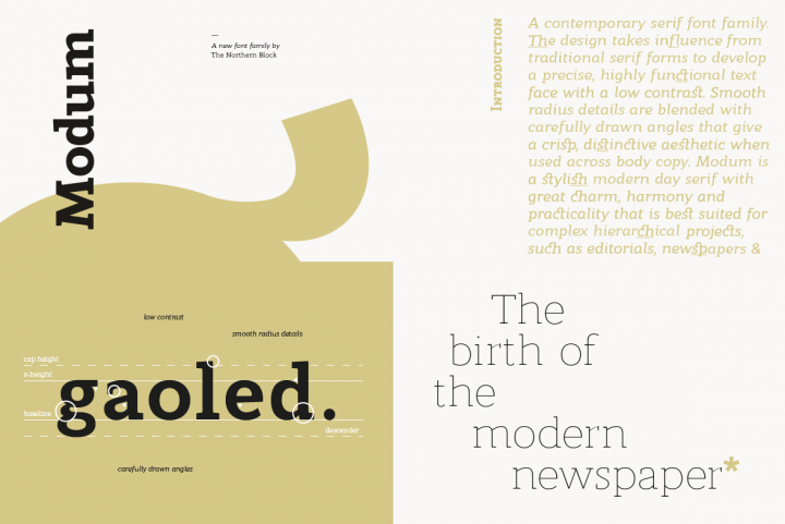
Modum is a contemporary serif font family. The design takes influence from traditional serif forms to develop a precise, highly functional text face with a low contrast. Smooth radius details are blended with carefully drawn angles that give a crisp, distinctive aesthetic when used across body copy. Modum is a stylish modern day serif with great charm, harmony and practicality that is best suited for complex hierarchical projects, such as editorials, newspapers and text based books. Details include 8 weights and true italics, over 800 characters with alternative lowercase a, e, g and y. 7 variations of numerals, true small caps with accents, ligatures, manually edited kerning and Opentype features.
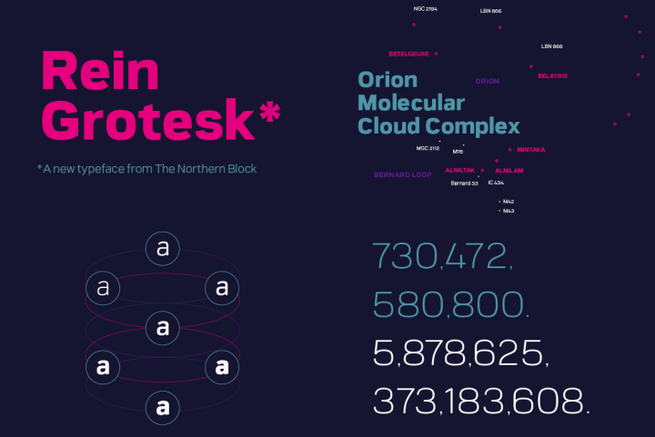
Rein Grotesk is a low contrast typeface with a strong, neutral personality. It’s tall structure and open counters make Rein Grotesk a versatile typeface which is both readable at small sizes and legible in any display environment. The heavy weights of Rein Grotesk take on a less subtle nature due to it’s high stroke variation, transforming Rein Grotesk into a font that shines with an abundance of character, ready to inject personality into any project. Details include 7 weights and 240 characters with manually edited kerning.


