Leifa Thin Font

Leifa Thin Font
Font Name
Leifa Thin Font
Font Family
Leifa
Glyphs
883
Copyright
Copyright (c) Moritz Kleinsorge, 2020. All rights reserved.
Price
$39.00
Description
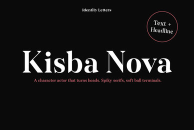
Leifa is a flare-serif typeface that strikes a balance between elegant and affable. It’s pleasant to read in text sizes yet takes center stage in headlines and display applications.

With its higher-than-usual contrast, Leifa might evoke Didone typefaces at first. However, it differs from strictly Didone designs in the details: flattened serifs and deeply incised, tapered spurs provide an organic effect. These humanist elements are restrained and almost inconspicuous in body copy. It’s in display sizes that they realize their full potential. Set your message in Leifa, set it large, and it will get noticed.

A true socialite, Leifa is a most welcome guest on any party. With its dual character and a range of weights that allow for fine-tuning the desired visual voice, it’s a brilliant choice for branding and editorial design. Its good-natured yet sophisticated character makes Leifa the perfect typeface for fashion, sports, lifestyle, social media, food and cooking, health, beauty, architecture, interior design, art, literature, theater, and travel. (And any other topic that you’d love to talk about at a dinner in good company.)

The entire font family consists of eight weights. Each comes with an italic counterpart, totaling 16 styles. Leifa’s italics are oblique, optically corrected versions of the upright styles. Each style comprises a character set of 883 glyphs that includes small caps, a set of ligatures, tabular and old-style figures, case-sensitive forms, fractions, symbols, and many other features. Four stylistic sets allow you to adjust the appearance of the Leifa fonts: a single-story a (SS01), a simple f (SS02), a triple-story g (SS03), and thin punctuation marks (SS04) are at your disposal.

If you’re looking for a typeface with some debonair spirit, look no further than Leifa.
flare serif,flare,serif,optima,dynamic,contrast,organic,humanistic,commercial,strong,powerful,versatile,functional,elegant,delicate,sturdy,classic,international,branding,advertising,corporate,corporate,identity,logo,logotype,sign,signage,user interface,editorial,magazine,book,newspaper,web,screen,app,web,infographic,headline,package,poster,text,ligatures,case sensitive forms,old style figures,multilingual,fractions,superiors
OpenType
Standard, Subscript, Stylistic Set 04, Stylistic Set 03, Stylistic Set 02, Stylistic Set 01, Small Caps, Scientific Inferiors, Stylistic Alternates, Proportional Figures, Ordinals, Oldstyle Figures, Numerator, Localized Forms, Lining Figures, Standard Ligatures, Fractions, Denominator, Discretionary Ligatures, Glyph Comp/Decomp, Case Sensive Forms, Capitals to Small Caps, Access All Alternates, Superscript, Tabular Figures, Slashed Zero
Posted by

Nestled near the Dutch border in Germany, Identity Letters is a boutique type foundry that epitomizes the essence of innovative typography. Rooted in the cosmopolitan spirit of the Rhine-Ruhr metropolitan region, near Cologne and Düsseldorf, Identity Letters is a testament to the rich cultural history that permeates this area. This unique backdrop fuels their dedication to crafting powerful, precision-made fonts that convey the right message for businesses and creatives across the globe.

The guiding principle of Identity Letters is that typography is much more than just words; it is the embodiment of identity. This belief drives their creation of fonts that not only complement but also elevate the character of any brand or project. The typefaces designed by Identity Letters are not mere letterforms; they are carefully curated tools that help shape and define the identity of their users.

At the helm of Identity Letters is Moritz Kleinsorge, a figure synonymous with passion and expertise in type design. Moritz's approach, deeply influenced by the 'Total Design' philosophy of Wim Crouwel, extends his meticulous structuring and organizing skills from letter shapes to his entire environment. With a background in graphic design and a rich academic portfolio, including a Bachelor’s degree from Rhine-Waal University of Applied Sciences and an MA from Peter Behrens School of Arts, Düsseldorf, Moritz possesses a unique blend of practical design skills and theoretical knowledge. His expertise was further refined with a postgraduate diploma in Type Design from the Plantin Institute for Typography, Antwerp.

Identity Letters excels in a variety of typographic styles, from the clean lines of sans-serif fonts to the elegant curves of serif and slab serif fonts. They are especially known for their brutalist type design, a hallmark of their German design roots. Each font is a blend of aesthetics, functionality, and the latest font technology, making them a prime choice for designers and creatives seeking distinctive and effective typographic solutions.

At YouWorkForThem, we are proud to offer the exceptional fonts of Identity Letters for both personal and commercial licensing. Whether you're a designer embarking on a personal project or a corporation seeking a unique typographic identity, our platform provides easy access to Identity Letters’ diverse collection. Explore their collection today, where each typeface is more than just a font – it's a piece of identity, ready to be a part of your story.

Posted on
Jul 15, 2020
Product Ranking
10335
Highest Rank Achieved
285
Licensing available
Desktop, WebFont, Mobile App & ePub
The Original Creative Marketplace
Copyright © 2002-2024 YouWorkForThem. All Rights Reserved.