Register now for instant access to an exclusive collection of Free Fonts, Graphics, and Photos.

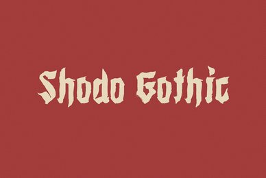
Behrens Schrift Font
Font Products, T14570 Behrens Schrift
Starting from
$38.00
Starting from
$38.00
- Images
- Glyphs
- Type Tester
-


Peter Behrens’ renowned art nouveau type from 1902 – with ornaments. Newly revised and neatly digitalized by Ingo Zimmermann
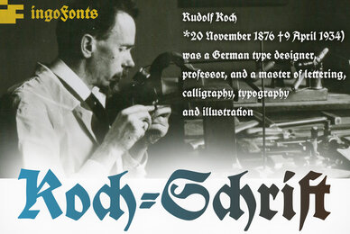
In 1902, Peter Behrens (1869–1940), architect, designer and typographer, created a new ”German“ type which became very successful very quickly for the Rudhard’sche Gießerei (foundry which later became Gebr. Klingspor AG) in Offenbach am Main. It served, for example, as the official German type for the world expositions in 1904 and 1910.
Behrens himself writes about the development of this type ”...For the actual form of my type, I took the technical principle of the Gothic script, the stroke of the quill feather. The proportions of height and width and the boldness of the strokes of the Gothic letters were also decisive for me in producing a German character. A cohesive character could be hoped for by avoiding all non-necessities and by strictly carrying out the design principle of holding the quill at an angle…“
By the way, when “long s” is activated, the typographically correct “round s” is automatically placed at the end of the word so that you need only pay attention to the correct s on syllable endings within words.
When using “long s,” you must ensure the correct use of the rules for the Fraktur font: “round s” is always at the end of the word, also in compound words. For those of you who want to be even more correct, read the corresponding article in >> Wikipedia.
Peter Behrens also drew matching ornaments for his typeface – we have likewise carefully revised these decorative touches and arranged them into a font.
Affordable Fonts: One-Time Payment, No Extra Fees
Save on desktop, web, mobile apps, and ePub fonts with one-time payments at YouWorkForThem. If you're planning on using the product for any large volume, video games, commercial or broadcast/streaming use, you may need to purchase a license extension. Contact us anytime for questions or quotes—we’re here 24/7 ready to help.
YouWorkForThem fonts work on Mac, Windows, Linux, iOS, Android and Canva. Licensing for web, eBook, and mobile apps are available under Buying Options. Pay once, enjoy lifetime access—no subscriptions required.
Founded in 1994 by Ingo Zimmermann, ingoFonts is a distinguished type foundry based in Augsburg, Germany. Zimmermann, a professional in corporate and editorial design, has spent decades refining letterforms with precision and character. His work bridges classical typographic traditions with contemporary design...
Follow