Volker Schnebel’s prolific career has largely focused upon font digitization and type design. He has digitized dozens of type families that include two of the most well known in the world: Arial and Times. Employed at URW++ as chief type designer and type director, his body of work is beyond substantial and continues to flourish. “My first contact with type design was 1977, when I joined URW and I have never left from it since then,” Volker told us.
One of his most recent releases is Schnebel Sans Pro ME, a typeface that’s spent more than a decade in development. “A lot has been changed, transformed, peeled and developed in all those years,” he shared. “For many of my projects I used it as my quarry and so it might have become something like a synthesis of all my imaginations and experiences.” Even the name underwent a complete transformation; the typeface-family was originally “Kronos Sans Pro,” later changed to “Schnebel Sans Pro” due to a naming conflict with the “Cronos” font family from Adobe.
With Schnebel Sans Pro ME, Volker set out to craft a perfect typeface with a confident character, the model design of a contemporary grotesque that unites dynamics with statics. “Special elements of Schnebel Sans are certainly the humanist proportions and the diagonal movement, that produces a special flair,” Volker said.
In spite of design challenges that present themselves along the way, particularly those which develop as the work on any font naturally progresses, Volker finds that more moments of pleasure arise as he nears the end of a project, when perfection can finally be reached.
One particular challenge with Schnebel Sans Pro ME involved the immense number of characters from different scripts. The Arabic developed a similar dynamic movement as the Latin, and both work perfectly together. Volker collaborated with Professor Ráfat Negarandeh on the Arabic alphabets. “Another challenge is the huge number of weights and of condensed and extended versions,” Volker recalled. “This variety offers a perfect instrumentarium for the user and can be used in all sorts of combinations.”
Schnebel Sans Pro ME is beyond versatile, offering a staggering 48 styles that provide designers with extensive fluidity in their work. The sheer magnitude of glyphs, 1403 to be exact, bestow capitals to small caps, case sensitive forms, discretionary and standard ligatures, terminal forms, initial forms, fractions, numerator, denominator, lining figures, oldstyle figures, tabular figures, proportional figures, and small caps.
Schnebel Sans Pro ME’s multilingual support might just blow you away, extending to Basic Latin, Western European, Euro, Catalan, Baltic, Turkish, Central European, Romanian, Pan African Latin, Dutch, Afrikaans, Igbo Onwu, Basic Greek, Basic Cyrillic, Arabic, Farsi, Urdu, and Hebrew for impeccable worldwide accessibility.
Through March 31, 2017, Schnebel Sans Pro ME is on sale for 50% off of its regular price so it’s a prime time to add this one to your font stash!
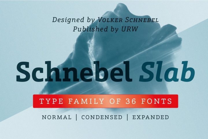
URW++ currently offers more than 460 products through YouWorkForThem. URW++ is an absolute world leader in typography so visit their incredible portfolio and bookmark it to watch for future releases. Volker is currently working on Schnebel Slab Pro and if Schnebel Sans Pro is anything to go by, the slab version will be absolute perfection, as well.


