Chatnarong Jingsuphatada is a Bangkok-based graphic designer who has an intrinsic understanding of what designers really need when it comes to type design. In fact, that’s basically how he got his start in typography in the first place. While working in the graphic design industry, it was not uncommon for him to struggle with finding the exact font he needed for a project. Out of necessity, he eventually sought to create his own, perhaps not realizing at the time just how much that decision would shape the course of his entire career.
As Chatnarong’s experience grew, so did his confidence and his love for the art of type design. He opened up Superstore Font Foundry to release his work to the public, eventually starting another personal label, Typesketchbook. Chatnarong’s work has certainly seen its fair share of success over the years, in large part due to releasing attractive and functional fonts that offer a high degree of versatility in their applications.
One of Typesketchbook’s most recent releases is Noyh Geometric, an alteration of the original Noyh typeface published back in 2015. Chatnarong wished to develop a more geometric presentation, choosing to create much sharper corners in Noyh Geometric. Because he was working with the established architecture of Noyh, the process of adding flat corners and sharp apexes only took about one month to complete.
The differences between Noyh and Noyh Geometric are both subtle and striking, which is why Chatnarong decided to present them beside one another in the slideshow presentation of the latter. At quick glance, it isn’t easy to make out the differences between the two, but once you’ve taken note of Noyh Geometric’s razor-sharp corners, there’s no denying that it’s vastly different from its predecessor.
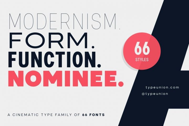
With a businesslike posture and impeccable clarity, Noyh Geometric is a sleek and modern option for corporate communications, white papers, headlines, editorials, publishing, advertising, web content, and mobile apps. Featuring nine weights that range from a whisper Thin to a robust Heavy with corresponding italics for each, it’s a fantastic choice for identity and branding projects.
Noyh Geometric supports Basic Latin, Western European, Euro, Baltic, Turkish, Central European, Romanian, Pan African Latin, and Basic Greek for extensive accessibility worldwide.
Right now through June 30, 2017, Noyh Geometric is on sale for 85% off of its regular price!
Chatnarong currently offers 25 products through Typesketchbook’s portfolio on YouWorkForThem and it’s one you’re going to want to keep an eye on. He is working on a number of projects that he intends to release this year, including:
Anteb, a large and useful font family that combines originality and legibility. It’s a sans serif with geometric modern architecture designed with soft round look. Chatnarong is developing ten weights for Anteb, each accompanied by an Alternate version and intended to suit a variety of typographic applications. It will support multiple languages and will be available as both a webfont and desktop font.
Morl is reminiscent of the condensed san serif families of the 90s to 2000s, bringing together the distinctive features of the era but presented in a simpler design. Its potential will be greatly increased with the inclusion of Original, Sans, and Rounded options. The family will be available in nine weights, offering 54 styles to suit a wide variety of applications.
Calps is a condensed sans serif font. An unfussy design, the font is designed to be consistent across such letters as a, b, d, q, p, g and C, G, O, Q, creating a uniformity for the set. Each corner is carved to decrease its sharpness, adding a touch of friendliness. If the standard font is not sufficiently condensed, there will be a slim variation offering narrower proportions. The font also comes in Roman and Italic versions in 9 weights, offering a total of 36 variations to work with.
Kelpt is an extra large superfamily of 54 fonts in nine weights with an abundance of contrast, styles, weights, and x-height. A very functional, clean, and modern sans typeface with rounded corners, it’s designed with unusual stylistic features to give the Kelpt font a special and unique touch.
Grimpt is a fashionable and modern type design, made up of three sub-families and 12 individual typefaces. Brush (with an alternate version), Print (made from the beautiful sans-serif, “More”), and Script. In these families, you’ll be able to choose from Original and Rust styles to achieve different effects.
We’re really looking forward to seeing Chatnarong’s work throughout the rest of this year and we wish him luck with all of his projects!


