Based in Buenos Aires, Argentina, Sudtipos is an immensely successful type collective and the first of its kind in its home country. Founded by four designers, each offering individual strengths through their own unique skill sets and masteries, Sudtipos has worked with companies throughout the world and has won numerous awards from Tipos Latinos, Communication Arts, and the Type Directors Club, among others.
While the type collective has a large team of type designers and illustrators on hand, Alejandro Paul, Diego Giaccone, Claudio Pousada, and Ariel Garófalo remain as steadfast founders who who ensure the foundry continues to flourish and thrive in a global marketplace.
Alejandro began his career as an art director before making a shift to type design, and he currently teaches a postgraduate typography program at the University of Buenos Aires, where he used to teach graphic design. Diego brings with him a mastery of branding and all it entails, working with major companies and eventually founding his own branding company. Claudio is a typographer and visual communication designer who has been working with television graphics for nearly two decades. Rounding out this talented quartet, Ariel is a graphic designer and art director who also runs his own consulting company. With more than 20 years of experience in the field, he teaches typography and publishing design at the University of Buenos Aires.
Over the years since it began, Sudtipos has grown in size and each member of the collective has added immeasurable value to the team. They’re passionate about the work they do as they adhere to Sudtipos’ original vision, striving “to translate the aesthetics of culture and commerce into technically sophisticated typefaces that help creative professionals create work that impresses clients, attracts customers, and builds brands.”
One of Sudtipos’ more recent releases through YouWorkForThem is Address Sans Pro, designed by Alejandro Paul. Address Sans Pro embraces midcentury modern design elements, recalling the style and charm of a beloved era while bringing it firmly into the 21st century. “History is always in sight,” Sudtipos said. “It is constantly being reconsidered and reformulated in the context of now.” Historic approaches to everything from art and fashion to home design and furnishings are often revisited and revamped to be made anew, and typography – something that impacts our daily lives whether we realize it or not – is no different.
Address Sans Pro took a page from the condensed structure and block modulation that was prevalent in German street signage lettering in the early 1950s. That said, as any artist or maker knows, what you have in mind in the beginning is not always what you end up with after a project is finished. As Sudtipos worked on the various weights and widths of the family, design elements from the 1960s, particularly those influenced by Butti and Novarese, began to emerge. The end result of Address Sans Pro’s design is a sleek retro sans serif with a heavy European vibe, one that’s well suited to a wide variety of project types. Address Sans Pro clearly evokes decades long since passed, with geometric features that are “effortlessly seductive” and “ooze cool.”
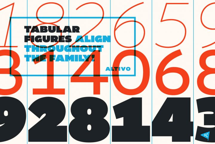
This contemporary classic is available in Condensed, Regular, and Extended widths. Each width contains eight weights that range from Thin to Black, with corresponding italics for each, offering a total of 48 fonts in the family. This extensive range of weights and widths makes Address Sans Pro adaptable to just about any type of design project including signage, displays, logos, headlines, advertising spreads, product packaging, book and album covers, posters, marketing materials, apparel, website designs, and mobile applications. It’s especially well suited to identity and branding projects that need a unique letter style with plenty of options for design cohesion across multiple media outputs.
Address Sans Pro provides a number of additional features that include capitals to small caps, fractions, standard ligatures, superscript, small caps, and stylistic alternates for greater flexibility. Its multilingual support is extensive, covering Basic Latin, Western European, Euro, Catalan, Baltic, Turkish, Central European, Pan African Latin, Dutch, and Afrikaans for design projects aimed at a global audience.
Sudtipos currently offers more than 125 products through YouWorkForThem, providing an incredibly diverse range of serifs, sans serifs, unique display fonts, and elegant script designs. Visit their portfolio to check out the rest of their work and if you love what you see as much as we do, bookmark it so you’ll always have it close at hand for your next design project!
