Based in Cincinnati, Ohio, Adam Ladd is graphic designer and typographer with a preference for retro design aesthetics. Active in the field for more than 15 years, he’s worked as an art director for several magazines and has worked in print design, logos, branding, identity, and lettering.
It wasn’t until around 2013 that he explored type design. Working in the publishing industry, he developed a pretty good eye for which types of letter sets worked well in various layouts and applications, and eventually tried his own hand at type design.
Within a few years, Adam was focusing on typography more and more, becoming a full-time type designer in 2017. His work has been licensed by numerous companies that include Penguin Random House, Trader Joe’s, Harley-Davidson, and Disney, to name a few. His work has also been featured in many books and online publications and he’s enjoyed crafting blog posts and videos about graphic design.
Taking the leap into working as a type designer full time was not without risk, given that you’re essentially working on your own and for yourself instead of receiving a regular paycheck from a company. That said, it hasn’t been without its rewards: Adam is in complete charge of the artistic direction and technical execution from start to finish. Regardless of how well a font does in the retail market, however, Adam consistently learns from the creative process of each new type design he releases.
Having worked as a graphic designer, Adam strives to create type designs that will suit the varied needs of other designers around the world. One of his most recent releases through YouWorkForThem is Fractul, a sharp geometric sans serif that was built from the Konnect family. Where Konnect is softer in its curvature and flow, Fractul carries a stark and much more angular structure.
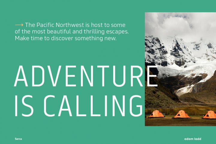
Aside from the avant-garde design of Fractul, you can see the similarities when compared to its warmer predecessor. It carries the same classical proportions with a high x-height and closed apertures, but Fractul kicks things up a notch with straighter strokes. The result is a type family that’s cutting edge and modern, a technological advance and a perfect example of how a font might evolve over time.
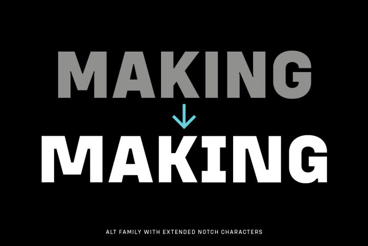
Fractul is available in Hairline, Thin, Light, Regular, Medium, SemiBold, Bold, ExtraBold, and Black, with corresponding italics for each weight. The family also includes Fractul Alt, an alternate variation that pushes the angular design even further by styling some of the characters to be rectangular. The complete Fractul family offers 36 character sets, giving graphic designers a lot to work with. It’s well suited to advertising, logos, headlines, album art, book covers, posters, titling, publishing, product packaging, website designs, and mobile applications. Its range of weights and styles make it a great choice for branding and identity projects.
Fractul offers a number of OpenType features including case-sensitive functionality for all caps, fractions, discretionary ligatures, standard ligatures, scientific inferiors, subscript, superscript, slashed zero, and stylistic alternates for greater versatility. It extends multilingual support to Basic Latin, Western European, Euro, Catalan, Baltic, Turkish, Central European, Romanian, Pan African Latin, Dutch, and Igbo Onwu for global accessibility in international design projects.
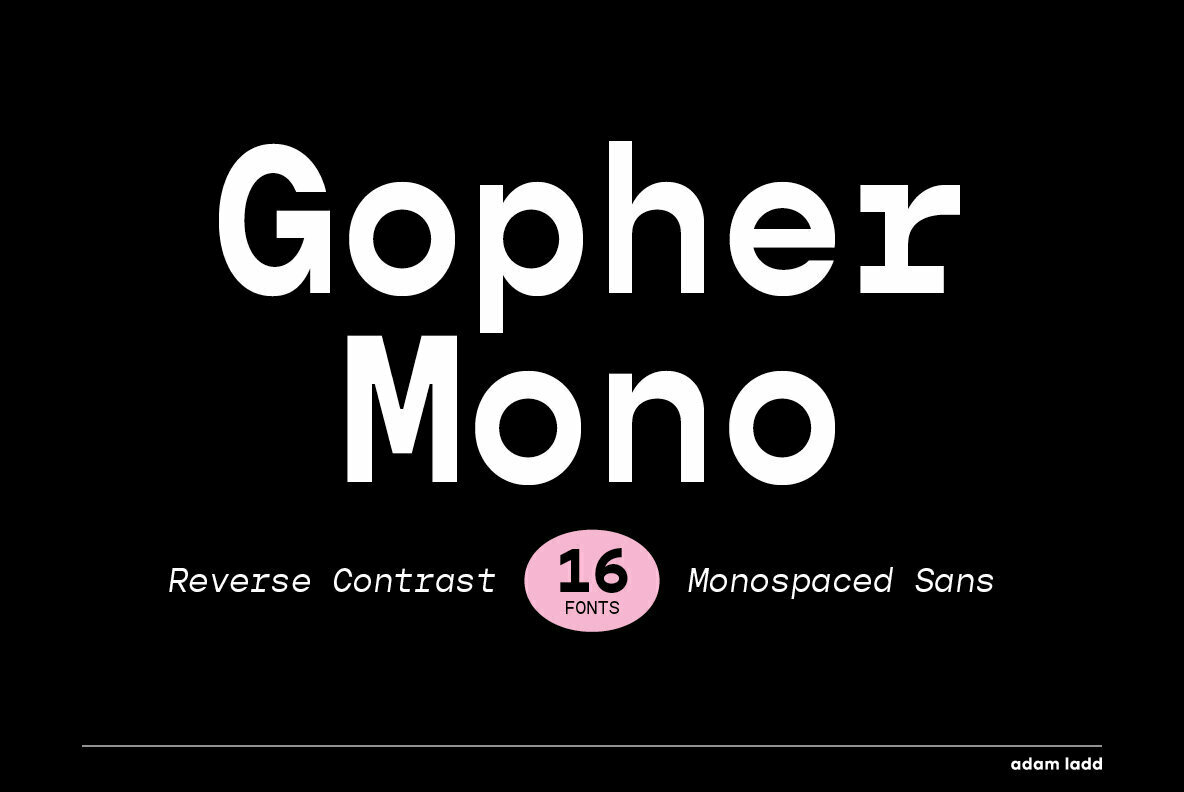
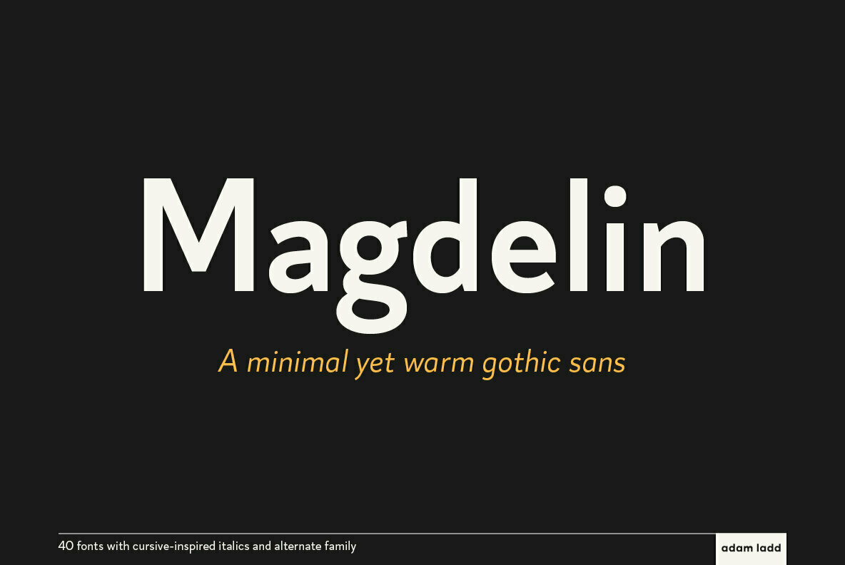
Adam Ladd currently offers 24 products through YouWorkForThem, a range of serifs, sans serifs, scripts, and display fonts to suit a wide variety of project themes. Visit his portfolio to see the rest of his work and if you love what you see, bookmark it so you can check back for new additions!
