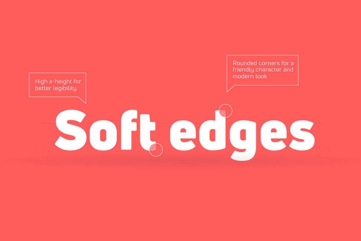
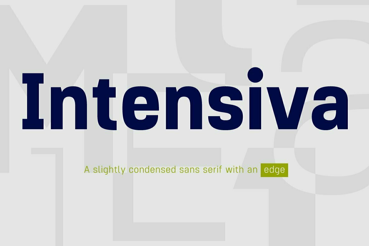
Dharma Type is the brainchild of Ryoichi Tsunekawa. Based in Japan, the digital type foundry was established in 2005 and has released more than 100 type designs through YouWorkForThem in an incredibly varied range of styles.
Ryoichi had always taken an interest in art and design, even during his childhood. He was particularly drawn to geometric shapes, repeating patterns, and abstract designs, eventually attending Nagoya University to study engineering and architecture. While there, he learned a great deal about the history of architecture and design, noting the relationship between typography and design trends like Modernism, Art Deco, and Bauhaus. Ryoichi never actually studied type design during his college classes, but they would certainly leave a mark on his eventual career as a type designer.
He went to work as an architectural engineer in Tokyo, but it was architecture that served as his driving force to learn more about typography. Just as architecture carries with it the trends of the era in which it was built, type design does, as well. Ryoichi recalled how much he would fuss over selecting a font for an architectural design, wanting to stand out from what others were using but also wanting to use something that reflected his work. He would study foundry catalogs for hours on end but at times… he would simply design his own.
That’s kind of how he made his way into the field of type design. After working as a freelance graphic designer for a while, he established Dharma Type as a foundry for his own type designs. For the first few years, Ryoichi distributed free fonts online, unsure that he’d ever be able to make a living from his work. As time went on and his work was met with approval and praise, his career as a type designer took off and he hasn’t looked back since.
Ryoichi’s type designs have been used by global corporations that include Amazon, Netflix, Disney, H&M, Sony, Starbucks, Universal Studios, Warner Bros. and Marvel – yes, that Marvel. To say he’s been successful in his career as a typographer is an understatement. It still amazes him when he thinks of how widely his work has been used, and its a feeling that will probably never lose its luster.
When it comes to type design, Ryoichi is always looking to expand on his methodology. He’ll imagine a concept, sometimes making some notes or drawing sketches on paper before taking to the computer to actually draw each character. That isn’t to say that each design is perfect from the beginning; sometimes he’ll scrap an entire project only to start again from scratch, redesigning it from the ground up. Because of this, the final product is often vastly different from the idea he originally came up with.
Ryoichi’s design style has a pretty wide range, including everything from futuristic and experimental designs to traditional architecture, formal and informal styles – and everything in between. Each type design was crafted to fill a specific need in the graphic design world; because of this, you’re sure to find something perfect for your next project.
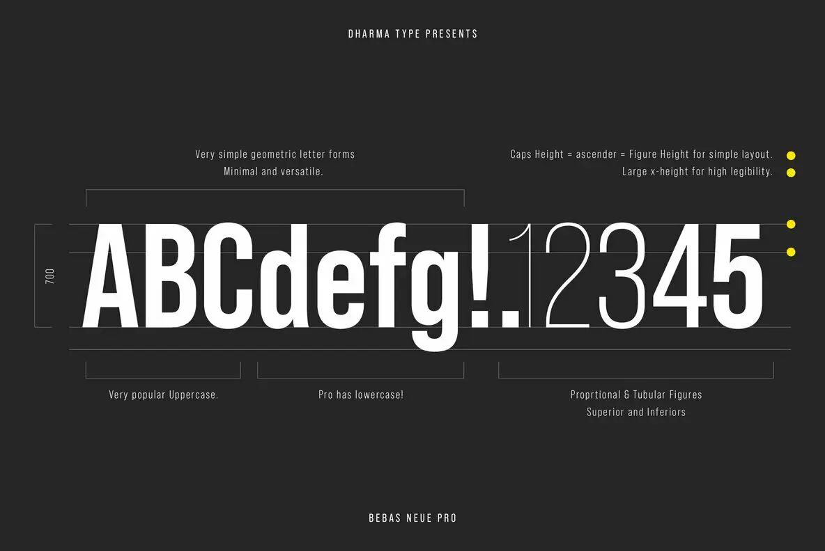
One of Dharma Type’s most recent releases is Bebas Neue Pro, an expanded version of one of Ryoichi’s most popular font families. Originally released in 2010, Bebas Neue was an all-uppercase family that has been used for design projects all over the world.
In spite of its widespread popularity, Ryoichi received numerous requests for lowercase lettering in the Bebas Neue family. Even though he had secretly been working on them for some time, these requests only solidified his need and desire to create them. Ryoichi put great care into the design of the lowercase letterforms, expertly matching them to the original uppercase lettering.
Bebas Neue Pro is a contemporary sans serif font family with a condensed architecture that makes the most of limited horizontal space. Speaking with a neutral tone, this type design offers high legibility in all sizes, conveying each message with the utmost clarity. It offers the original condensed lettering, plus SemiExpanded and Expanded widths for greater versatility.
Bebas Neue Pro is available in Thin, Light, Book, Middle, Regular, and Bold weights. Both Bebas Neue Pro SemiExpanded and Expanded contains those same weights plus an ExtraBold weight for the strongest headlining and titling applications.
Bebas Neue Pro also comes equipped with italics, which are a step up from the original family. The complete range of widths, weights, and styles make this family an ideal choice for design projects of all kinds, including headlines, editorials, publishing, website designs, product packaging and informational inserts, logos, letterhead, corporate communications, infographics, presentations, pamphlets, and mobile applications. Bebas Neue Pro is also well suited to branding and identity projects that require design cohesion across multiple media types and sizes.
Bebas Neue Pro offers plenty of additional features through OpenType, including fractions, standard ligatures, ordinals, scientific inferiors, subscript, superscript, and tabular figures. It extends multilingual support to Basic Latin, Western European, Euro, Catalan, Baltic, Turkish, Central European, Romanian, Pan African Latin, Dutch, Afrikaans, Basic Greek, and Basic Cyrillic, covering almost all European languages for greater accessibility.
Dharma Type currently offers more than 120 products through YouWorkForThem and given the range of Ryoichi’s work, we know you’ll find the perfect type design for your next project. Visit his portfolio to view the rest of his extensive body of work and bookmark it so you can check back often for new additions as they arrive!
