Based in Brazil, PintassilgoPrints is a studio and type foundry owned and operated by Erica Jung and Ricardo Marcin. The company’s name was inspired by a perching bird that used to sing from a tree outside their balcony during the wee hours of the morning. The pintassilgo took on the role of an alarm clock of sorts, beginning its song around 2 in the morning and reminding the pair that it was probably time to go to bed if they were still awake!
Over the years that have passed since they first established PintassilgoPrints, the pair have worked together in graphic design, illustration, screen printing, product development, and web design. Makers in every sense of the word, Erica and Ricardo spend much of their lives creating, whether that involves making art or furniture for their home, cooking dinner, or designing fonts. Having worked in printmaking, perhaps type design was not that big of a leap for the couple.
The first nudge toward typography sort of came along when they started working for a non-profit organization that needed help creating artwork for handmade paper products. They learned the process of silkscreening and from there, worked on numerous hand-printing projects, finding joy in the printing process even when a project was especially difficult.
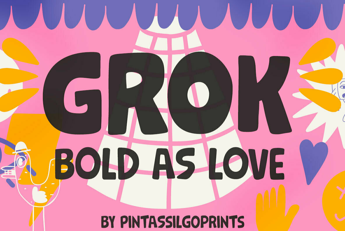
The manual process of silk screening encouraged Erica and Ricardo to work by hand when it came time to design letter sets, using their eyes as their only guides. Where many type designers use grids and rulers to fine-tune their work, Erica and Ricardo let creativity reign, drawing interesting letterforms with a truly handcrafted aesthetic.
Art history plays a starring role in much of their work. Graphic arts from the 60s and 70s, for instance, influenced several of PintassilgoPrints’ previous type designs. They find inspiration in not just visual objects, but in music, literature, movies, and even in their children.
Whatever the project, Erica and Ricardo work on each and every font their studio releases. They keep a reservoir of sketched alphabets, adding to it as inspiration strikes from wherever it will, and select one to flesh out into a full type design. Typically one of them will draw out the letters into a more finalized form while the other works on reviewing the architecture, kerning, and spacing.
They program the additional features together as a team, going over the final revisions before selecting a name and preparing it for release. Because their designs tend to be visually peculiar, the testing period can be considerable. PintassilgoPrints’ type designs are generally aimed at display use but they still put a great deal of care into ensuring they will work well in application.
Oftentimes, they’ll have a rough idea of a font’s name during the creation process, but it’s rarely the final version. Because the name will be displayed using the font, they prefer to choose a word that looks good, offers a variety of letters with few repeating characters, and isn’t too long. It’s equal parts science and art, and what seems simple at first glance, may have actually taken a long time to perfect.
One of their most recent releases is Soundstar, a quirky hand-drawn display type with a heavy geometric aesthetic. A little bit rock n’ roll, a little bit jazz, and a little bit bohemian, Soundstar is a cheerful letter set that’s “kind of blocky, but not that straight.” Marching to the beat of its own drum without a care in the world, Soundstar is the kind of display type that’s instantly at home on album covers, playbills, and event flyers.
There’s a subtle retro aesthetic to its letterforms; triple line elements conjure a touch of art deco and its structure is reminiscent of midcentury jazz album covers, drawn freehand to reveal a casual and fun-loving attitude. Because of its chunky design, Soundstar is best suited for smaller blocks of text, such as those in displays, signage, posters, album art, book covers, flyers, product packaging, apparel, merchandise, and logos. It’s an unexpectedly unique choice for branding and identity projects, as well.
Soundstar offers contextual alternates, but also provides a randomize feature to mix and match letter variations in graphic design projects. It extends multilingual support to Basic Latin, Western European, Euro, Catalan, Baltic, Turkish, Central European, Romanian, Pan African Latin, and Dutch for international design projects.
PintassilgoPrints currently offers 90 products through YouWorkForThem. If you love working with handcrafted typography that’s rich in personality, you’ve got to check out the rest of their portfolio and check back often for new releases!


