How people perceive past decades oscillates between facts and nostalgic reinvention. In Midnight in Paris, the main character’s novel begins, “Out of the Past was the name of the store, and its products consisted of memories: what was prosaic and even vulgar to one generation had been transmuted by the mere passing of years to a status at once magical and also camp.” The main character time travels to 1920s Paris, only to fall for a woman that disdains the decade he so reveres, longing instead for the 1890s Belle Epoque.
Recently we’ve seen nostalgic journeys into the 1970s, with films like American Hustle and the series Vinyl showing us a world of gigantic cars and lapels, 8-tracks and reel-to-reels, and an unhinged Studio 54 lifestyle. The 1980s receive similar artistic treatments.
An interesting aspect of these artistic lookbacks is discovering what symbols come to define past decades, and to what extent they mattered at the time. For instance, in 1976 nobody especially noticed the 8-track in the player, and nobody felt hilarious when they yearned for an even wider necktie. These symbols gained more meaning over time. It took more perceptive artists and social philosophers to choose and perfect these nostalgic signposts. Tellingly, many of these artists didn’t experience the decade that inspired them—they were either too young or not born at all. Perhaps the reason they get such accurate results is because they create with both nostalgia and objectivity.
Several of our staff members came of age in the 1980s, and look back with their own sentimental biases, while at the same time their memories are enhanced by younger artists that recreate the 1980s based on signposts they define. We recall, for instance, how in 1985 we laughed at natural hair styles carried over from the 1970s, while we took no note of the hairspray towers all around us. It was the elephant in the room we could not see, but now we can only laugh at ourselves as younger artists immediately point out the absurdity of the chemical-laden birds’ nests we proudly sported.
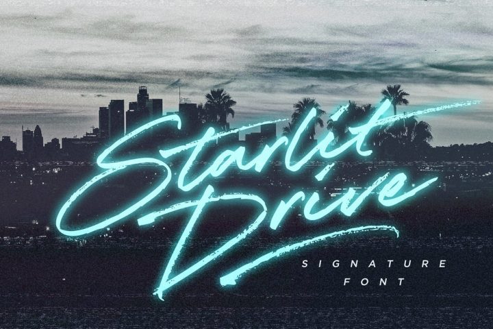
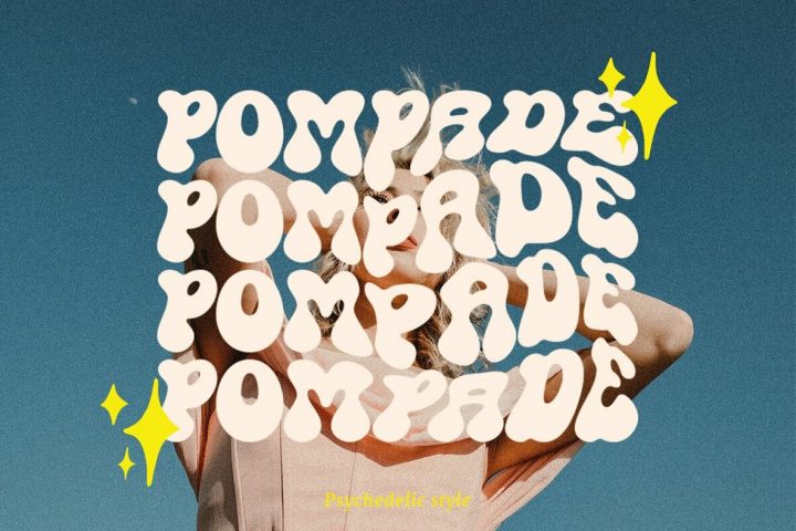
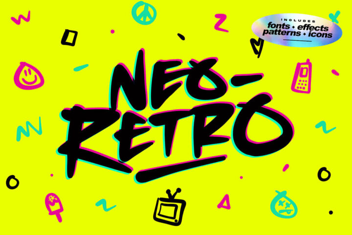
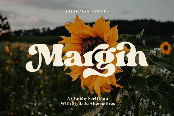
In our world, many designers we work with create outstanding renditions with a genuine 1980s feel through typefaces, backgrounds, and special effects. Set Sail Studio’s founder Sam Parrett grew up in the early 1990s watching television and movies from the ’80s, and he felt particularly drawn to the sense of nostalgia they created for him. He set out to explore this nostalgia with his art. Set Sail Studio’s portfolio reflects that, with several direct hits like Primed and Lacuna. Our 1980s veterans unanimously confirm that Mr. Parrett’s renditions are absolutely accurate. They hit “play” on a swift montage of John Hughes, Motley Crue, and Miami Vice.
And Miami brings the amazing part: Sam Parrett backed into his accurate 1980s creations via music, specifically the soundtrack of Grand Theft Auto: Vice City. As he described it, it was what, “really made me fall in love with the ’80s.” Grand Theft’s fictional Miami “during the height of that era—the neon lights, the flashy cars, the palm beaches and loud fashion will inevitably take hold of you.”
He’s right, and his latest offering Hot Rush Font Duo brings it on home. Sam still regularly listens to GFA Vice City’s soundtrack, and as far as favourites go, “it’s hard to even single any out because they’re all total bangers…I spent some of the best times with my best friends playing that game, so it has a special place in my heart. I listen to a lot of retro wave playlists these days, and they take me back to those times and really help me focus on my work.” Perhaps it’s that blend of recollecting good times with great friends superimposed on a previous decade that fuels Sam’s magic—retro with heart.
So “prepare yourself for a wild retro ride with Hot Rush – ’80s nostalgia is about hit you harder than a DeLorean at 88 miles per hour.”


