Almoneda from Sudtipos should be appreciated with a long and loving inspection. In addition to the images here, it is imperative to visit the product page, click on the glyphs tab, and take in every character. One glance at the images here shows that Almoneda is an astounding accomplishment: classic, yet indelibly marked by Sudtipos individuality. But in Almoneda’s case, the brilliance and absurd beauty of this font must be appreciated glyph by glyph. Almoneda is one of the most beautiful fonts in existence, and however slowly you appreciate it, it is an immeasurably small fraction of the time invested in its creation.
Sudtipos states that angular Almoneda was inspired by the mood and visuals of Madrid open air markets in El Rastro. These markets feature flea to antique-quality items. Books, boxes, and posters from the late nineteenth and early twentieth century yield typographic treasures: unique uppercase letters, letters embedded, and rare ligatures. Sudtipos was also inspired by “elements extracted from street signs, tiles from bars and commemorative elements of Madrid,” in the process of creating Almoneda with “care and patience.”


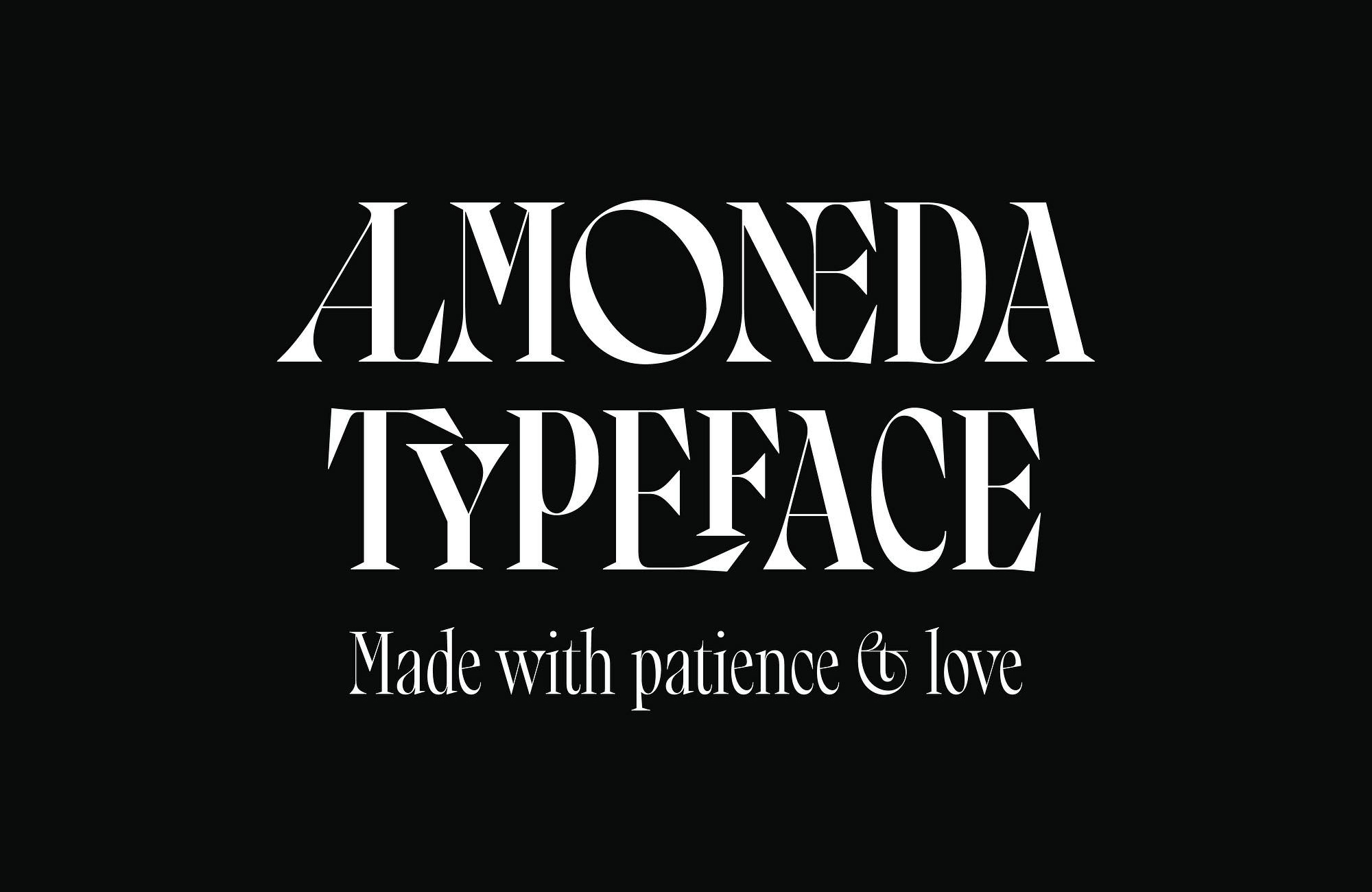
All of the patience and love that fueled Almoneda’s creation can be part of your project immediately. The hours of explorations in Madrid markets, the planning and the work, the gorgeous result: it will all be there in your project, infusing it with unrivaled elegance and character. Try the type tester. Type your name, and then try the alternates and ligatures. Look at it in bold. Seeing your name rendered in this work of art will change how you feel about yourself. The same effect will shine from your branding, packaging, book covers, posters, social media, magazine, musical projects, films, visual identity, or logo.
Sudtipos says Almoneda is “a typeface that will not leave you indifferent.” We say that’s the understatement of the year.


