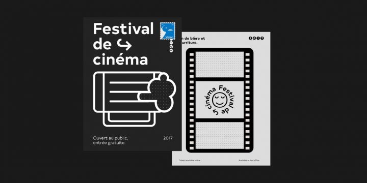
Based in the picturesque and historic city of Newcastle upon Tyne, The Northern Block is a design studio and type foundry that has really made a name for itself in the world of graphic design. The studio’s work is well known for its unorthodox approach to design, its innovation, and its willingness to explore creativity for creativity’s sake.
While the foundry embraces varying styles, the core of its work is centered around themes that heavily relate to our ever-changing and modern world, including computers, mobile technology, electronics, and video gaming. The Northern Block offers letter sets that are aesthetically beautiful, incredibly versatile, and of the highest quality.
The foundry was established by Jonathan Hill in 2006. In his early career, he worked as a painter and decorator but went on to enroll at the Batley School of Art in West Yorkshire, and later studying at the Newcastle College of Art & Design.
In the beginning, type design was something he made use of in his interior and graphic design work but he eventually moved toward graphic design for advertising. While working for a design agency active in the local music scene, Jonathan found himself immersed in typography far more than he had previously, and it marked the future course of his career.
Jonathan found a great deal of influence and inspiration in The Designers Republic, admiring how they made use of irony and wit in their work. In fact, their use of the phrase, “North Of Nowhere,” helped to inspire the name Jonathan would eventually give to his own foundry and studio.
The Northern Block prizes collaboration and artistic individuality, working with a growing number of designers and typographers over the years. Even though The Northern Block team has expanded over the years, Jonathan remains ever active in the field of type design.
One of his most recent type designs released through The Northern Block is Roag, an industrial geometric sans serif family that pays homage to the mechanical designs of the 1930s. With Roag, Jonathan wanted to craft a type family with precise geometric balance through its architecture, a minimalist design that would communicate without unwanted distraction. To that end, Roag is a “straightforward, unadorned type family with efficient construction.”
Roag is available in UltraLight, Light, Regular, Medium, Bold, ExtraBold, and Black, with corresponding italics for each. It’s a classic go-to sans serif family that’s perfectly suited to everything from bold headlines and displays to editorials, advertising, body copy, publishing, logos, letterhead, corporate communications, white papers, infographics, labels, tags, product packaging, merchandise, apparel, website designs, and mobile applications. It’s a great choice for branding and identity projects that require fluid design cohesion across multiple media channels.
Roag offers a fantastic range of additional features through OpenType including capitals to small caps, case-sensitive forms, fractions, standard ligatures, ordinals, superscript, slashed zero, tabular figures, small caps, and stylistic alternates for great design versatility. It extends multilingual support to Basic Latin, Western European, Euro, Catalan, Baltic, Turkish, Central European, Romanian, Vietnamese, Pan African Latin, Dutch, Pinyin, and Igbo Onwu for design projects intended for an international audience.
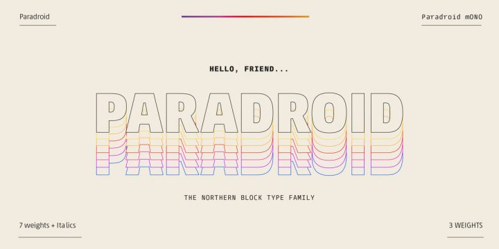
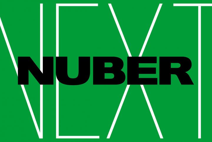
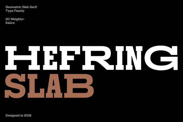
The Northern Block currently offers more than 110 products through YouWorkForThem, including a variety of serifs, slab serifs, sans serifs, scripts, and display fonts to suit a wide range of design themes. Visit their portfolio to take a look at their entire body of work and bookmark it so you can check back often for their latest releases!
