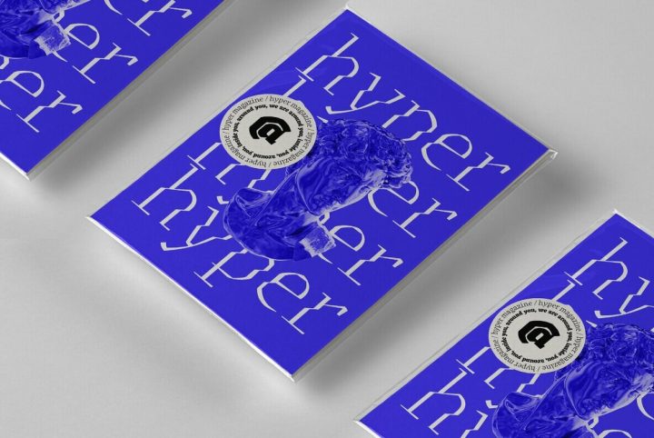
We are pleased to announce that we are now an official distributor of the well respected TypeTogether font collection. To celebrate the addition of their designs to YouWorkForThem, TypeTogether have discounted four of their designs by 25%, valid until March 11, 2014.
Another great, unique and exclusive deal available only at YouWorkForThem.
Iskra is a practical sans serif need not appear dry, constructed, or derivative. It can excel in its sensible role and yet possess a distinct flair. Iskra (spark or flash) is a new sans serif designed by Tom Grace. It was conceived to challenge the limits between utilitarian and decorative. Sporting a low-contrast profile, it is a study of bridled energy in the Cyrillic and Latin scripts. Its eye-catching forms are an oblique tribute to the less-predictable style of brush lettering, and contain daring, elegant curves, economical proportions, and a slight top-heavy asymmetry. Its warmth comes from the subtle emphasis on the structures and details of individual letterforms, whereas its solidity is demonstrated through its balanced rhythm over long spans of text.
Karmina Sans was conceived as a larger type family, six weights with matching italics, that could perform alongside it’s serifed cousin, but that had its own features and personality. It shares the same technical excellence and has the same basic proportions, but it proposes to be a much more versatile tool for editorial designers. While intermediate weights match the proportions and weight of Karmina Serif and are excellent for setting short texts or magazine articles, the more extreme weights are intended for all kinds of headlines above 14 points and for corporate identity programs.
Karmina is a text typeface developed mainly for pocket books and budget editions. It was built to withstand the worst printing conditions: low quality papers, high printing speed with web presses and variations in the ink level of the printing press. Some of Karmina’s most representative features are the rather large serifs, intended to work perfectly in small reproduction sizes, the sharpness of the shapes, including some calligraphic reminiscences, and the large and yet graceful ink traps in the acute connections. Structurally, Karmina combines a significantly large x-height with relatively compressed letterforms. The result of these features grants Karmina outstanding legibility and economy.
Sirba, a seriffed typeface family with a friendly personality, was conceived especially for the demands in complex text environments like dictionaries, academic texts annual reports, novels and magazines. It has many design features that were particularly designed with Sirba’s purpose in mind. Because of its open counters, the large x-height, short ascenders and descenders, this typeface conveys a pleasant reading experience and high legibility even in small sizes. Intensive study of typefaces from the period of letterpress printing used in bibles and dictionaries, in particular for small type sizes, and the understanding of the typefaces’ “secrets”, influenced the design and concept of Sirba to a great extend.
Cora is a sans serif with an experimental bent, offering a large x-height, some contrast of stroke weight, and capitals inspired by classical lettering. The uppercase exhibits classical proportions found in ancient Roman inscriptions, which provides opportunities for setting titles in all caps.
Being inspired by early Czech type design, Maiola is clearly a contemporary typeface, that is mindful of its historical heritage, implementing old-style features and calligraphic reminiscence, more frankly so in the Italic. Nevertheless, through its personality, it attempts to create a welcoming tension on the page, without shouting too loudly at the reader. It handles its expressive tendencies with care and in doing so increases its usability, with legibility being of great importance. Subtle irregularities of the letterforms enhance furthermore the dynamic spirit and liveliness of the typeface.
Alizé is a three-weight typeface inspired by the chancery italic of the 16th century. It is a high-contrast face, created with syncopations in axes and proportions and subtle irregularities that form a lively and delicate weave, suitable for setting a single word, a special expression, or a short block of prose. The family does not contain a roman, and instead promotes the italic as a primary style, a common printing convention in the 16th and 17th centuries. The italic lowercase predates inclined capitals by about twenty years, and as a nod to this typographic evolution, Alizé’s capitals, small capitals, and figures are very slightly inclined to match the energy of the lowercase.


