Type

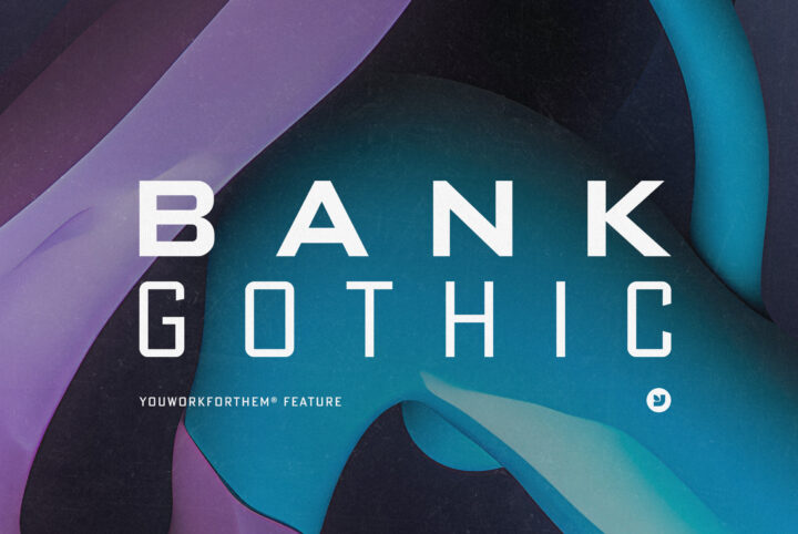
The Art of Typeface: Bank Gothic Font and Its Variations
When it comes to the world of typography, there are few names as eminent as Morris Fuller Benton's. Known for his numerous contributions to typeface design, Benton gifted us with a timeless classic: the Bank Gothic font. Embodying an enduring charm, Bank Gothic (also see our feature collection) has been a beloved part of digital landscapes for decades. Its perfect blend of geometric rigor and subtle roundness has found its way into countless design projects. At YouWorkForThem, we appreciate
Eveleth’s Font Style: A Key to Prego’s Success
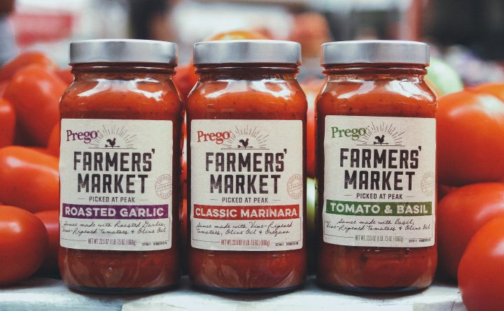
In the dynamic field of design, the right font style frequently emerges as the secret sauce, the magic touch that endows a brand with its distinctive identity. Amidst the myriad of typefaces, Eveleth Font from Yellow Design Studio uniquely stands out, lending an air of authentic nostalgia and vintage charm. Consequently, this post delves deeper, examining how the Eveleth typeface was instrumental in revitalizing the brand identity of Prego Farmer's Market sauces.   The Charm of
Summer Paradise: A Creative Typeface for Logo Design & More!
SilverStag presents Summer Paradise—a perfect recollection of this year's summer adventures, as the warmth fades. Summer Paradise comes in rustic, solid, and solid rustic fonts styles —each featuring light, regular, and bold font weights. It has the confident air of coincidental perfection, an effortless artistry that results in a warm, natural, gorgeous font. Summer Paradise is a creative typeface perfect for logo design, branding, posters, social media, corporate identity, package design,
The Artistry of ED Lavonia – A Quintessential Handwriting Font
The charm of a handwriting font lies in its ability to transport us back in time to yesteryears. It honors the carefully penned letters of the past, the ink blots, and the elegance of ancient scribes. The allure is irresistible, evoking a sense of nostalgia that is intrinsically human. Handwriting fonts create a sense of intimacy, weaving a personal touch to the digital world, which often lacks warmth. In a realm where design aesthetics are constantly evolving, there's one handwriting font
20+ Fonts Similar to Cooper Black: Perfect for Retro Designs
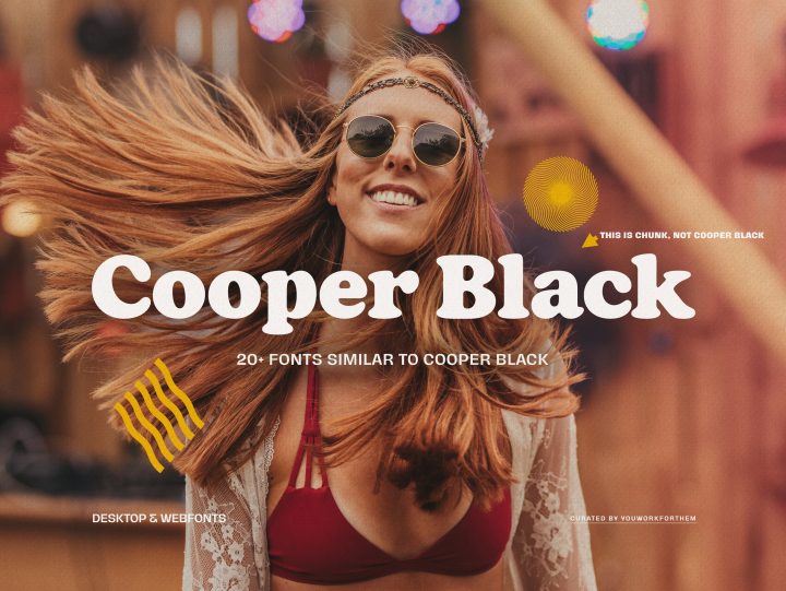
Evoking the spirit of bygone eras, the chunky and popular Cooper Black font brings a retro touch to your designs. Oswald Bruce Cooper initially crafted this typeface, ideal for headlines and logotypes, and larger body copy. While Cooper Black stands out with its unique playful and vintage aesthetic, many other fonts share these qualities. Whether you're looking to create a vintage design or give your project an edgy, retro feel, there are multiple options available at YouWorkForThem. We've
A Brief History Of Franklin Gothic
You've likely seen the Franklin Gothic typeface a thousand times without even realizing it. From advertising logos and billboards, television and movie screens, books and album covers, board games and computer games, this timeless typeface is everywhere. Morris Fuller Benton created the original version of Franklin Gothic in 1902. The typeface found its influence in Akzidenz Grotesk types and it was issued by American Type Founders (ATF), where Benton himself served as chief typeface
Exploring The Bones of Typography: Part Three
Understanding Typography Terms When you're reading through the product descriptions for fonts on YouWorkForThem, you'll often come across a number of strange terms that don't necessarily mean a whole lot unless you actually work in the field of typography. For type designers, a "counter" isn't just the place where the coffee pot lives, and the word, "terminal," certainly isn't referencing the closest airport or bus depot. Typographic terms can seem especially confusing when you don't know
Exploring The Bones Of Typography: Part Two
Typographic terms can seem especially confusing when you don't know exactly what they mean. In Part Two of our "Exploring The Bones Of Typography" series, we're going to get into the actual placement and spacing of letters, numbers, and punctuation. When you're reading a block of text, a lot of work actually went into making sure that it's not only legible, but comfortable to read after a font is typed out. Some parts of each letter's placement happen automatically, but there are some parts
Exploring The Bones of Typography: Part One
Typographic terms can seem downright confusing when you don't know exactly what they mean, so we thought it would be fun to do a three-part series that really digs into the bones of typography. Through a little digital archeology, we're going to explore the structure of letters and drop a little useful knowledge on the subject of typography. We hope that this guide will help laymen to better understand a bit about type design, and it might even help those aspiring typographers who aren't sure
YWFT Ultramagnetic: The West Elm Font for Global Success
YWFT Ultramagnetic: This is the bold, smooth West Elm font choice for the global home decor retail chain, in its worldwide marketing and branding efforts. Whether it's in-store displays, social media, or their corporate website in WebFont format, this font is integral to West Elm's global success. Known internally as "Ultramag," this font carries the emblem of YouWorkForThem's excellence, boasting an inherent dual nature that is both "soft and gothic." YWFT Ultramagnetic, a harmonious blend
Ten Great Movie Fonts For Title Sequences
Choosing the right movie font for the opening title sequence is crucial to setting the tone and building the brand of the film. A well-designed font can make all the difference in the success of a movie's presentation. Take "Jaws," for example, if Comic Sans had been used, it would have completely shifted the mood away from the bloodcurdling terror that the audience was meant to experience. Movies are (for the most part) as unique as the individuals who conceptualized them and we realize
Radnika Next, A Sans-Serif Font for Everywhere
The Hanken Design Company is based in the Philippines. Hanken produces intelligent, functional fonts that are well designed and easy to use. The studio's work is defined by readability, flexibility, and a blend of modern and classic. Hanken fonts can be seen around the world. Please take a moment to explore their Instagram page. Hanken creates fonts for almost any project. These well-designed fonts are a great addition to any graphic design toolbox. They exemplify typography's
Mastering Variable Fonts: The Future of Web Typography
Welcome to our comprehensive guide on variable fonts, the groundbreaking font format that enables unparalleled control over typography and design. At YouWorkForThem, we have been at the forefront of supporting and licensing variable designs since their inception. Today, we proudly offer hundreds of variable type designs, ready for instant download to cater to diverse design needs. Our commitment to providing clients with the most cutting-edge and versatile resources is what drives us to share
Geometric Fonts: The Essential Guide for Modern Designers
Before we jump right into some of our favorite geometric fonts, let's explore where this all started. Geometry as a mathematical science began to emerge somewhere around the sixth century B.C., with its core axioms being discovered in the third century B.C. The "father of geometry," Euclid of Alexandria, was a Greek mathematician whose work influenced the entire framework of geometry as we know it today, including those mathematical proofs many of us came to loathe in high school. (Thanks a
Game Changers: The 25 Best Sports Fonts to Boost Your Design Game
As fans who live and breathe our favorite team's colors, we're always on the lookout for the perfect sports fonts to elevate our athletic-themed designs. To celebrate sportsmanship, YouWorkForThem has curated an incredible selection of our Top 25 Fonts for Sports, including baseball fonts, football fonts, soccer fonts, and more. So, put on your favorite team jersey, grab a refreshing beverage, and prepare your favorite pregame snacks – it's time to dive into an exhilarating world of
The Ultimate Guide to Web Fonts
Welcome to the YouWorkForThem comprehensive guide to web fonts. As a trusted authority in the font industry, we're excited to share our knowledge on this essential aspect of web design. In this in-depth article, we'll explore licensing, font options, and how web fonts can elevate your website's user experience. Let's dive in!   What are Web Fonts? In the early days of the internet, browsers supported only a limited set of fonts. Fast forward to today, and we now have the power to
An Alternative to Helvetica for Today’s Graphic Designers
SK Synonym Grotesk is a geometric neo-grotesk typeface with versatility and aesthetic charm. Influenced by Swiss type design and Helvetica, this grotesque font has been adapted to modern digital design realities. Its sturdy, simple structure is characterized by angular joints that accent the details. SK Synonym uses a strict geometric and stable construction combined with organic, lively forms. The result is an unusual, attractive aesthetic. SK Synonym Grotesk offers a broad variety of
Older Posts
Download Free Stuff