
Used in advertising project around the world, the typography of Yellow Design Studio has become a sensation through their distressed and retro style fonts. Yellow Design Studio founders Ryan and Rena Martinson started their business out of Madison, Wisconsin in 2004, but within a couple years it evolved into a type design and fine arts studio as Rena poured herself into her artwork and Ryan focused on creating fonts. Together, they managed to form one of the most successful type design companies in the current marketplace.
So where does Yellow Design Studio find their inspiration for such enticing fonts?
Their font families likes Sucrose, Veneer, and Anodyne draw heavily on vintage inspirations with bold letterforms combined with a distressed look that makes them the perfect fit on everything from an apocalyptic wasteland billboard to an aged t-shirt.
However, Yellow Design Studio is not a company that shies away from experimentation. As Ryan Martinson puts it, when you only design fonts experimentation is necessary to keep things from growing tedious. While the playful lines of Thirsty and Sant’Elia remain favorites, Ryan considers Gist to be his biggest experimental success. When creating the Gist font family, he had to start over from scratch twice while trying to create the perfect mix of retro and modern while not being too fancy or uptight.
Looking to grab a piece of Yellow Design Studios beautiful fonts for your unique creation? Simply start at their profile page and you can begin to browse today…
As an extra bonus for this month only, Yellow Design Studio is taking part in our end of year sale. This means, all designs mentioned above are currently 50% off until December 30, 2015. Hurry up and grab these quality designs while the price is right.
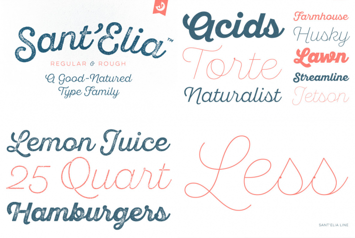
Sant’Elia Script from Yellow Design Studio is a robust modern type family with regular and rough versions in six weights. Its letterforms are crisp and welcoming with a splash of verve. Alternate versions feature angled strokes that inject extra energy. Rough weights include three different distress levels that can be mixed for added control and customization. Try Sant’Elia Rough Line, Line Two and Line Three for free!

Gist from Yellow Design Studio is an inline slab serif with a retro yet modern vibe. It’s a collision between monoline slab and indie script. With 627 glyphs per weight, it’s highly customizable…either keep it simple with the base character set or use ligatures, alternates and swashes for extra flair. All-caps typesettings have an especially retro edge. Also included are line layers for adding color to the inline areas. As a bonus, try Gist Light for free!

Veneer from Yellow Design Studio is a high resolution hand-crafted letterpress font that’s vintage and authentic with a touch of grunge. It’s highly customizable with six distress options for every letter and three for all other characters, and because it’s remarkably detailed, it looks great even at very large sizes. In addition it includes a matching set of funky extras…for free!

Thirsty Script Rough from Yellow Design Studio is the warm and weathered version of Thirsty Script with texture that captures the authentic qualities of letterpress printing. It’s highly customizable with four alternate versions of every weight ranging from very light to heavy distress. Because it’s remarkably detailed, it looks great even at large sizes. For extra customization and fun, it includes a set of matching texture pieces…for free!


