Based in Bangkok, Thailand, the designer behind the Typesketchbook foundry is hard at work creating fonts that are as attractive as they are functional. Chatnarong Jingsuphatada initially began his career as a type designer after dealing with a common struggle that most graphic designers have also experienced firsthand: finding the perfect font for a project.
Chatnarong would spend two years experimenting with type design, eventually creating Superstore Font Foundry. 2012 ushered the release of his fonts in the online marketplace, debuting with Gusto, a casual sans serif with a humanist character. Another well-received type design has been Noyh, an incredibly versatile geometric sans serif family of 72 fonts. Extensive design flexibility is particularly important to Chatnarong, who tries “to create fonts that are multi-functional and attractive to suit today’s diverse fields of design,” in his own words.
One thing is certain: Chatnarong knows what he’s doing. His ability to fuse key elements from multiple sources of inspiration allows him to create multifaceted type designs for an endless array of design applications. As Chatnarong himself explained, “Having worked as a graphic designer, I have gained insight into what designers want and need and what they look for in regard to how usable and interesting a font is.”
His pragmatic approach to type design is apparent in his latest release, Breul Grotesk.
Breul Grotesk is classic and straightforward, sparing nonessential design elements that would otherwise detract from its simplicity. Inspired by Bauhaus design concepts, Breul Grotesk is a sans serif typeface that pairs both the artistry and the innovation of the early 20th century.
Two distinct variations of the font allow for extensive flexibility in graphic design layouts. The sharper angles of Breul Grotesk A take a formal and businesslike approach, while the rounded edges of Breul Grotesk B add a more relaxed, contemporary flair that’s ideal for web content. Because of their inherent differences, these two fonts are appropriate for an impressive range of projects, including corporate correspondence, white papers, letterhead, business cards, logos, advertising, and editorial spreads.
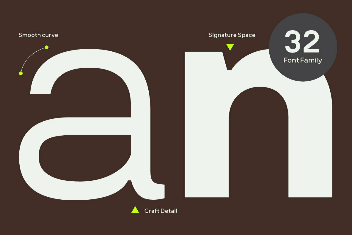
Breul Grotesk includes a total of 32 fonts: A and B styles in eight distinct weights, with corresponding italics for each. 359 glyphs provide multilingual support for Basic Latin, Western European, Euro, Baltic, Turkish, Central European, Romanian, Pan African Latin, and Basic Greek.
You don’t want to miss this one; Breul Grotesk is on sale at 85% off its regular price until November 30th.
If you’re looking for highly versatile, extensive font families, be sure to check out all of Typesketchbook’s portfolio on YouWorkForThem, bookmark it for future reference, and check back often for new updates!


