Operated by Nils Thomsen in Hamburg, and Jakob Runge in Munich, TypeMates foundry offers a diverse assortment of type designs in addition to providing custom work for clients. “We don’t believe that typefaces are neutral or purely functional systems for reading, rather that they are a visual language with emotional values,” they told us. Becoming masters of their craft through devotion to the tiniest of details, Nils and Jakob strive to deliver letter sets held to high technical standards while incorporating innovative and useful designs for a wide range of applications.
Jakob Runge focused on communication design at university, receiving his bachelor’s degree from the University of Applied Sciences in Würzburg and acquiring a masters degree from Muthesius Academy of Fine Arts and Design in Kiel. For Jakob, type design is a passion to be celebrated though the act of creation, with a strong emphasis on articulate communication.
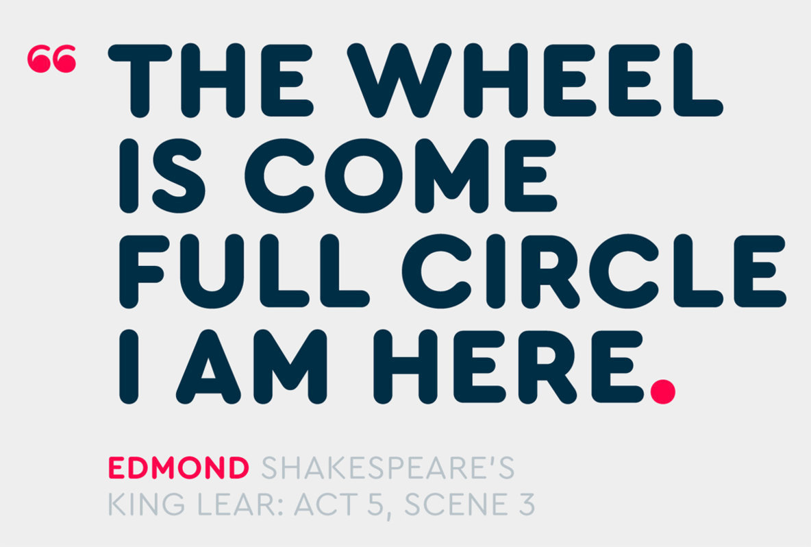
One of his latest designs, created in partnership with Lisa Fischbach, is Cera Round Pro. This elegant, geometric sans serif is so much more than simply a rounded version of its predecessor, Cera. “We’ve carefully reworked and adjusted many of the glyphs to adapt them to Cera’s new attitude,” they said. “Cera Round Pro features circular stroke endings and softly rounded corners to create cheerful feeling text.”
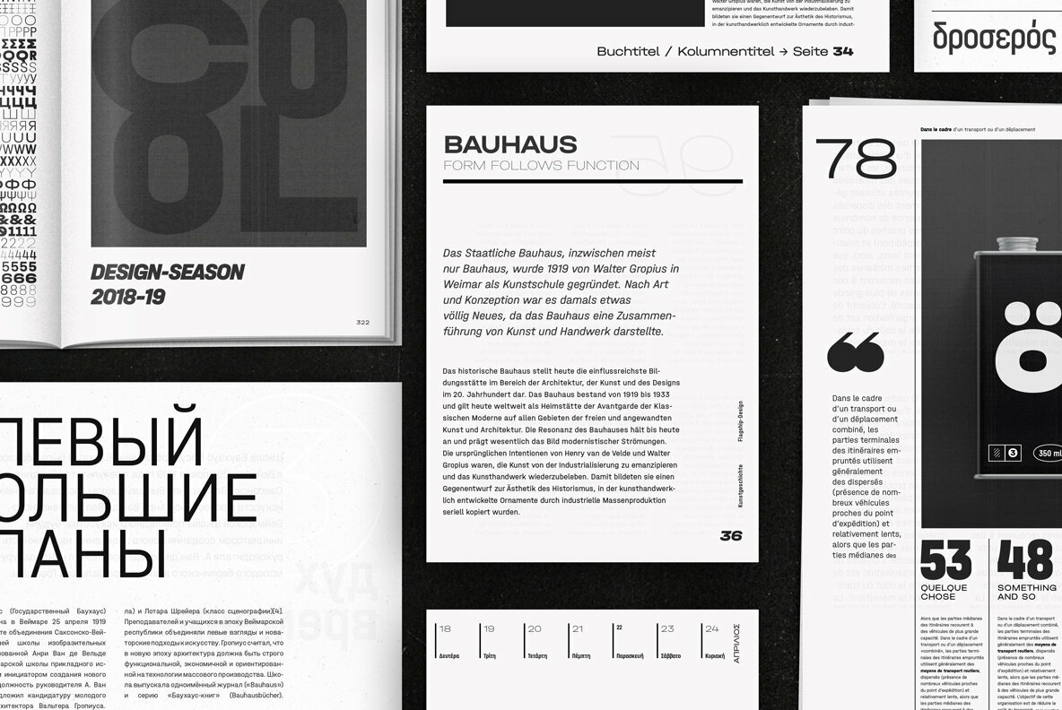
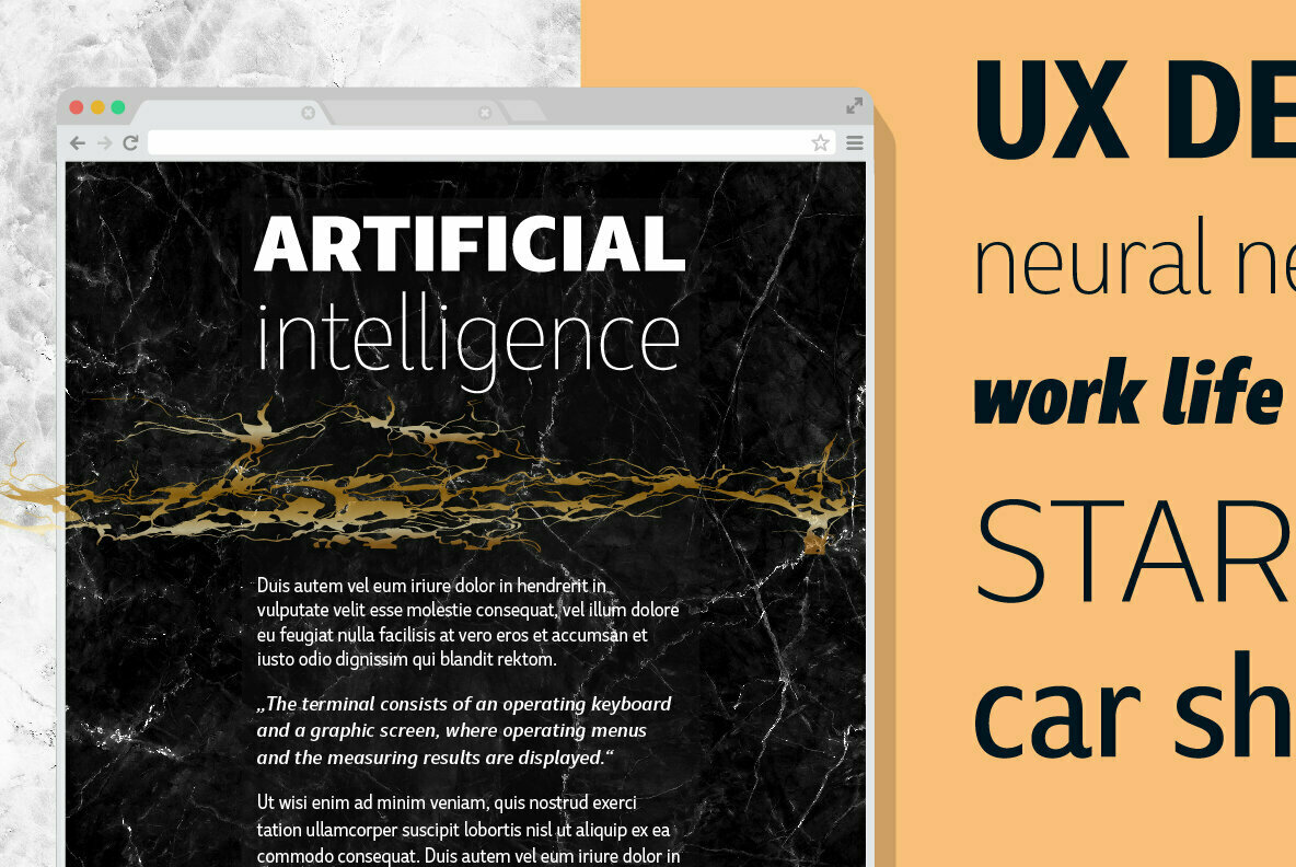
Cera Round Pro is indeed a more jovial letterset, one whose message is delivered with clarity and friendly approachability. Its lighter weights are ideal for a wide range of projects that include easy-to-digest educational body text, technical manuals that share information without intimidation, clean web copy, editorials, and publishing. Cera Round Pro’s heavier weights are well suited for bold headlines, signage, advertising, and product packaging. In large point, this font is incredibly playful and legible, making it an excellent choice for youth-oriented book cover designs and body text for early-reader children’s books.
The whole suite of letterforms, comprised of six weights that range from Thin to Black, offer total cohesion when used in branding and identity projects, giving designers a pliable range of expression to work with. Everything from logos, letterhead, business cards, labels, corporate communications, website design, and mobile applications will make good use of this eloquent and sincere type design.
With 990 glyphs, Cera Round Pro offers designers an incredible amount of versatility that includes contextual alternates, case sensitive forms, standard ligatures, slashed zero, numerators, denominators, mathematical Greek, localized forms, stylistic alternates, oldstyle figures, and tabular figures. Multilingual support for Cera Round Pro extends to Basic Latin, Western European, Euro, Catalan, Baltic, Turkish, Central European, Romanian, Pan African Latin, Dutch, Basic Greek, and Basic Cyrillic for exceptionally far-reaching accessibility.
Through April 30, 2017, Cera Round Pro is on sale for 50% off of its regular price so it’s great time to add this one to your font collection.
TypeMates currently offers 15 products through YouWorkForThem and if you like what you’ve seen with Cera Round Pro, check out their portfolio to view more from the Cera Collection along with the rest of their work.


