While many of us tend to be our own harshest critics when it comes to our creative work, artists (of all genres) usually have at least a few personal favorites nestled among their own portfolios. It’s always interesting to learn what makes those particular works stand apart from the rest, and that’s why YouWorkForThem is incredibly excited to announce a brand new blog series that will highlight the personal top picks of individual designers, studios, and foundries!
We have been speaking directly with YouWorkForThem’s partners to find out what products they’re most proud of and why, mingling their choices with some of our own to present a fresh batch of Foundry Favorites each week.
Kicking off this series, we interviewed Connary Fagen, a graphic designer and typographer with a considerable background in web and UI design, motion graphics, art direction, illustration, branding, and identity. Connary is well versed in the mechanics of great type design, a knowledge that’s paired with a deep understanding of exactly how typography affects the overall quality of any given design. While he accepts work on commission to develop unique type designs for his clients, Connary also offers more than a dozen products through YouWorkForThem, three of which appeared in our Top Ten Fonts Of 2016.
“Addington is my personal favorite,” Connary shared. “It’s charming, versatile, has good italics, and is the most technically proficient of my typefaces so far. The Identifont blog called it “mature and confident”, which made my day. Addington is great on its own, but also pairs nicely with a good sans-serif.” This sophisticated, modern classic is perfect for just about any project that requires contemporary elegance, including branding and identity, corporate communications, publishing, editorials, advertising, web content, and mobile applications. With six weights that range from Light to Extra Bold, Addington CF is packed with OpenType features and extensive multilingual support.
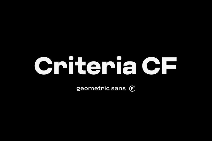
“Greycliff has done me proud; it was recently used for Coachella’s 2017 website and app, and Diabetes Canada’s rebrand,” Connary told us. “Even though it’s one of many geometric typefaces out there, Greycliff has enough personality to stand out, and is one of the more consistently popular typefaces in the catalog.” Greycliff CF is intelligent with a decidedly warm demeanor, an excellent choice for corporate communications, white papers, posters, publishing, branding, and identity. Seven weights range from Light to Heavy with corresponding obliques, providing even more design flexibility through a host of OpenType features.
“Couplet began as an experiment, using Manifold as a base and rounding it down to a more humanist style, but it quickly turned into its own new typeface,” Connary said. “Couplet is not flashy; it’s a friendly, humble typeface, and I suspect it will be a slow burn in terms of picking up steam. I’m good with that.” Couplet CF is like the little black dress of typography: it’s a versatile basic that’s an absolute must-have. Ranging in weight from Light to Heavy with corresponding italics for each, Couplet is packed with OpenType features and multilingual support.
“Visby has evolved a lot since version 1.0,” Connary observed. “Over time, new weights and features have been added, along with hours and hours of fine tuning and redrawing glyphs. Visby is a solid performer and a good example of the long term, continuous support I offer with every typeface.” Visby CF is charming and warm, with updated enhancements that include redrawn letters, an additional weight, kerning and hinting adjustments, and improved obliques. Eight weights with corresponding obliques offer extensive design flexibility and, as usual, it comes loaded with OpenType features and thorough multilingual support.
YouWorkForThem also has several favorites among Connary’s portfolio, including Cartograph, Turismo, Integral, and Manifold.
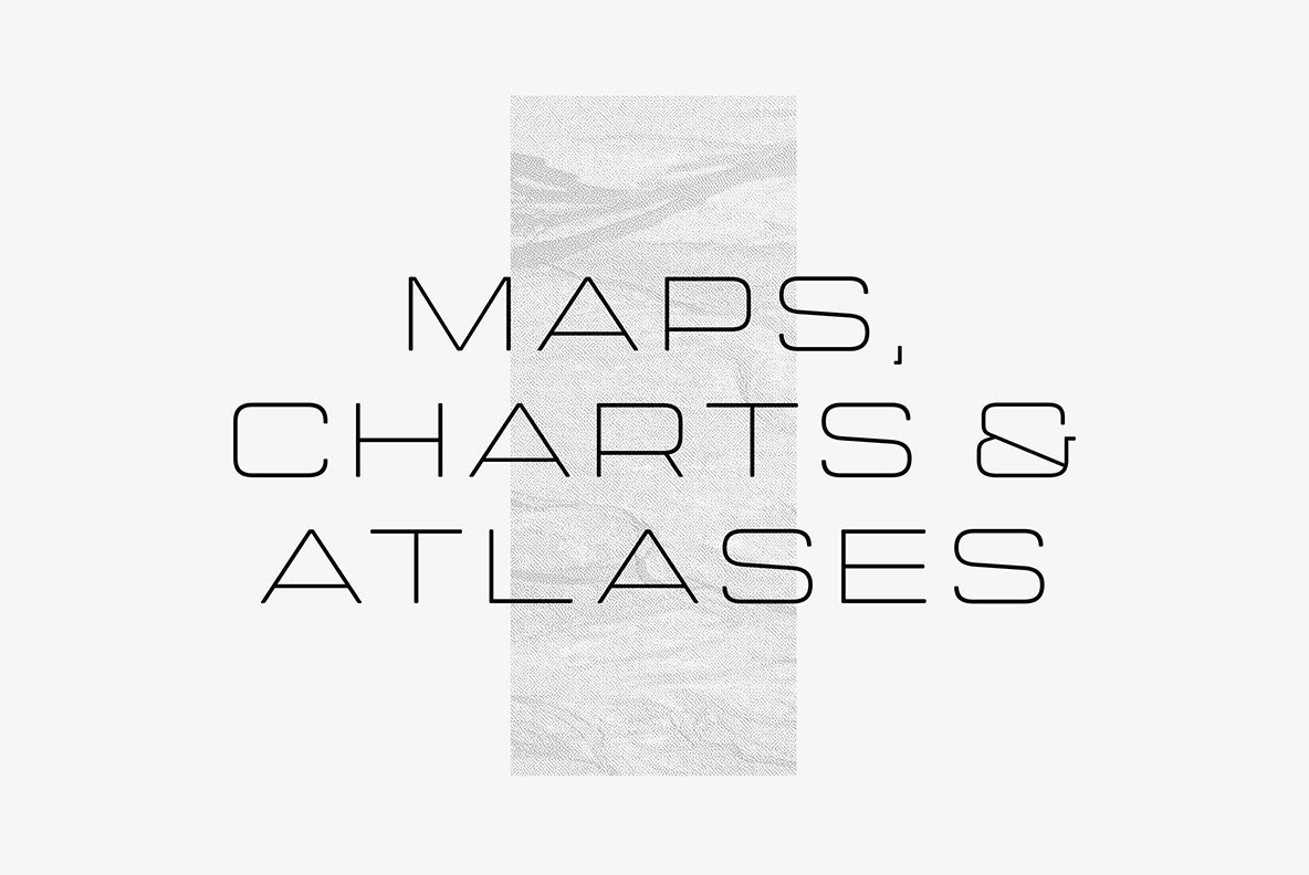
Cartograph CF is a proportional monospace type design that recalls the familiar elements of vintage typewriter print with far more warmth than its mechanical predecessors. We love this modern take on a vintage classic. Streamlined curves and soft corners offer clean legibility in programming settings, and it absolutely sings in design projects centered on the themes of technology, science, and mathematics. Cartograph provides eight weights that range from Thin to Heavy with corresponding italics for each, featuring Connary’s signature attention to OpenType and multilingual support that includes Basic Cyrillic.
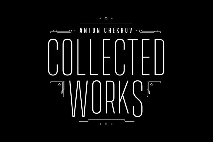
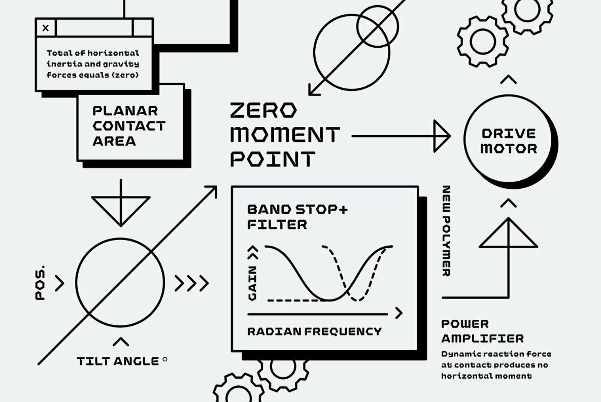
If you love the visual appeal of midcentury technology and motorsports, you’ll adore Turismo CF as much as we do. Blending elements of the roaring 20s and the 60s space race, Turismo pairs intense, rectangular shapes with lengthened curves that capture the essence of those decades. Seven weights offer exceptional adaptability in advertising, logos, branding, titles, headlines, posters, and cinematic credits.
Visual impact is the name of the game with Integral CF, one of Connary’s boldest type designs to date. As its name suggests, Integral is an essential tool for crafting prominent displays, signage, headlines, book covers, and posters. Its architecture is strong, solid, and built to leave a lasting impression. Integral offers six weights that range from Regular to Heavy with corresponding obliques for each.
Finding its inspiration in modern computer terminals and displays, Manifold CF balances stark lines with contemporary aesthetics. Crisp and striking, Manifold is a no-nonsense choice for headlines, body copy, advertising, product packaging, branding, web content, and mobile applications. Six weights with corresponding obliques offer plenty of OpenType features and extensive multilingual support that includes Russian and Ukrainian Cyrillic alphabets.
Connary is dedicated to providing the very best long-term support possible, so make sure to stop back at his portfolio now and again to download any new updates as they arrive. “I spend a lot of time going back to my older typefaces and improving them – adding features, cleaning up shapes, removing bugs – and these updates are free!”
