Stawix Ruecha is a typographer whose love of type design began while he was enrolled in coursework for communication design. He was fascinated by the principles behind solid type design, essentially wanting to know everything about what makes a font tick and how to craft a letter set from scratch.
Eventually, Stawix was given an opportunity to do exactly that. His first typeface was actually completed as his senior project during his fourth year and once he left school, he gained several more years of hands-on experience while working for a local type foundry.
Immersing himself in the profession is what has enabled Stawix to grow his skills so thoroughly. While he feels that typography as a whole is so massive it might never be fully explored to completion, he learns something new with each project he takes on, forcing himself to meet every challenge head-on. He wouldn’t have it any other way.
Stawix is fascinated by the way each character gets along with all of the other characters in a letter set. For Stawix, type design is a delicate dance of structure, form, and functionality, and it’s a fascinating endeavor. He finds inspiration for new fonts everywhere he goes, even while he’s out walking his dog.
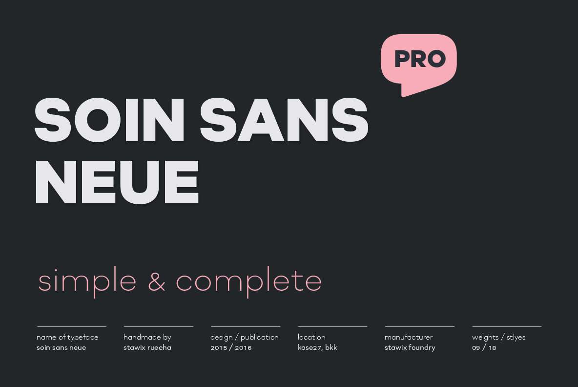
The Bangkok-based designer established his own independent foundry in 2012. Many of the foundry’s releases pay particular attention to crafting Thai alphabets, although Latin letter sets are just as important. Stawix Foundry strives to craft and release simple typefaces “with a twist,” designing fonts that are memorable, functional, and that will stand the test of time.
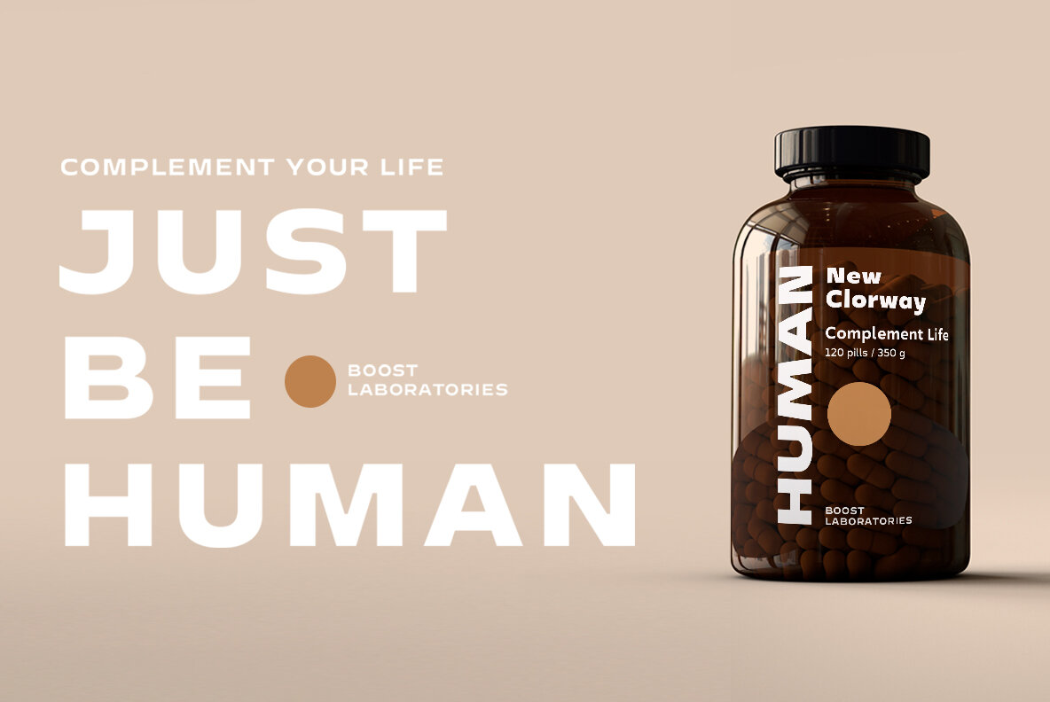
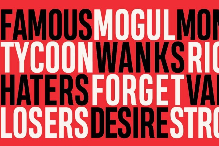
One of Stawix Foundry’s more recent releases through YouWorkForThem is Kinn, an industrial style sans serif. Designed by Kawisara Vacharaprucks, Kinn carries itself with a squared architecture that’s softened with the subtle roundness added to its shape. The result is a robust sans serif design that borders on the edge of being futuristic, one that offers a high degree of clarity and legibility.
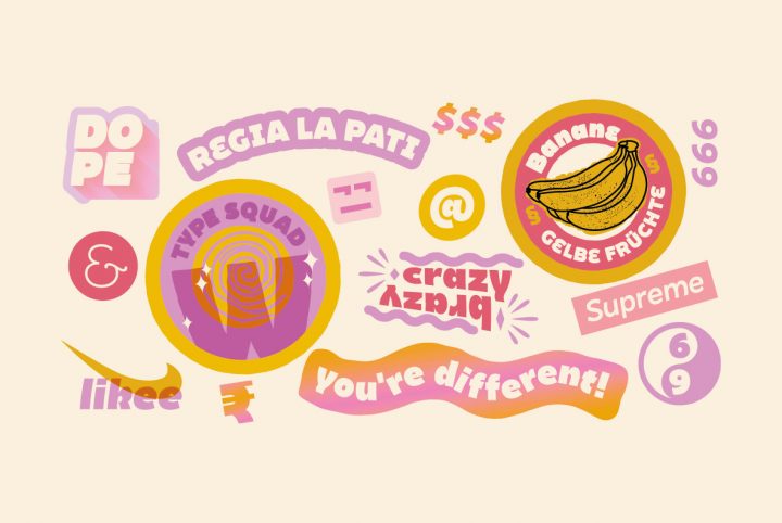
Kinn is a flexible type design, one that mirrors its surroundings very well and takes on the characteristics of its surrounding design elements. It comes across as warm and friendly in one application, formal and sophisticated in another, and pure fun and games in yet another. This kind of fluid adaptability is what makes Kinn such a great go-to sans serif type design to have on hand.
Kinn is available in Thin, ExtraLight, Light, Regular, Book, Medium, Bold, Black, and Heavy, with corresponding italics for each weight. It’s well suited to everything from headlines and editorials to displays, signage, body copy, logos, letterhead, corporate communications, presentations, infographics, publishing applications, website designs, product packaging, and mobile applications. The range of weights available through Kinn makes it a great choice for branding and identity projects that require design cohesion across multiple media channels.
Kinn offers a number of additional features, including case sensitive forms, fractions, standard ligatures, proportional figures, tabular figures, and stylistic alternates. Its multilingual support is extensive, as well, covering Basic Latin, Western European, Euro, Catalan, Baltic, Turkish, Central European, Romanian, Pan African Latin, Dutch, Afrikaans, and Basic Greek for graphic design projects aimed at a global audience.
Stawix Foundry currently offers 16 products through YouWorkForThem, a variety of serifs and sans serifs to suit design projects of all kinds. Visit their portfolio to check out the rest of their work and bookmark it so you won’t miss out on any of their releases in the future!


