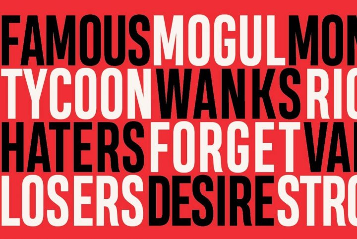
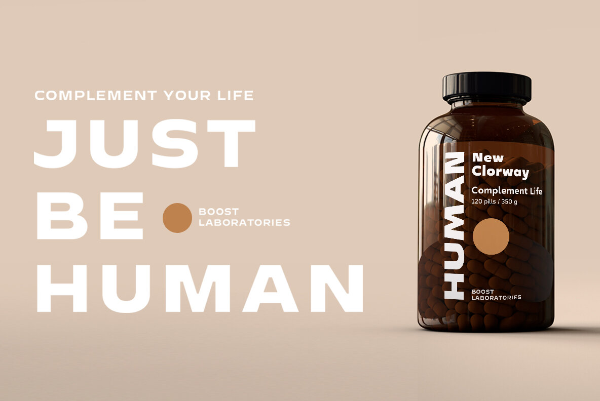
Based in Santiago and London, W Type Foundry originally started off under the name, Without Foundry, when it was established by Felipe Sanzana and Diego Aravena in 2012. The two met while involved in a lettering and typography degree program at the University of Chile, a place where they shared ideas and their fondness for designing letters.
A few years later, Patricio Truenos and Magdalena (Bana) Arasanz joined the endeavor alongside Diego Aravena, operating as W Type Foundry does today. The trio is well versed in every aspect of typography and its uses in graphic design, advertising, branding, identity, and art direction, ensuring that the foundry has a well-rounded foundation.
Their work focuses on contemporary aesthetics with a high degree of versatility through OpenType and extensive multilingual support. W Type Foundry has had work selected for the Latin American Typography Biennale, a conference event that celebrates and promotes Latin American typography, in 2014 and again in 2016.
Over the years since its inception, W Type Foundry has worked with a growing number of graphic designers and typographers to craft new font families for the retail market. David Súid is one such typographer. Based in Santiago, Chile, David works in type design, graphic and editorial design, and branding. He regularly collaborates with artists and designers, and he’s the hand behind one of W Type Foundry’s most recent releases, Armin Grotesk.
Armin Grotesk was crafted and named as an homage to Armin Hofmann, a designer who was essential to the development of the Swiss style. His work in typography, logotypes, symbols, signage, and beyond, helped to set the standard for the signature minimalist style. “Grids and grotesk and neo-grotesk typefaces are a fundamental part of the tools that make this aesthetic possible,” W Type Foundry said. The visual language of the Swiss style is something that they have admired since their days as university students and they sought to take on a project that would be worthy of his name.
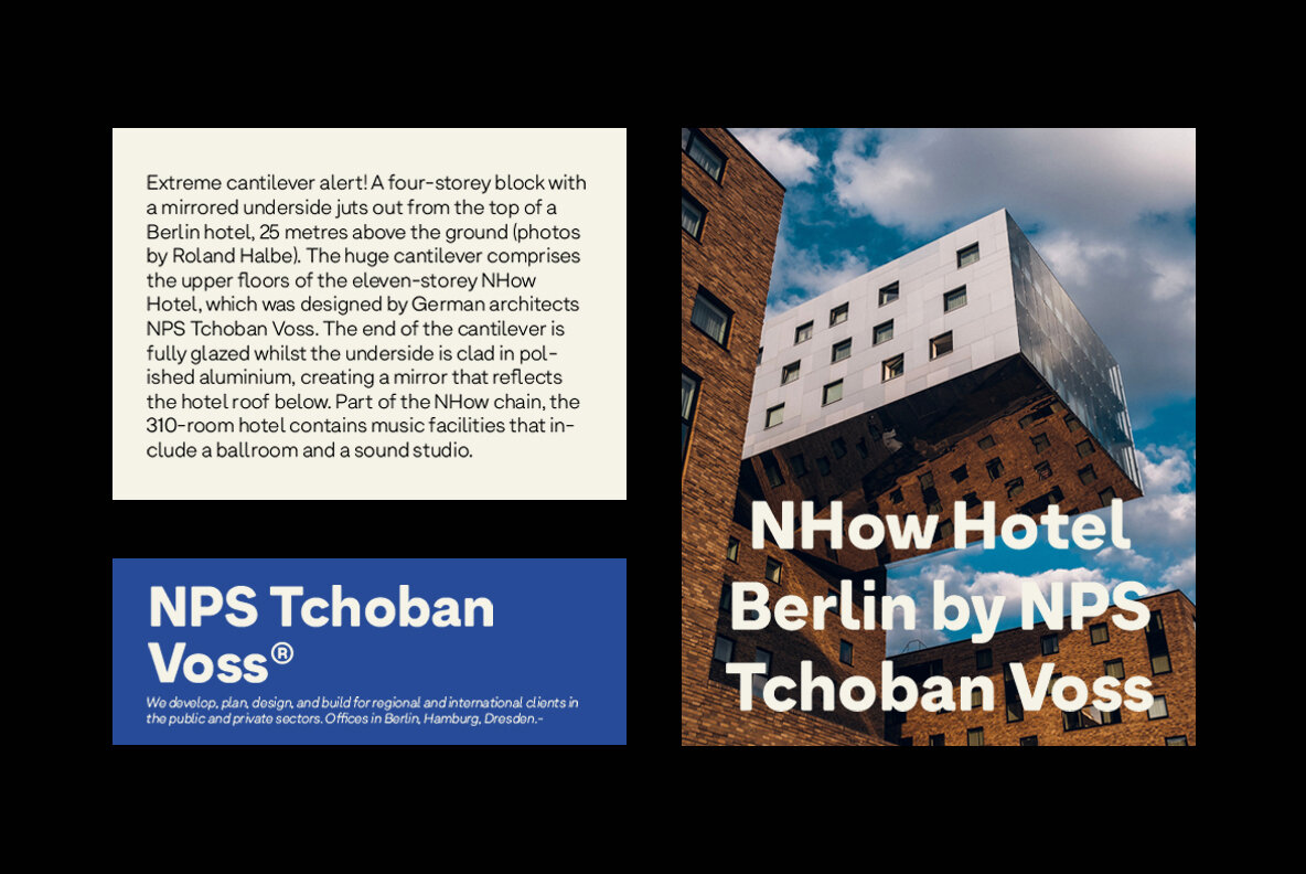
Armin Grotesk is, at its core, a contemporary grotesk sans serif with high legibility and a neutral tone. It’s a cleanly designed family that speaks with quiet authority and intent, one that conveys a message with clarity and minimal embellishment. When David developed Armin Grotesk, he added stylistic sets to some of the letters to offer a few eclectic variations for greater design versatility.
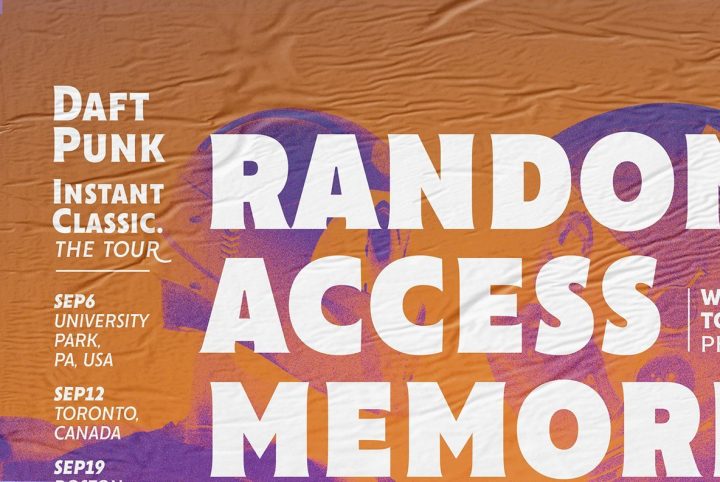
Armin Grotesk is available in Thin, UltraLight, Normal, Regular, SemiBold, UltraBold, and Black, with corresponding italics for each weight. This range makes the family well suited to everything from bold signage and display use, to headlines, subheadings, editorials, publishing, logos, letterhead, corporate communications, marketing materials, product packaging, website design, and mobile applications. Armin Grotesk is also a great choice for branding and identity projects that require fluid design cohesion across multiple media platforms.
Armin Grotesk offers a number of additional features through OpenType, including case sensitive forms, fractions, standard ligatures, discretionary ligatures, scientific inferiors, subscript, superscript, tabular figures, and stylistic alternates. It extends multilingual support for Basic Latin, Western European, Euro, Catalan, Baltic, Turkish, Central European, Romanian, Pan African Latin, and Dutch for projects intended for an international audience.
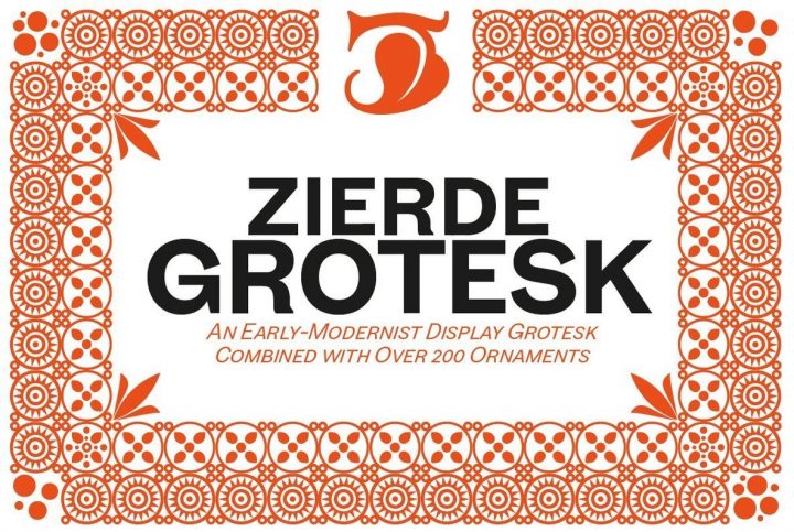
W Type Foundry currently offers 30 products through YouWorkForThem, a range of serifs, slab serifs, sans serifs, scripts, and display fonts for projects of all kinds. Visit their portfolio to view the rest of their work and check back often so you won’t miss out on any of their new releases as they arrive!
