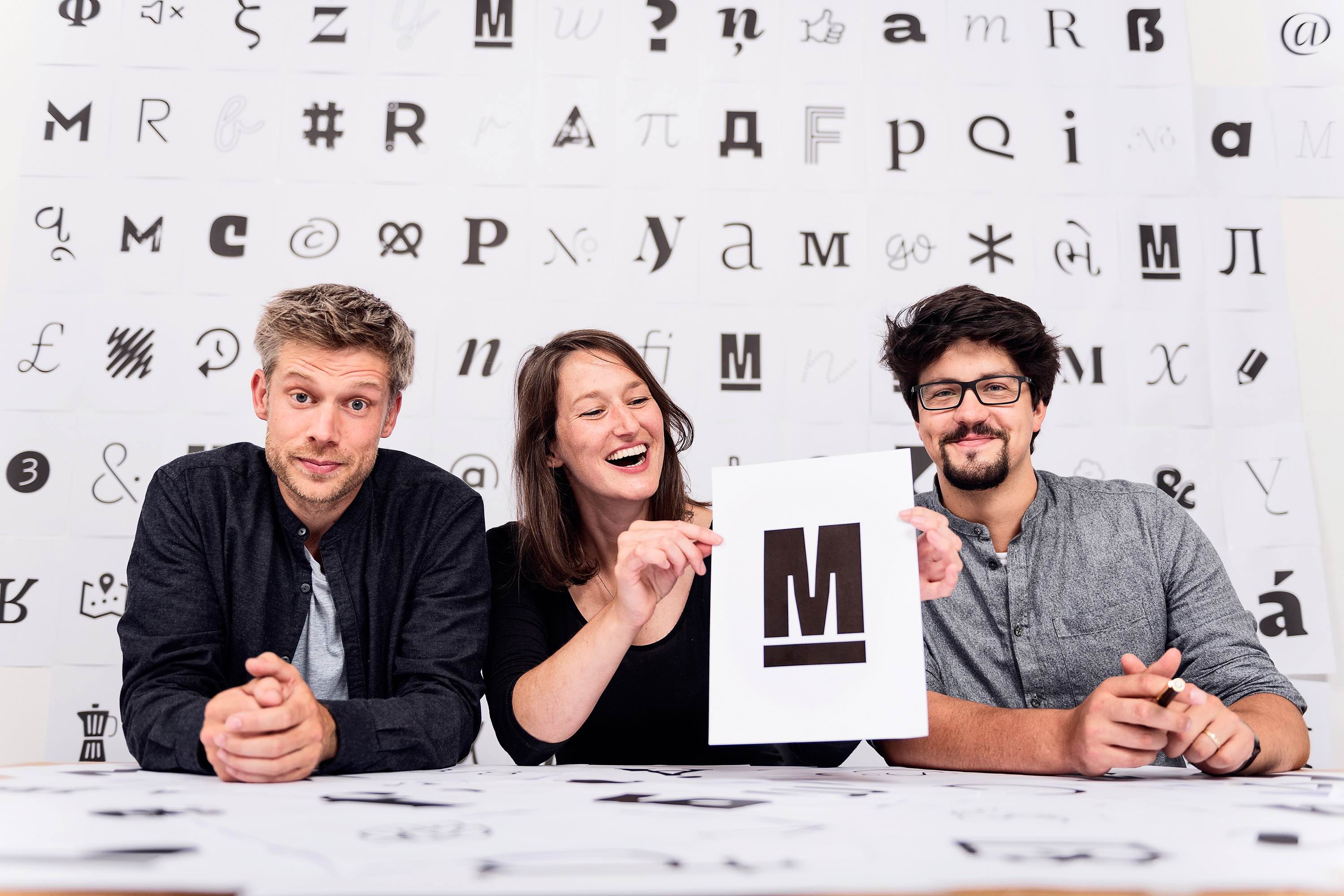
Founded by Nils Thomsen and Jakob Runge, TypeMates is a digital type foundry run from their residences in Hamburg in the north and Munich in the south of Germany. Lisa Fischbach later joined their team and together the trio works to craft a varied range of type designs for a global market. “Our focus is on designing functional and universal typefaces,” they told us. TypeMates is service oriented in its development of complete font systems.
Given their distance apart from one another, Nils, Jakob, and Lisa converse online through Slack and use Google Drive services to share their work. Although the team works remotely, each attends to their job the same way they would if they shared physical office space together.
Nils may use Robofont while Lisa and Jakob are hard at work in Glyphs, but working remotely allows for a great deal of flexibility in their individual workspaces. “The freedom to – most of the time – work right at the moment you want to is great,” they said. “To skip work at noon and keep on when the sun goes down is a freedom not many other industries offer.”


That said, working in type design can be unpredictable at times. “It’s hard to foresee if a design will reach a market,” they admitted. Even a carefully designed font system with interesting shapes and text, like Urby, might not be seen as trendy at the moment. That’s not necessarily the end of the world, however. TypeMates noted that when you have more than one typeface, you can spend effort on other designs. And as we’ve all seen with trends, you never know what can happen with a type design’s popularity (or lack thereof) in the future.
When it comes to designing a font system, one of the biggest challenges for TypeMates is achieving visual and logical consistency throughout all of its styles. “You have to fiddle each character again and again, and sometimes make compromises,” they explained. “In our latest release, Halvar Mittelschrift Stencil, we wanted a complete stencil superfamily with various weights and widths to be prepared for future variable font usage.” With some letters, the solution involved cutting the shapes and placing a stencil bridge that would fit all weights and widths, even if there were better ideas that would suit only one single letter style.
“Another technical challenge is the vertical metrics,” TypeMates told us. Vertical metrics are the way the line height and height of the font is defined. Getting it right across multiple operating systems and software can take a great deal of time.


A font’s hinting is also important but can be quite time-consuming. “Cera Pro, for example, has manually-placed instructions for a perfect TrueType rendering,” TypeMates said. They added that hinting can mean spending many extra hours after the design of the letters is finished. They hope that perhaps in the future, font rendering engines will improve enough that manual hinting will no longer be required so a typographer’s focus can remain on the design.
The font industry is in a constant state of evolution and TypeMates feels it could be improved by making it more difficult to export fonts as a way to increase quality. “Exporting a font does not mean you are an experienced designer and have a sense for how to create a typeface,” TypeMates explained. That said, it’s true that the cream always rises to the top. “In the long run,” they added, “if you provide quality it is valued and recognized even more by the customers.”
TypeMates laments that OpenType support is lacking, not only from a software standpoint but that its use can seem overwhelming to those who don’t know how OpenType works. “Nils has this great typeface that is more a tool than just a bunch of letters,” TypeMates said. “Jabana Alt offers many funny features, but most customers don’t get access to or recognize these.” They added that as usage and demand grow, simplifications in OpenType application will surely follow.
One of the biggest trends in typography in recent years is variable fonts. “The subject of variable fonts isn’t really new to type designers: multiple-master technology is part of our everyday lives and actually every one of our fonts has a weight axis,” TypeMates explained. What is new, however, is that the user has access to the whole spectrum of the font, not only predetermined moments of width or weight. “This makes a font more flexible and responsive because the font can react directly to its digital medium or the immediate wishes of the designer.”
TypeMates thinks that technology is pretty cool.
“Why should the font remain static when all typography has become responsive in recent years?” they mused. “That a typographer has a design engraved forever on paper is hardly the case anymore.” Instead, it’s more about the laws of aesthetics and layout.


TypeMates’ latest release, Halvar, was inspired by multi-axis design and thinking, representing a wide spectrum of widths, weights, and slanted angles. This font system is perfect for the graphic designer who is into variable fonts. “With Halvar, we had fun synchronizing shapes across a large spectrum of extremes,” TypeMates said.
They find that mobile and web support for flexible typefaces is lacking at the present moment, particularly in reference to narrow reading conditions in portrait mode on a mobile phone. One of TypeMates’ solutions for this was the development of Cera Compact, an expansion to the Cera Pro family that makes the most of limited horizontal space.
While Cera is a sans serif family, TypeMates hopes that eventually, the fear of using serifs in mobile technology will fade. When screen typography first emerged, screens were low-resolution and sans serifs became the de facto solution for comfortable reading. “Today, this is obsolete,” TypeMates noted. “When serifs are somehow robust and designed for the screen, plus optimized with hinting, they work better than most sans serifs for smooth reading.” A prime example is Harrison Serif Pro, a slab serif that was designed for long-form reading on screens and user interfaces.
Regardless of where technology takes us in the future, TypeMates intends to remain active in the field. They offered some advice to those who may be considering a career in type design. “Optimism and endurance are more valuable skills than talent,” they told us. “If you are passionate, you are a winner already – even if you lose, you have no choice but to keep on designing letters and evolving with the industry.”


They added that the business is all or nothing. “If you want to make a living on type design you have to be straightforward,” TypeMates said. They explained that to do otherwise means you’ll do just a little bit of type while the rest of your time will be occupied with graphic design jobs.
TypeMates currently offers 21 products through YouWorkForThem. They offer a varied range of serifs, sans serifs, scripts, and display fonts for design projects of all kinds. Visit their portfolio to take a look at the rest of their work and bookmark it so you can check back often for new releases!


