Based in Finland, Emil Bertell is an all-around creative force to be reckoned with. The designer, illustrator, and typographer is well known for his intricate poster and advertising work. His style is one that straddles the real and surreal, with unique takes on typographic art that is simply breathtaking.
Emil has been drawn toward the visual arts since he was a child, an interest that led him to enroll in an arts-based high school. During his coursework, Emil attended multimedia classes that introduced him to graphic design, noting the importance of type in effective design.
His own interest in learning more about typography led him to study it for himself, even though he hadn’t received any formal training in the art. He jumped into it with both feet and released his first type designs when he was just 16 years old. Emil’s work was published in a few books, which was no small feat for someone of his age.
He went on to enroll in university at 20 years old, studying graphic design among other things he took an interest in before working as a freelance designer.
At the time, illustration was the primary source of his livelihood, crafting illustrations for magazines, posters, festival, stamps, and advertising. Emil typically crafted his own one-of-a-kind fonts for his festival designs, hand-drawing each letter to perfection. Over time, he began designing fonts again.
Emil was eventually commissioned to illustrate the lettering a television show’s opening credits and his freeware font, Lakmus, was licensed by the Disney television show, “Shake It Up,” in 2010.
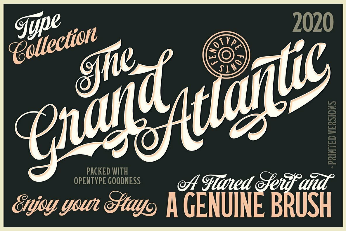
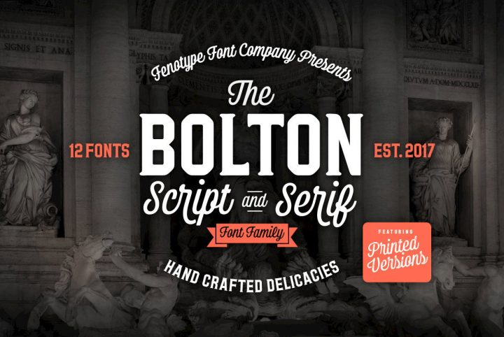
Emil went on to establish his own foundry label, Fenotype, and has even worked with his brother and fellow typographer Erik to create new type designs. Working as a full-time type designer has given Emil the freedom to explore his own creativity, free from the confines of an agency or commissioned work. It’s a craft he is passionate about and it’s one that led to an incredibly successful career so far.
One of his most recent releases through YouWorkForThem is Explorer, a complete family of sans serifs, serifs, and script letter sets with a distinctly vintage aesthetic. All of the fonts within this family are designed to complement one another in the design workspace, but they also work well on their own.
Explorer Script is a bubbly connective script featuring upper and lowercase lettering in Regular, Bold, and Black weights. It offers its lettering in solid strokes but provides those same character sets in a roughened, distressed texture perfect for adding an instant vintage appearance to any design project. With contextual alternates that enable smooth connections between letters, Explorer Script is a beautiful addition to product packaging, merchandise, apparel, logos, displays, signage, advertising, and marketing materials.
Explorer Sans is an all-caps sans serif with a wide stance that makes the most of horizontal space. Available in Regular and Bold weights, this letter set is also available in a smooth or rough texture for greater versatility. Explorer Sans is fantastic in displays and signage, logos, product packaging, headlines, subheadings, website designs, menus, merchandise, apparel, social media imagery, and mobile applications.
If you’re in need of a letterpress-style sans serif that will capitalize on vertical space, Explorer Condensed is perfect. Featuring all-caps lettering in a smooth and rough finish and available in Regular and Bold weights, Explorer Condensed stands tall and lean, working beautifully in designs with limited horizontal space.
Explorer Serif is a bulky all-caps serif letter set available in a single but heavy “regular” weight. Like the rest of its family members, Explorer Serif is available in both a solid and distressed texture for greater versatility. It’s well suited to signage and displays, logos, product packaging, merchandise, apparel, posters, book covers, album artwork, and marketing materials.
Beyond its extensive series of letter sets, the family includes Explorer Catchwords, a collection of pre-made short catchwords made from Explorer’s various fonts and they’re the perfect way to join strings of text together in eye-catching logos, titling, displays, signage, and banners.
Explorer Pictures provides a series of illustrations and dingbats for quick ornamentation in design layouts and Explorer Swoosh is a collection of strokes and swashes designed to accompany the script letter sets of the family.
Explorer extends multilingual support to Basic Latin, Western European, Euro, Catalan, Baltic, Turkish, Central European, Pan African Latin, and Afrikaans for design projects intended for an international audience.
Emil Bertell currently offers 88 products through YouWorkForThem. Visit his portfolio to take a look at his complete body of work and if you love it as much as we do, bookmark it so you can check back for new additions!
