Font Feature of the Month: Fraktion Sans From Juri ZaechYOUWORKFORTHEM BLOG
YouWorkForThem
  • Fonts
    • Sale!
    • New Releases
    • Best Selling
    • Handpicked
    • Free
    • Sans Serif
    • Script
    • Serif
    • Decorative
    • Blackletter
    • Monospace
    • Distressed
    • Retro
    • Graffiti
    • Stencil
    • Handwriting
    • Art Deco
    • Wood Type
    • Variable
    • View All
  • Graphics
    • Sale!
    • New Releases
    • Best Selling
    • Handpicked
    • Mockups
    • Photoshop
    • Instagram
    • Canva
    • Logos
    • Icons
    • Illustrations
    • Patterns
    • Textures
    • Halftones
    • Gradients
    • Distressed
    • Abstract
    • 3D
    • Collage
    • View All
  • Photos
    • Sale!
    • New Releases
    • Handpicked
    • Abstract
    • 3D
    • Illustrations
    • Mockups
    • Architecture
    • Sports
    • People
    • Backgrounds
    • Nature
    • Textures
    • Animals
    • Business
    • Drone
    • Food
    • Aerials
    • Travel
    • View All
  • Videos
    • Sale!
    • New Releases
    • Handpicked
    • 3D
    • Abstract
    • Backgrounds
    • Patterns
    • Textures
    • Aerials
    • Space
    • Animation
    • Drone
    • Technology
    • Time Lapse
    • View All
  • Extras
    • Sale!
    • New Releases
    • Best Selling
    • Handpicked
    • Photoshop
    • Lightroom
    • Procreate
    • Illustrator
    • Brushes
    • Text Effects
    • Textures
    • View All
  • Collections
  • Cart
  • Account
Toggle navigation
  • Cart
  • Account
  • Fonts
  • Graphics
  • Photos
  • Videos
  • Extras
  • Collections
Blog
Popular Posts
  • A Simple Guide to The Best Blackletter & Gothic Fonts
  • A Fabulous Update to The Ultimate 1970s Retro Font
  • Exploring the Elements of Midcentury Graphic Design
  • Didone Fonts: The Unseen Influencers of Fashion and Luxury
  • Ten Great Movie Fonts For Title Sequences
  • Alternatives to Palatino Font for Your Creative Projects
  • An Elegant Serif Font for Classy Designs
  • Mastering Variable Fonts: The Future of Web Typography
  • Geometric Fonts: The Essential Guide for Modern Designers
  • Metro Sans: A Grotesk Sans Serif From Samuel Oakes
Categories

Categories

Archives

Font Feature of the Month: Fraktion Sans From Juri Zaech

May 31, 2020

Juri Zaech is a designer and typographer based in Los Angeles, although his career initially began half a world away in Switzerland.

Back in the 90s, Juri pursued an apprenticeship in typography and worked in a design studio for a couple of years before attending Miami Ad School in Hamburg. “The more conceptual work interested me,” he explained, “and the rather large film productions are a very exciting aspect of that job.

Juri spent nearly a decade working for large agencies in Paris before relocating to California with his wife and the couple’s now-two-year-old child.

“My typography background never let me go and with my commercial work often being more filmic I started picking up type design on the side,” he told us. “I enjoy it as a balance to frenetic agency projects which always have lots of people involved.”

Juri said that his type design projects are a slow-paced and mostly solitary activity, although his wife, who is an art director, is close by to weigh in on his design process when he needs a second set of eyes on his work.


T12291.jpg
T12291_1.jpg
T12291_2.jpg
T12291_3.jpg
T12291_2.jpg

One of Juri’s most recent releases through YouWorkForThem is Fraktion Sans, a squarish sans serif family he began designing about a year ago.

“I seem to come back to this style a lot,” he observed. “There is a lot of potential in that shape, especially for rather technical designs. 

“Sometimes squarish typefaces can get a bit fancy with heavily tapered terminals and omitted spurs,” Juri explained. “I wanted something closer to a basic grotesk, mechanical and sturdy, yet with expression and a certain flavor.”

Such details include an exaggerated rectangular spur on the lowercase “a.” In addition, straight horizontal terminals on a few characters “add pleasant contrast to the vertical stress of the squared design,” Juri said. 

“Another detail that adds to the character are faux ink traps, especially in larger sizes,” he added. “They allow for non-tapered vertical terminals without clogging the joints.”


FraktionSans_Screenshots_006
FraktionSans_Screenshots_001
FraktionSans_Screenshots_002
FraktionSans_Screenshots_003
FraktionSans_Screenshots_005
FraktionSans_Screenshots_007
FraktionSans_Screenshots_009
FraktionSans_Screenshots_010
FraktionSans_Screenshots_011
FraktionSans_Screenshots_004

At the start of the design process for Fraktion Sans, Juri began drawing letters in Glyphs. “For a mechanical design like Fraktion Sans I do without sketches on paper,” he explained. “I space letters as I go to quickly find the rhythm I’m looking for.”

Juri found that the vertical stress of the squarish shapes provides a steadier cadence throughout the letterforms and improves the legibility of Fraktion Sans when it’s used in longer text passages.

Throughout the entire design process, he always kept the ideal and intended usage of the type design in mind. 

“In this case it was mainly screen design for websites and apps,” he explained. “The technical aspect of the typeface plays well in those fields. The use in editorial and branding was also something I kept an eye on.”

As he worked, Juri held onto alternative design options for certain characters, later incorporating them as built-in stylistic alternates available through OpenType. After the entire basic character set was crafted, he completed punctuation characters, figures, symbols, and finally the diacritics. All told, Fraktion Sans supports Underware’s Latin Plus character set and with it, more than 200 Latin languages.


T12291_4.jpg
T12291_5.jpg
T12291_6.jpg
T12291_7.jpg
T12291_6.jpg

Juri told us that the italics required a different workflow altogether. He used the original upright character designs as his base, but noted that the electronically-slanted shapes of the italics required a lot of manual correction in order to get them “optically balanced and evenly spaced.”

The entire family was manually kerned and auto-hinted for crisp display on screen, making it perfect for print and digital display at any size.

Fraktion Sans is available in Light, Regular, Medium, Bold, and Black, with corresponding italics for each weight. It is well suited to branding and identity projects, product packaging, editorial use, advertising, corporate communications, website designs, mobile applications, and so much more.

This type family provides additional flexibility through OpenType features that include case sensitive forms, fractions, standard ligatures, ordinals, subscript, superscript, scientific inferiors, slashed zero, oldstyle figures, and stylistic alternates. It extends multilingual support to Basic Latin, Western European, Euro, Catalan, Baltic, Turkish, Central European, Romanian, Pan African Latin, Dutch, Afrikaans, and Igbo Onwu for design projects intended for a global audience.

Right now through June 26, 2020, Fraktion Sans is on sale for 50% off of its regular price so it’s a great time to add this one to your font collection!

“I feel Fraktion Sans is a great tool for designers that want to create clean and meticulous layouts for a wide variety of projects,” Juri said. “I am looking forward to see what people will create with it. That is always a very rewarding part of any project.”


T12291_12.jpg
T12291_8.jpg
T12291_9.jpg
T12291_11.jpg
T12291_10.jpg

Juri told us that he has a few work-in-progress designs “in the depths” of his hard drive that he wants to revisit. He said that he typically plays around with a couple of designs to gauge their potential before settling to focus on one for a future release.

We know that whatever he chooses to work on next, it’ll be well worth the wait and we look forward to seeing it when it’s released.

Juri Zaech currently offers 14 products through YouWorkForThem, providing a variety of contemporary typefaces that will suit design projects of all kinds. Visit his portfolio to take a look at the rest of his work and bookmark it so you can check back for new additions in the future!
Fonts
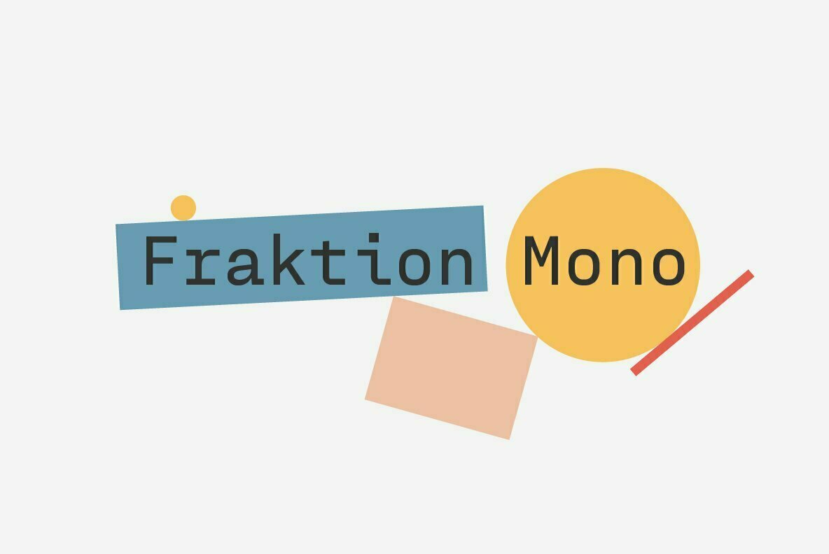
Fraktion Mono: A Squarish Monoline Sans Serif From Juri Zaech
November 10, 2020

Fraktion Mono: A Squarish Monoline Sans Serif From Juri Zaech

Juri Zaech is an accomplished graphic designer, art director, and typographer who began his career during a typography apprenticeship in a design studio back in the 90s. Eventually, he went on to attend Miami Ad School in Hamburg and later spent many years working for larger design agencies thro...
Read More
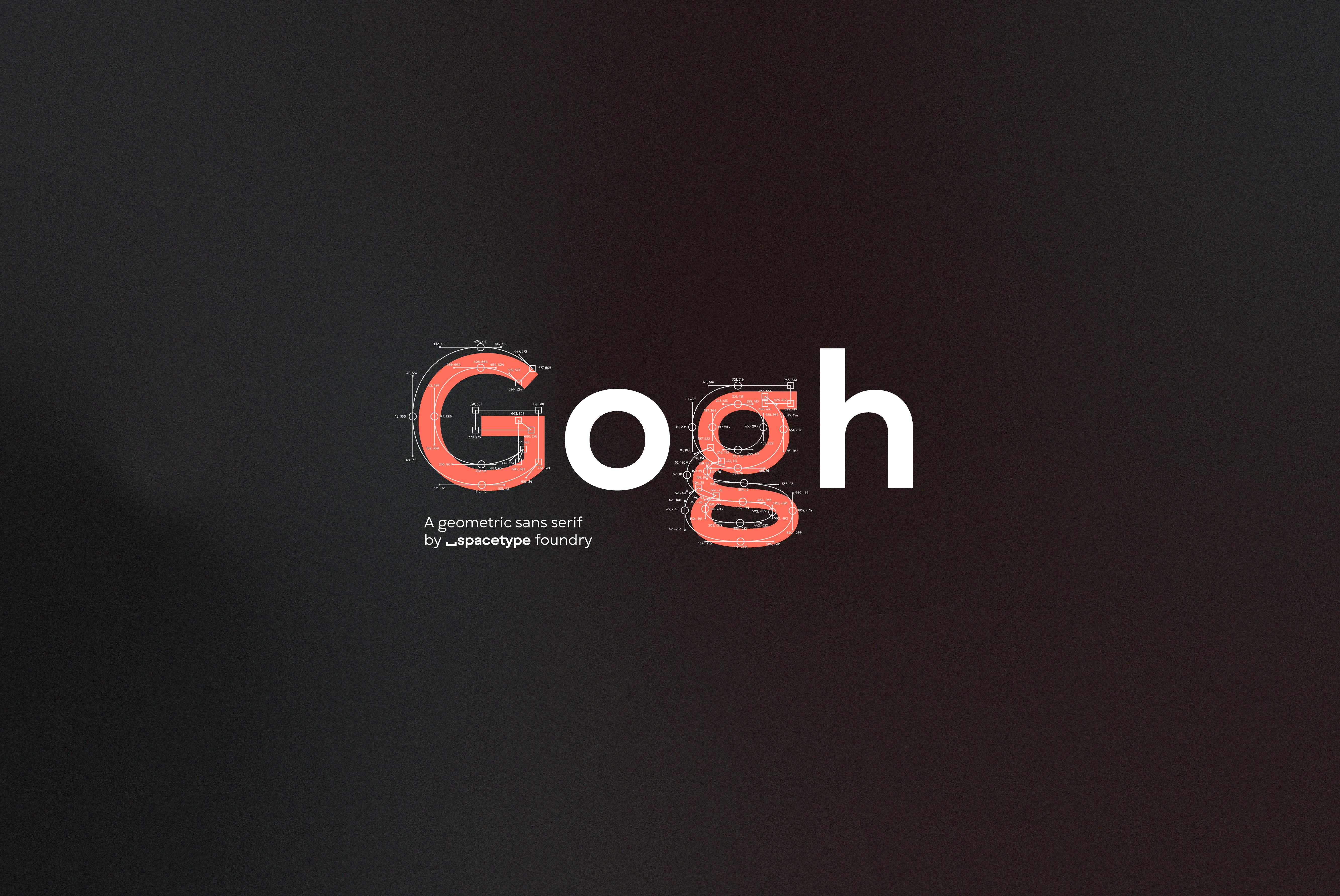
Font Feature of the Month: Gogh, The Debut Type Design From Spacetype Ltd.
October 9, 2020

Font Feature of the Month: Gogh, The Debut Type Design From Spacetype Ltd.

We’re always excited whenever new foundries and designers join the YouWorkForThem family, and we’re thrilled to introduce Spacetype Ltd., the independent type foundry established by Stan Partalev and Mirela Belova.  The duo has been working together successfully for the past few years, an endeav...
Read More
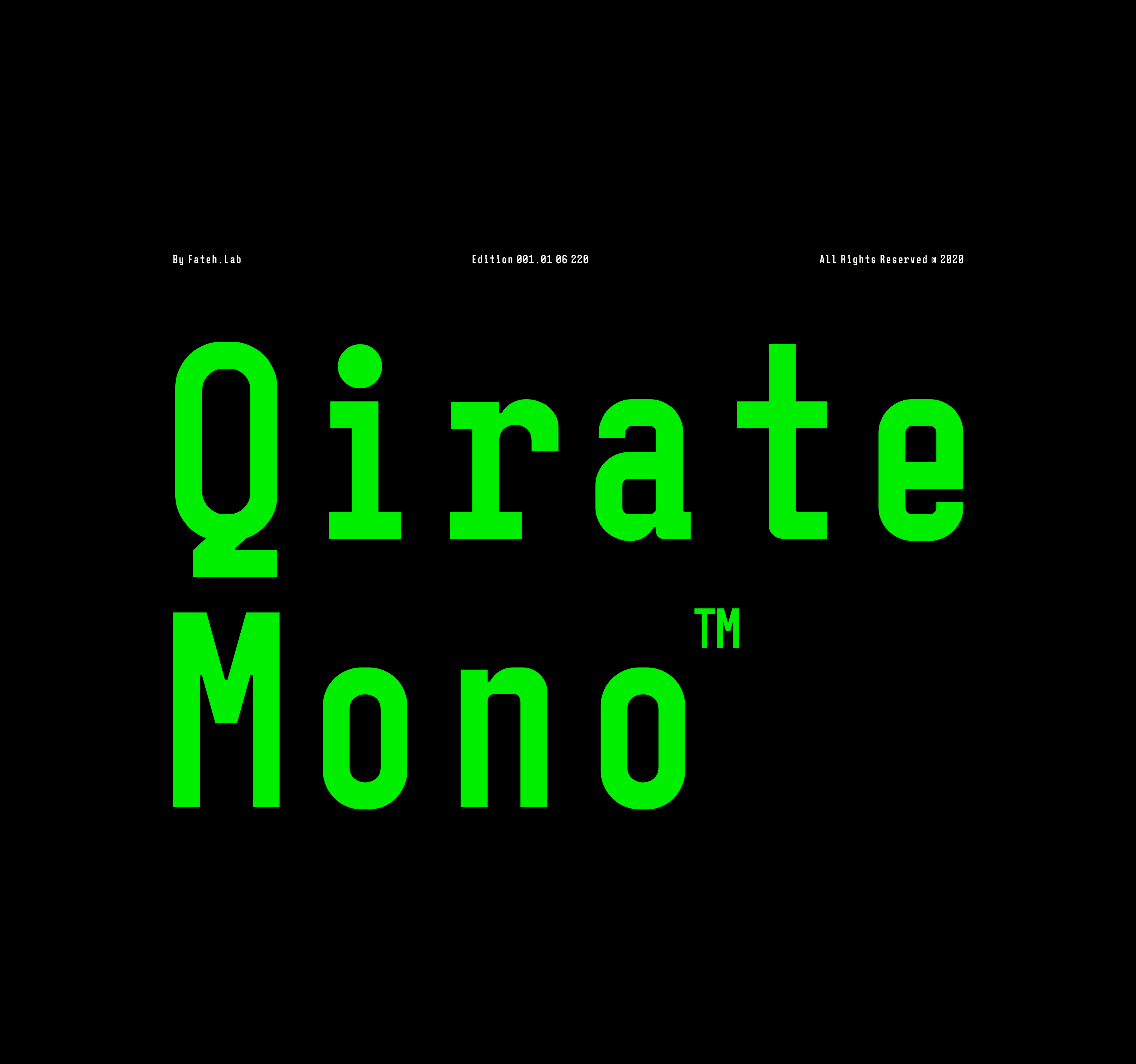
Font Feature of the Month: Qirate Mono From Wisnu Cipto Wibowo
July 6, 2020

Font Feature of the Month: Qirate Mono From Wisnu Cipto Wibowo

Living with his spouse and son in Indonesia, Wisnu Cipto Wibowo is a type designer and illustrator who releases work under the studio label, Fateh Lab. Aside from working on his own font projects, Wisnu works as a freelance illustrator for several brands and products. The one thing that draws Wi...
Read More
A Dimensional Sans Serif From Juri Zaech: Patrima
July 30, 2018

A Dimensional Sans Serif From Juri Zaech: Patrima

Juri Zaech grew up in the Swiss countryside. The son of a ceramist and an artist, Juri was always surrounded by creativity and craftsmanship. When it came time to explore his own career options, he knew he wanted to be employed in a craft or trade, but his plans were never cast in stone. Instead...
Read More
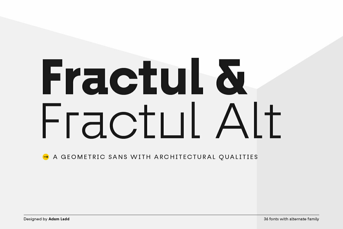
An Angular, Avant-Garde Sans Serif From Adam Ladd: Fractul
June 28, 2019

An Angular, Avant-Garde Sans Serif From Adam Ladd: Fractul

Based in Cincinnati, Ohio, Adam Ladd is graphic designer and typographer with a preference for retro design aesthetics. Active in the field for more than 15 years, he’s worked as an art director for several magazines and has worked in print design, logos, branding, identity, and lettering.  It w...
Read More
Previous Post
Next Post
  • Support

    Help

    Privacy

    Contact

  • Licensing

    Fonts

    Stock Art

    Enterprise

  • Services

    WebFonts

    Mobile Fonts

    Font Embedding

  • Creators

    Type Foundries

    Stock Designers

    Photographers

  • Site

    About Us

    Submissions

    YWFT Blog

  • Extra

    Buamai

    FontPath

    TypeBrowser

  • Misc

    Gift Cards

    Affiliates

    Rewards

Support
  • Help
  • Privacy
  • Contact
Licensing
  • Fonts
  • Stock Art
  • Enterprise
Services
  • WebFonts
  • Mobile Fonts
  • Font Embedding
Creators
  • Type Foundries
  • Stock Designers
  • Photographers
Site
  • About Us
  • Submissions
  • YWFT Blog
Extra
  • Buamai
  • FontPath
  • TypeBrowser
Misc
  • Gift Cards
  • Affiliates
  • Rewards
The Original Creative Marketplace | Copyright © 2001-2025 YouWorkForThem. All Rights Reserved.