Born and raised in Argentina, Fernanda Cozzi is a passionate type designer who completed her degree in graphic design at the University of Buenos Aires, where she pursued a postgraduate specialization in type design. In fact, she currently works at her alma mater as an assistant professor in the master of type design coursework and also teaches a typography course at the University of Business and Social Sciences in Buenos Aires.
To put it bluntly, Fernanda loves lettering. Working to develop shapes using ink and paper, she said that she finds freedom and serendipity in the accidental — which she considers to be a good starting point for building new type design projects.
Experimentation is part of Fernanda’s typical design process and she has actually lectured in workshops dedicated to experimental typography, along with calligraphy and monograms. She regularly collaborates in the biennial Tipos Latinos Argentina beginning in 2012 and has had work selected for inclusion in renowned typography exhibitions that include Tipos Latinos and Pangramme.
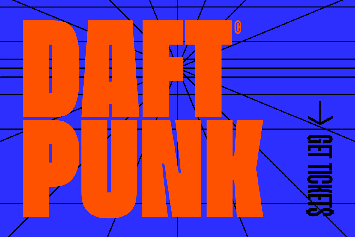
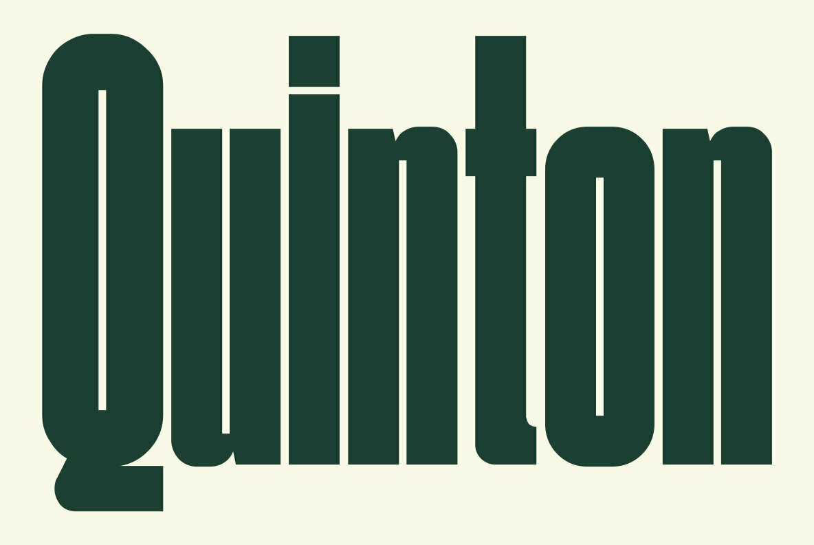
One of Fernanda’s most recent releases through YouWorkForThem is Inge, a tightly-condensed sans serif display font “with a strong sense of rhythm and a very solid texture.” Inge is a single-weight typeface that achieves a perfect balance between acceleration and strength.
What Inge lacks in weight options is more than made up for in its movement. While its Upright variant stands tall and lean, Inge is available in Backslanted and Slanted versions that lean toward direction movement the viewer can feel.
That’s kind of where this type family earned its name. Inge Lehmann is the Danish seismologist and geophysicist who made the discovery that the earth has a solid inner core inside a molten outer core.
As a font, Inge certainly lives up to its namesake — the study of seismology is the study of earthquakes and movement below the surface of the earth, which is captured in the fluid architecture of this type family. The side-to-side movement of the characters hints at acceleration and speed, without losing control (or legibility.)
The condensed nature of Inge makes it best suited to displays and signage, advertising, logo designs, product packaging, merchandise, apparel, marketing materials, book covers, album artwork, or posters. It’s a solid contender for branding and identity projects that need a speed-driven type design in the driver’s seat.
Inge provides case sensitive forms, fractions, ordinals, superscript, and stylistic alternates through OpenType for greater versatility. It extends multilingual support to Basic Latin, Western European, Euro, Baltic, Central European, and Pan African Latin languages for global accessibility.
Fernanda Cozzi currently offers four products through YouWorkForThem, providing a range of expressive script and display fonts. Visit her portfolio to take a look at the rest of her work and bookmark it so you can check back for new releases in the future!


