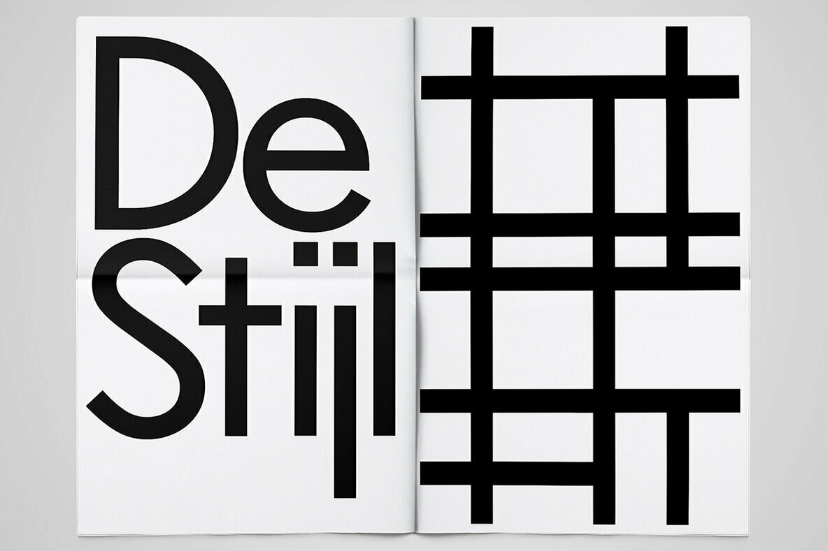
The modular stencil sans serif Architype Albers was designed by Josef Albers at the Bauhaus in the late 1920s. If one considers its discrete geometric shapes and bold, poster-centric look, the connection it shares with II Vorkurs (German, preliminary course, the foundational classes at the Bauhaus) isn’t immediately obvious. II Vorkurs is a smooth and functional sans serif, and although it is founded on universal, geometric forms and is also a sans serif, its precise connection to Architype Albers is subtle.
But to look for an obvious connection merely between types is an oversimplification. One should note that II Vorkurs is dedicated to the life and work of Josef Albers: that says more about II Vorkurs designers Ross and Evan Lelliott and Josef Albers than it does about the modular blocks that inform both fonts. Of course the astounding life of Albers has been written. There are innumerable primers available on his work, and the fame of his ubiquitous Squares outstrips his own. The genius of the squares only begins to unfold after prolonged consideration, but once this happens, even the most cynical viewer never again questions their complexity.
In much the same way, the appreciation Ross and Evan Lelliott have for Albers and the various ways that affects their art and lives only becomes clear after deeper investigations. Even then, we learn that we have much to learn—the classic first step when discovering artists gifted in multiple mediums. For instance, are the gentlemen in question also gifted photographers? Evidence suggests the possibility.
London-based Ross and Evan Lelliott comprise the musical duo Increments that, with seeming incidental ease, also produces first-class typographical designs. They are brothers: their profiles are blessed with the same striking Greek nose and all around classical handsome. They grew up in the Caribbean, where they started their musical careers surrounded by the requisite heat, sky, and sea.
When one considers their music, it might not be clear at first glance that these are graphic designers at work. But like Homage to the Square, their music’s nuance and magic steadily grow. The brothers present us with a simple repetitive beat, lightly accented with occasional overlays so fleeting, that they resemble musical versions of the illusions of translucence we see in many Albers paintings.
But it’s the simplistic beat that commands the foreground, its hypnotic effect perfectly designed to replace banal thoughts with groove, trance, freedom. The redundant thump untethers the day and signals the night. In other words, these two men know precisely how to say a lot using very little. In this respect, even the newest student of Albers realizes how II Vorkurs is an homage to this precise dynamic: one line makes a distinct face, overlaid squares question the world, a steady beat strips away the practical, leaving only the mystery, the sensual, the dance. The colors and larger structures of the music are implied by the imagination rather than stated by instruments and lyrics.
Listen to the music. Watch the brothers listening. Watch them dancing in their seats. See how they smile at each other at a job well done. We can learn something here.
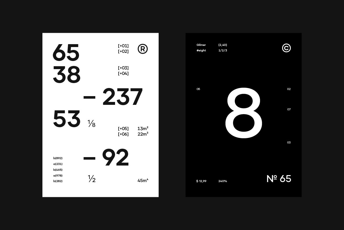
Indeed, II Vorkurs is a functional, constructive sans-serif with universal, geometric forms. It’s a typeface that “follows a disciplined approach to composition using a limited palette of modular blocks.” II Vorkurs has 3 weights and 6 styles with latin language support and squared, stylistic alternates.
But we implore you to let II Vorkurs be an entryway to more. Josef Albers said that the origin of art is the discrepancy between physical fact and psychic effect, and part of his brilliance was repeatedly illustrating this by creating worlds with a few lines or simple colors. Consider II Vorkurs again. Contemplate the lower case R. Watch the Albers video again, but this time focus on a spartan beauty that smacks of the macabre in its otherworldly perfection: the andantino from Schubert’s Piano Sonata No. 20 that accompanies the art.
Let’s “open eyes” to Albers, Schubert, Increments, and the beautiful simplicity of their offering II Vorkurs. Thank you, Ross and Evan, for reminding us of a way to see the world best summarized by Albers himself: “Learn to see and feel life, cultivate imagination, because there are still marvels in the world, because life is a mystery and always will be. But be aware of it…”


