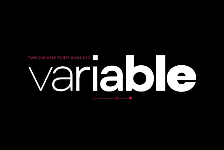
To fully appreciate Acherus Feral, it is important to first examine Horizon Type’s established offering Acherus Grotesque. Based on geometric shapes, Acherus Grotesque is a tremendously popular font that comes in 16 styles. It is sleek and incredibly versatile. Its Greek and Cyrillic characters manifest so well, that it seems indigenously designed within every language family it offers. Acherus Grotesque is a perfect example of the magic of subtlety—those in the know understand the meticulous planning required to create a font that is effective across an incalculable number of mediums. And for advertising, posters, branding, and other bold applications, Horizon offers a highly readable stencil version of Grotesque called Acherus Militant—a four-wheel drive font for rougher terrains.
As explained by Horizon Type, Acherus Feral is a “sharp-edged version” of Acherus Grotesque that can also be used in web and print. As the successful Acherus Grotesque is a favorite, they wanted to see its sharp version. He explains, “There are subtle differences that separate Feral from the Grotesque version. The corners, which are round in grotesque form, have been sharpened in Feral. Sharp edges of the letters ‘A,M,N,V,W,Z,v,w,z; have been smoothed, and alternate G and t characters have been added.”
The tangible result of this fine tuning is a more confident and serious look, thus providing even more options for mood and application to an already vast array. It makes sense that Horizon Type is constantly looking at fonts with special focus on the mediums they are used in, and how their design determines efficacy in this regard. In other words, he takes the long view when he designs, and always considers how his final products will deliver in their assigned mediums. Based on this ongoing analysis, he strives to deliver products that become more effective and beautiful with each iteration. This forward thinking is evident in everything Horizon Type offers. These fonts are designed to deliver.
