Regarding the stellar Centrale Sans Pro, Typedepot states, “finally we are ready to end this five-year journey and present you the typeface as we have always intended it to be.”
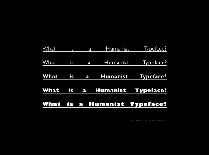
Centrale Sans is “a humanist typeface incorporating elements from the more rationally constructed grotesque fonts. Its characteristics are relatively large x-height and open apertures. The overall effect suggests approachability without the sentimentality carried by some of the more authentic humanist designs. Centrale Sans is contemporary and precise.”
Centrale Sans Pro is what five years of hard work by seasoned professionals brings: an impeccably rendered, flexible font. The offering is vast: 932 glyphs in 9 weights. Typedepot is justified to call Centrale a “sturdy workhorse” relative to its versatility, but this gorgeous font is so strong and versatile, we’d liken it to more fundamental necessities, like floors and gravity.
It’s an encyclopaedia of type available to you at a click: you will be completely covered for text, headlines, advertising, logos, corporate communications, branding, packing, web design, social media, mobile apps, publishing, fashion, art projects, educational materials, and more. Readable, versatile, beautiful: Centrale Sans Pro.
Typedepot is an independent foundry operating out of Berlin, Germany and Sofia, Bulgaria. It was established in 2010 by Alexander Nedelev and Veronika Slavova. They strive to create “simple, elegant and functional” typography that “our community can rely on.” As evidenced by Centrale Sans, Typedepot has fulfilled the plan. Please take a moment to consider their entire collection, where you will find other brilliant iterations of Centrale Sans and many other works of art true to the Typedepot mission.


