In typography, grotesque fonts (or grotesk) are roughly synonymous with “sans serif.” Serif typefaces feature short, decorative lines that extend from a character’s body, like Times New Roman, Palatino, or Garamond. In use since the 1460s, serif fonts were the publishing norm until the 1800s. By contrast, grotesques do not have these decorative lines, hence “sans serif” or “without serif.”
The Birth of Grotesque Fonts
The first sans serif font is attributed William Caslon IV in 1748. In 1816, a fourth-generation Caslon, William Caslon IV, developed the first sans serif printing type, an uppercase design named “Egyptian. It isn’t clear whether Caslon IV cut the sans serif for a client or for art’s sake. Caslon IV was naturally innovative: he developed a method of casting wedge-shaped letters for cylinder printing, and he crafted two-part matrices for casting large letters. Perhaps it was pure creativity that led him to cut a sans serif typeface.
Caslon’s innovative uppercase sans serif did not catch on. Three years later, Caslon IV sold the foundry his great-grandfather had begun 90 years earlier for just over two-thousand pounds. Nonetheless, Caslon IV’s failed sans serif left its mark on typography despite its “radical” appearance. Hence the name grotesque: compared to the fashionable and familiar serif fonts, sans serifs were considered crude, plain, and artless.
Evolution of Grotesque Typefaces
While contemporary sans serifs have a sleek, polished architecture, the initial sans serif grotesque fonts were more eccentric. They flaunted their unorthodox styling, purposely contrasting simplicity against their elaborate and sophisticated predecessors.
Grotesque fonts typically feature uncomplicated, geometric letterforms. They also appear somewhat informal, at least compared to roman and modern serifs.
The German spelling “grotesk” is used interchangeably to describe grotesques. By the late 1800s, sans serif typefaces had become popular in Germany. Berthold Type Foundry’s Akzidenz Grotesk is a family of sans serif typefaces released in Berlin in 1898. Designed for trade printing, its name translates to “Commercial Grotesque.” Azkidenz Grotesk influenced countless iterations and generations of grotesque fonts, including the neo-grotesque Swiss-style fonts of the 1950s, like Helvetica.
Grotesque Fonts in the Digital Age
Relevant for over a century, grotesque fonts have enjoyed a resurgence in popularity with the advent of electronic type. Their simplicity makes them highly legible on mobile devices and websites. Grotesque fonts are modern and typically neutral in their architecture, making them a great choice for corporate projects, web design, mobile apps, infographics, digital publishing, advertising, text, and more.
YouWorkForThem offers countless grotesque sans serifs, and we’re excited to share some of our favorites with you.
YWFT Grotesk: Revolutionizing Digital Typography
YWFT Grotesk, a standout in digital typography, this font redefines the grotesk sans-serif genre with its digital-age sophistication. Ideal for social media, web, and interface design, YWFT Grotesk combines stylish flair with exceptional legibility, making it a prime choice for website headers and online ads. It offers an affordable, license-friendly alternative to traditional fonts, like Helvetica, aligning with YouWorkForThem’s commitment to accessible, high-quality design. With YWFT Grotesk, embrace a typeface that blends contemporary style with timeless elegance, making your brand’s digital presence uniquely compelling.
Radix: A Modern Tribute to Typographic Tradition
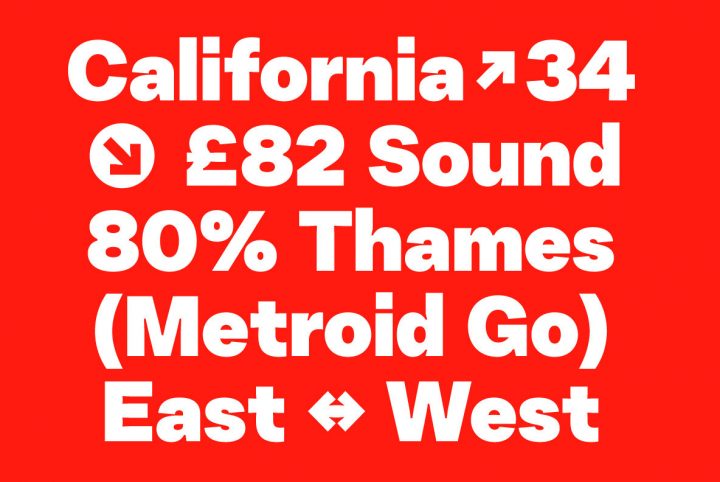
Reflecting on the enduring legacy of grotesque typefaces, Radix stands as a contemporary homage to this rich typographic history. Melding the timeless charm of mid-century modernism with pronounced inktraps, Radix echoes the clean, geometric lines of the Bauhaus movement and the iconic lowercase forms of Futura. This typeface, with its seven versatile weights, showcases a collection of spurless characters that enhance the distinctive inktraps, resulting in a composition that is both visually captivating and historically resonant. Radix’s array of alternate glyphs, accessible via OpenType stylistic sets, adds to its expressive range, making it an ideal choice for modern design projects that seek a connection to the storied past of grotesque fonts.
Britti Sans: The Intersection of Geometry and Industrial Design
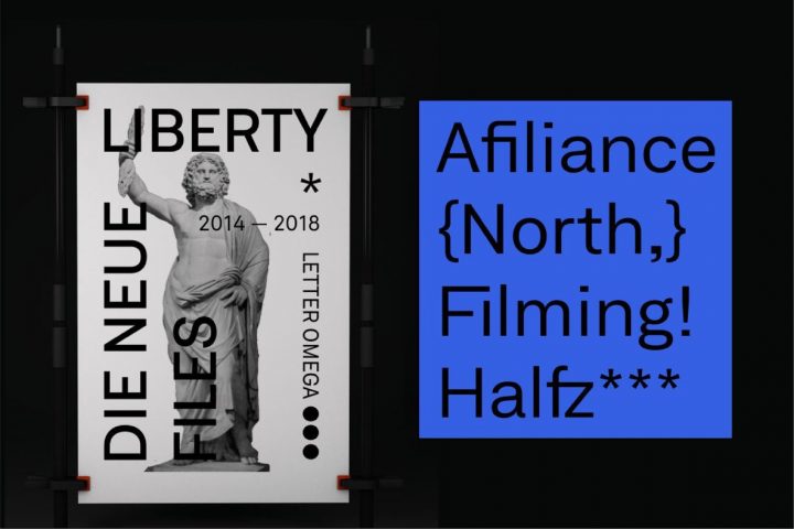
Britti Sans, a distinctly modern grotesque typeface, skillfully marries geometric precision with the foundational principles of industrial design. Boasting OpenType features, such as alternate and localized characters, it significantly enhances its versatility, thus allowing for seamless adaptation across a diverse range of contexts. Moreover, distinctive elements including localized Sharp S, a comprehensive spectrum of currency symbols like the Bitcoin icon, and extensive numerators and denominators, considerably extend its utility. Additionally, by embracing emojis and circled numbers, Britti Sans firmly establishes itself as an ideal choice for projects that demand a contemporary style.
Oakes Grotesk: Redefining Corporate Typography
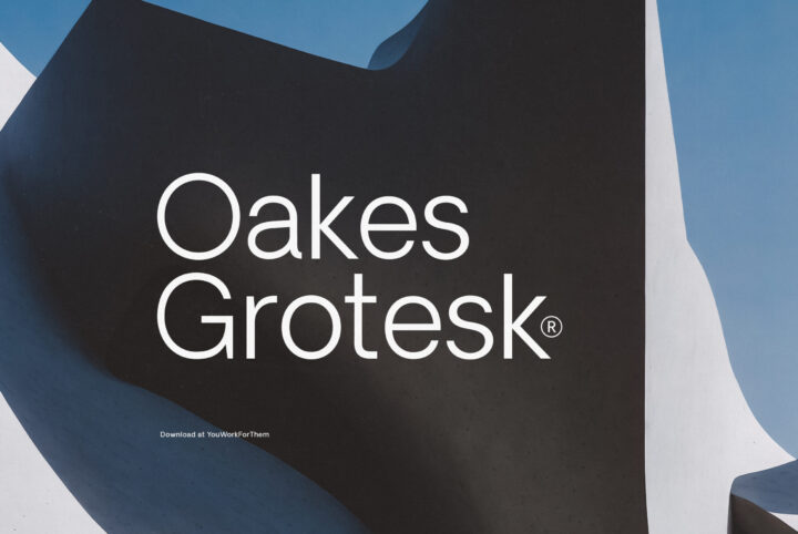
In the landscape of corporate typography, Oakes Grotesk emerges as a refined iteration of the original Oakes typeface, tailored for enhanced legibility in both body text and headings. This typeface delves into new metrics, offering a clearer reading experience in diverse applications. Notably, the transformation of the letter ‘g’ into a double-story form, along with the fine-tuning of other characters, exemplifies its meticulous design approach. Oakes Grotesk retains the subtle curves characteristic of the Oakes family, blending elegance with functionality. Its linguistic versatility, encompassing Baltic, Basic Latin, Central European, Dutch, Euro, Romanian, Turkish, and Western European languages, makes it a globally adaptable choice for businesses seeking a modern, yet timeless typeface.
Explore Grotesque Fonts with YouWorkForThem
YouWorkForThem has innumerable grotesque sans serif fonts available for personal and enterprise licensing, easily found through our search tool! Don’t forget to check out our type tester so you can see first hand how a font will look before you make a purchase. With more than 180,000 fonts and web fonts available, you’re sure to find the perfect typeface for your next project!


