Since its inception more than a decade ago, Zetafonts has grown to become one of the most successful and prominent type foundries in Italy. Based in Florence, the foundry was established by Debora Manetti, Cosimo Lorenzo Pancini, and Francesco Canovaro. Their work is centered around crafting type designs that meet the varied needs of graphic designers in an international marketplace, meaning their work must be aesthetically pleasing to a wide audience while also providing extensive multilingual support and Open Type features.
When it comes to designing any new typeface, Zetafonts strives to develop letter sets that will really stand the test of time. While many of their type designs derive their inspiration from beloved classic styles, the foundry consistently puts a fresh spin that makes their work equally adaptable to present and future design styles. This timeless quality ensures that their work will be adaptable to graphic design projects indefinitely, regardless of how design trends ebb and flow and change over time.
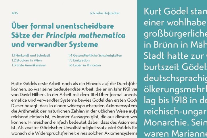
Much of Zetafonts’ work sits midway between text and display, enabling their letter sets to work beautifully and effortlessly in a wide array of project types. Each design they release has been meticulously thought through from beginning to end, each architectural decision carefully made with the product’s final application in mind. The foundry is deeply dedicated to its craft and the art of lettering, with much respect given to the history of typography through the ages. “When you draw letters, you’re actually playing with the DNA of our culture, both visual and written,” they told us. “Even a slight stylistic choice connects to the history of taste and design, and allows us to enrich our shapes with cultural connections.”
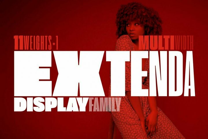
Zetafonts prizes innovation and creativity, ensuring that art consistently meets application with every type design they create. Since the years that have passed since it began, the Zetafonts foundry has worked with a number of graphic designers and typographers who have helped the foundry to grow and thrive in a global design marketplace.
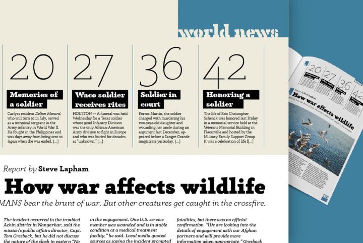
One of their more recent releases is Blacker, a contemporary wedge serif type design that strikes a perfect balance between text and display. Crafted by Cosimo Lorenzo Pancini and Andrea Tartarelli, Blacker is a fresh take on the “evil serif” genre that features dramatic high contrast and distinctive triangular serifs.
Blacker is a strong and modern type design with subtle retro undertones. Its design details have actually been worked into two distinct subfamilies for fantastic versatility. The display version features tighter kerning, sharper corners, and higher contrast that makes a more riveting impact, particularly in large-scale displays like signage and posters. The text version is kerned just a little more loosely and provides a more comfortable reading experience through its lowered contrast.
Both subfamilies are available in six weights that include Light, Regular, Medium, Bold, ExtraBold, and Heavy, with corresponding italics for each, providing graphic designers with a solid range of type styles to work with. Blacker is ideal for everything from displays and signage to headlines, subheadings, editorials, advertising spreads, publishing, logos, corporate communications, letterhead, product packaging, merchandise, posters, flyers, marketing materials, presentations, website designs, and mobile applications. Its range of styles and weights makes it a brilliant choice for identity and branding projects.
Like most of Zetafonts previous releases, Blacker is loaded with a host of Open Type features that include numerators, denominators, fractions, gracefully crafted discretionary ligatures, standard ligatures that include a series of short and dramatically designed catchwords for visual impact, superscript, scientific inferiors, lining figures, oldstyle figures, slashed zero, and stylistic alternates for exceptional versatility. Its multilingual support extends to Basic Latin, Western European, Euro, Catalan, Baltic, Turkish, Central European, Romanian, Pan African Latin, Dutch, Afrikaans, Latin Ligatures, and Basic Cyrillic for graphic design projects aimed at an international audience.
Zetafonts currently offers 50 products through YouWorkForThem, a range of serifs, sans serifs, scripts and display fonts to suit design projects of all types and themes. Visit their portfolio to check out the rest of their typography and if you love their work as much as we do, bookmark it so you won’t miss out on any of their future additions!


