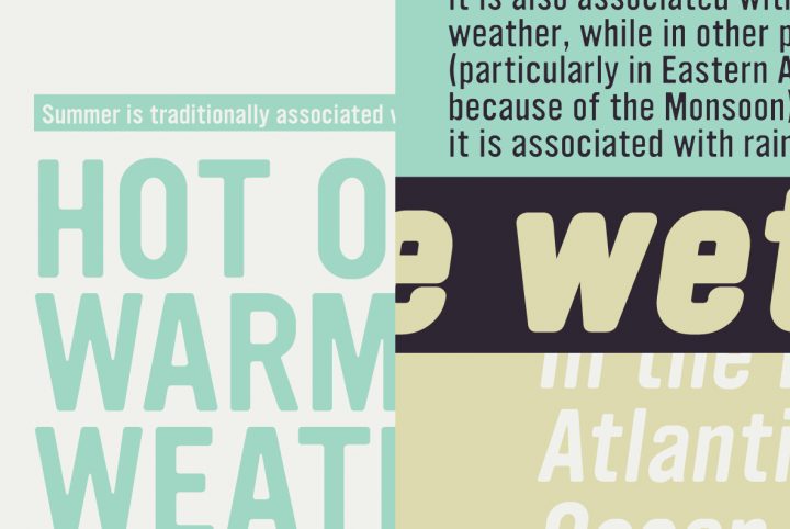
Klagia: An Ideal Retro Font for Tomorrow’s Digital Designs
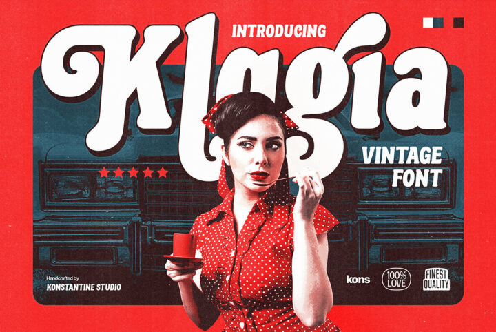
Vintage products and retro designs can look back, but the objective is using these designs to forge into the future. Today's uncertainties make retro hot. Plus it's cool—funky 1970s designs have timeless appeal, as do the modern spins they inspire like Klagia from Konstantine Studio. Klagia is the quintessential 1970s retro font. Based on adverting media from around 1970, Klagia is perfect right now for music promo, social media posts, package design, branding projects, visual identity,
2000s
A Font Inspired by Too Many Energy Drinks
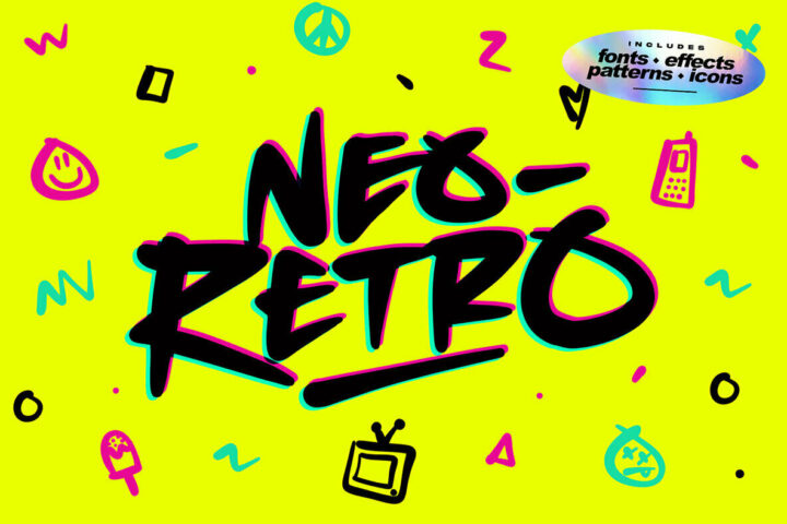
"Disclaimer: An unhealthy amount of energy drinks were consumed while creating this product." So states Set Sail Studios regarding this fabulous, colorful explosion that also spells words: New Retro. Set Sail's Sam Parrett is the one sacrificing his health so we can take a retro trip to the high-energy '80s and '90s—when energy drinks contained ingredients that are now banned in the USA. This bold, bright superset is roughly bookended by break dancing's break out and the aforementioned
Ultramagnetic Rough Font: A Soft Gothic Design with an Edgy, Gritty Twist
Designers, it's time to get rough! We've taken one of our bestselling fonts and roughed it up a bit to create Ultramagnetic Rough. This font has a soft gothic design with an edgy, gritty twist. The varying levels of distressing increase over time to create more depth for your designs. Plus, there are 15 variations so you can find the perfect fit no matter what project needs it! What emerged from the fight is a type design that's tougher, edgier, and grittier than its soft-around-the-edges
Wild Star Font Duo Rocks Hard, Rides Free
If you don't like heavy metal, okay—fair enough. Many don't, and that's fine. And there are times when even the most ardent metal fan would rather hear birdsong than Judas Priest. The morning after a Judas Priest concert, for example. But most people most of the time have at least a couple powerful numbers that get their heart rate up, and some make a lifestyle out of heavy rock and hard living. Heavy Metal communicates certain images and ideas that are almost universally agreed
YWFT Ultramagnetic – The “Soft Yet Gothic” Branding Superstar
YWFT Ultramagnetic is one of our hall of famers. The global home decor retail chain West Elm knew this when they chose "Ultramag" (as it's known in-house) for their worldwide marketing and branding, in store and across social media, as well as in WebFont format throughout their corporate website. The smooth power of the original was joined by YWFT Ultramagnetic Expanded, which took the original design down a more conservative path by bringing out the width by 20 percent, making for more
YWFT Ultramagnetic Language Update
YouWorkForThem's champion emeritus, the "soft-yet-gothic" YWFT Ultramagnetic, now supports more languages, including Basic Latin, Western European, Central European, Pan African Latin and Basic Greek, as well as Vietnamese! Extra symbol support, including the Euro symbol along with other mathematical and currency symbols is also now standard. The new YWFT Ultramagnetic is a great option for the web, as it contains over 400 standard glyphs. If you have previously purchased the
Save 25% Off YWFT Ultramagnetic
How to make soft-yet-gothic? Countless hours spent researching, and years of refinement, that's how. YWFT Ultramagnetic was finally mastered to postscript/truetype format in 1999 and has gone on to be one of the most widely-used YWFT exclusives of all time. In fact, from 2002-2006, YWFT Ultramagnetic ranked in our Top Ten, spending a majority of that time at Number One. YWFT Ultramagnetic has been used by Harley Davidson, Starbucks, Disney Channel, Best Buy, Nike, Wired Magazine and