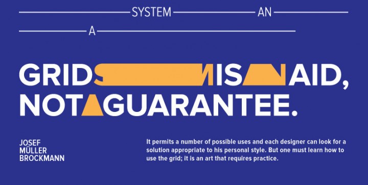
Without a doubt, Proxima Nova is one of the most popular web fonts and has been for many years now. We at YouWorkForThem love it so much, that we adopted it for our own branding back in 2010.
Just this month Mark Simonson, the designer of Proxima Nova, sent us an update to his popular font family. If you purchased Proxima Nova from us in the past, you would have received an email about the free update. But, you might be wondering what was updated? So, from the designer himself, here is what Mark has to say about the recent update:
Proxima Nova (version 2.015) details:
- Improved TrueType hinting (for Windows users).
- Includes descriptive names for Stylistic Sets. This isn’t widely supported yet, but the fonts are ready when it is.
- New Medium weight (six new fonts). These will now be included in the “complete” and “custom style” packages. The complete Proxima Nova family (all widths) now comprises of 48 full-featured OpenType fonts.
New glyphs:
- prime and double prime
- interrobangs
- inverted ! and ? for small caps (previously missing)
- Turkish Lira
- Indian Rupee (new symbol)
- optional tabular figure 1 with serifs
- slight redesign of lowercase f to eliminate the need for ligatures (they are frequently not used in web use, hence this)
- slight redesign of lowercase j (shorter tail)
- cap German double-s: ß
- additional Cyrillic characters
- Fixed support for cross-platform document sharing with Microsoft Office between Mac and Windows versions.
About Proxima Nova
The Proxima Nova family is a complete reworking of Proxima Sans (1994). The original six fonts (three weights with italics) have been expanded to 48 full-featured OpenType fonts. There are three widths: Proxima Nova, Proxima Nova Condensed, and Proxima Nova Extra Condensed. Each width consists of 16 fonts—eight weights with matching italics.
Stylistically, Proxima Nova straddles the gap between typefaces like Futura and Akzidenz Grotesk. The result is a hybrid combining humanistic proportions with a somewhat geometric appearance.


