Established in 2012, Talbot Type prides itself on creating designs with an aesthetic quality that will withstand the test of time. The man behind Talbot Type, Adrian Talbot, has nurtured a passion for lettering and type design ever since his college days at Birmingham Polytechnic. Greatly influenced by the Bauhaus, Modernism, Constructivism, and Art Deco movements, his designs tend to favor the practical over the flamboyant, producing utilitarian fonts that blend a beautifully classical styling with functional versatility.
Kenwyn is a distinctively geometric slab serif with a wood type presentation. Bold and visually striking, Kenwyn will instantly remind you of old-timey “Wanted” posters from the Wild West. In fact, most of the letterforms of Kenwyn Single Dot could have been used as target practice by Billy The Kid, each of his victims marked with a single bullet hole right through the center. Double Dot looks as though it were caught in the middle of a gun fight at high noon. Kenwyn includes a Stencil font for both Single Dot and Double Dot; these subtle changes actually create uniquely different letterforms for extensive design versatility.
Kaleko 205 Round is stylish, contemporary sans serif. Its elegance is further amplified by its pure simplicity, with generously rounded letterforms that express a good-natured attitude. Kaleko 205 Round is warm and amiable like a life-long friend, one you may not see everyday but who always welcomes you with open arms. This font is beautiful in both print and digital applications, including editorials and fashion spreads. The Book, Bold, and Heavy members of the Kaleko 205 Round family are absolutely perfect for children’s book covers and body text.
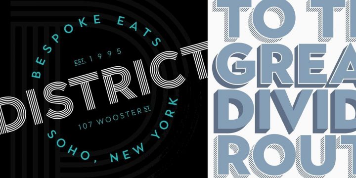
Keith takes an Art Deco approach to three-dimensional typography–with a unique edge. Keith includes two directional solid shadow effects, with those same shadows available in a halftone texture! Fill and Outline versions round out a decorative set that is full of design possibilities. Keith contains both upper and lower case letter sets, with some extended character support for Central European languages. This font family is incredibly versatile, offering something for just about every print and digital application: body text, advertising, poster layouts, signage, and so much more.
Korbin is a classically-styled sans serif with a modern sophistication that sets an elegant tone in print and digital displays. Lavish, rounded curves exude an easy-going attitude, one that’s confident yet not full of itself. Korbin is gorgeous in fashion spreads and editorial applications, web content, corporate communications and letterhead, and its excellent legibility in small point makes it particularly well-suited for business card information.
Kroppen Round is a sans serif stencil type design with geometric letterforms based on those of Kaleko Round. While stencil fonts typically take a heavier approach to lettering, Kroppen Round bears a nimble appearance and feminine demeanor. With clean and contemporary styling, this font includes four weights with corresponding italics for ample design flexibility.
Kilburn is a self-assured condensed sans serif with a substantial Gothic influence. Confident in its own skin, Kilburn exudes powerful authority in both print and digital applications. Featuring five weights ranging between Thin and Black, this font is incredibly strong in its simplicity, maintaining a perfect balance between its classical impression and contemporary intentions.
Talbot Type currently has more than 30 products available through YouWorkForThem. Visit their portfolio to see all of their offerings and purchase your favorites today!


