TypeMates is a straightforward type foundry that circulates a diverse range of typefaces and also tailors exclusive type designs for small and large clientele. Operated by Nils Thomsen in Hamburg, and Jakob Runge in Munich, TypeMates attends to everything from the tiniest nuance in a logo or piece of lettering, to the design of extensive type systems. “We’re passionate about well-made letterforms delivered to the highest technical standard,” they told us.
Nils Thomsen always thought he’d follow in his father’s footsteps and become a mathematician, but an introduction to graffiti would alter his course forever. “I fell into love with all the possibilities a letter can show off,” he said. “It was more a lettering style, drawing different words, sometimes on paper, sometimes on walls.” This inspired him to enroll in art school, where he attended type design courses with Albert-Jan Pool (FF DIN). Nils continued at the Royal Academia of Art in The Hague at the Type and Media master class, a hardcore type design course that put his skills to the test.
Nils feels that an excellent font’s primary requirement is a solid, basic quality of design. Beyond that, supplementary mistakes tend to bring a little personality and unique flavor into the mix. “Sometimes a simple solution is much more awesome than a strange and fancy concept,” he noted.
One of TypeMates’ latest releases is Pensum Pro, a contemporary serif whose inspiration lies in the brush and broad nib pen. “The basic shapes and contrast are based on calligraphy,” Nils observed. “In the end, the digitization helped to bring some details more and more into the foreground.”
Designed by Nils, this inky-sweet, sophisticated typeface offers high legibility for an incredible number of applications. Long-form publications will openly embrace Pensum Pro’s ease of reading, regardless of format. Editorials and magazine content will convey their messages with clarity, while printed books and e-books allow their readers to immerse themselves in a story without heavy eye-strain.
“Pensum’s uppercase letters are a mixture in its proportions,” Nils remarked. “They are inspired by the old Capitalis Romanis, but also follow the economic thinking of uppercase in text.”
Nils finds the mixed contrast of Pensum Pro to be his favorite element of its design, although achieving a perfect balance presented a challenge during its creation. “In the end it should work in reading sizes,” he observed, citing Lexicon from the Dutch typographer, Bram de Does, as a model for attaining similar equilibrium.
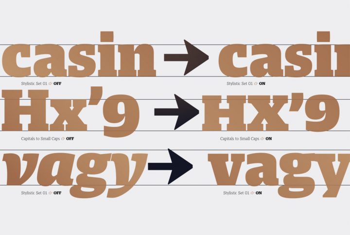
Pensum Pro is available in nine weights ranging from Thin to Black with corresponding italics for each. It’s absolutely packed with additional goodies that include capitals to small caps, contextual alternates, case-sensitive forms, discretionary ligatures, standard ligatures, fractions, lining figures, tabular figures, slashed zero, ordinals, scientific inferiors, superscript, and small caps. Its language support extends to Basic Latin, Western European, Euro, Catalan, Baltic, Turkish, Central European, Romanian, Pan African Latin, Dutch, Latin Ligatures, and Basic Greek for global accessibility.
TypeMates currently offers 11 products through YouWorkForThem and we highly recommend that you check out their portfolio to view all of them. Nils is currently working on a rounded sans serif to be released on YouWorkForThem in the coming months, and he intends to take a closer look at Pensum Pro to explore the possibility of a display or sans serif version in the future.


