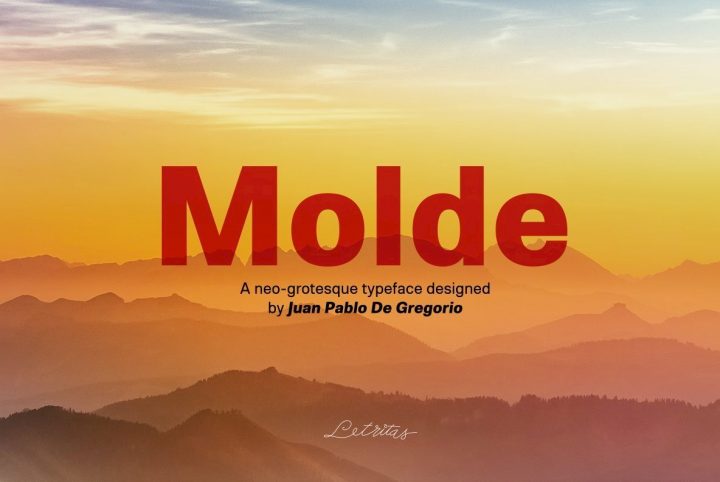
Juan Pablo de Gregorio is a Chilean typographer, graphic designer, and founder of Letritas Foundry. A man who always follows his intuition, Juan Pablo takes an innovative approach to his work, crafting ideas not yet realized by anyone else. Moved by thoughts that eventually emerge into almost tangible sensations on the screen, much of his work begins as a basic concept that transforms and captures the essence of the impression he wants to achieve through his typography.
One of his most recent releases is Isabel Condensed, a sweetly feminine serif he designed with Eleonora Lana.
“Isabel Condensed is what I call ‘enriched typography’,” Juan Pablo told us before explaining the three aspects of its modification.
The first is idiosyncrasy, meaning that Isabel has its own way to be read. “It tells us a story with a peculiar taste in a very specific way,” he said. “Isabel Condensed is easy to recognize in a cognitive sense, and it’s impossible to detach it from its peculiar voice.”
The second aspect of Isabel Condensed is its broad functionality. Alternative characters, diacritics, ligatures, and small caps offer designers a great deal of flexibility in their work and allow the type design to be employed in a variety of text applications.
The third and perhaps most important aspect is its inherent expressiveness. Ornamental characters have been created to further develop the remarkable posture of Isabel Condensed, assuring a stylistically pleasant yet readable result.
“I believe that in each design process there’s always that specific ‘moment’ in which the typography seems to start to work well while I begin a never ending job to remodel it in a stylistic way,” Juan Pablo observed. During this phase, some ornamental and functional ligatures along with the typology of the design will start to appear. “You may also begin to notice some alternative characters and swashes,” he added. To that end, the words are working exactly as intended, but with style.
Isabel Condensed was crafted for children and teenagers, creating a text that is both radiant in stature and functional in any reading setting. “My biggest wish was to keep the joyful shape in the letters,” Juan Pablo expressed, yet it was certainly not without its creative challenges. “I think that when you design a condensed typography, you really realize that you have to deal with shapes in the smallest space,” he added. This means learning to choose between shape and function, the most complicated choice to make.
The entire family is comprised of three variations that include the regular version, an italic version, and a unicase version, with five weights in each. Isabel Condensed offers capitals to small caps, numerators, denominators, standard ligatures, stylistic alternates, elegant small caps, and beautiful swashes. Its multilingual support is extensive, covering Basic Latin, Western European, Euro, Catalan, Baltic, Turkish, Central European, Romanian, Pan African Latin, Dutch, Afrikaans, Igbo Onwu, and Basic Cyrillic for exceptional accessibility.
Right now, Isabel Condensed is on sale for 85% off of its regular price through May 31, 2017!
To see more of Juan Pablo’s work, visit Letritas Foundry’s portfolio on YouWorkForThem. Keep an eye out for his future additions because Juan Pablo has some big plans in the works right now, including a sans serif type design intended to explore more functional aspects. “This new font will be the ‘joining link’ of all Letritas typographies,” he explained. “I’ll try to concentrate on creating very neutral shapes which will pair with each Letritas font.”
He’s given us a lot to look forward to and we wish him all the best in his future projects!


