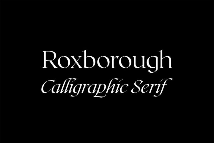
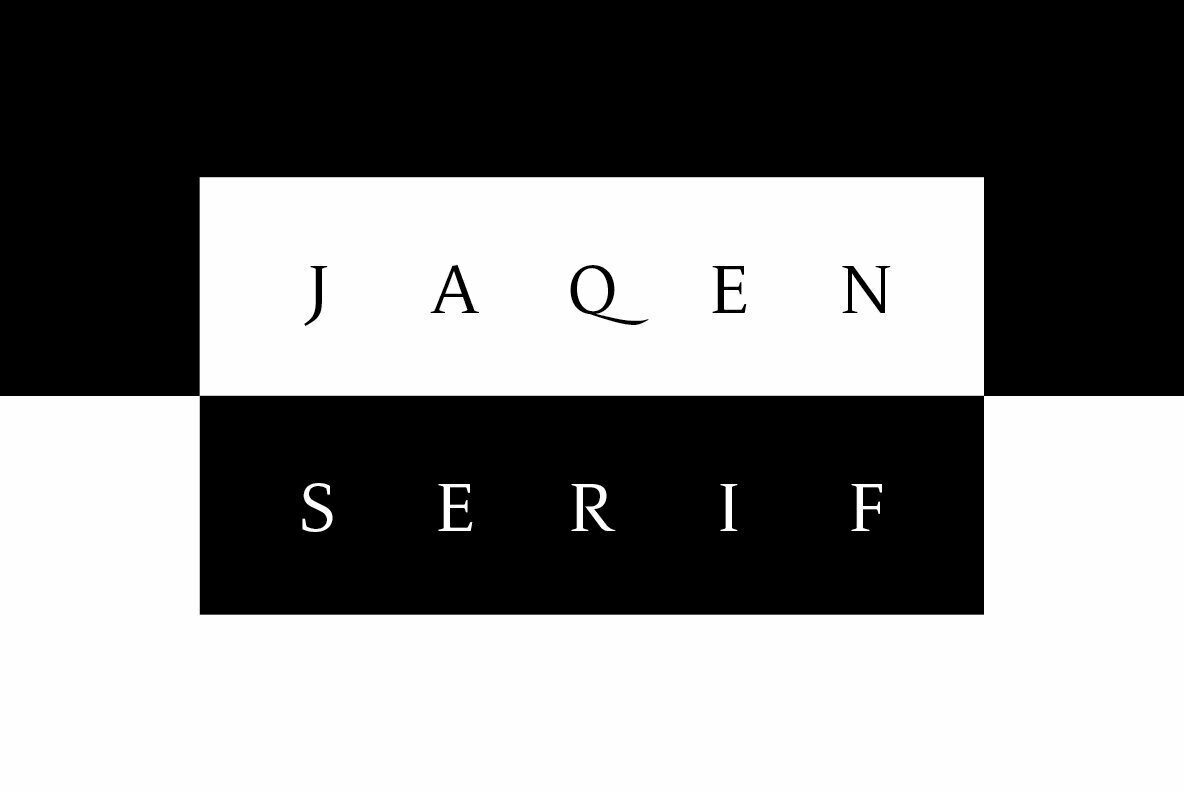
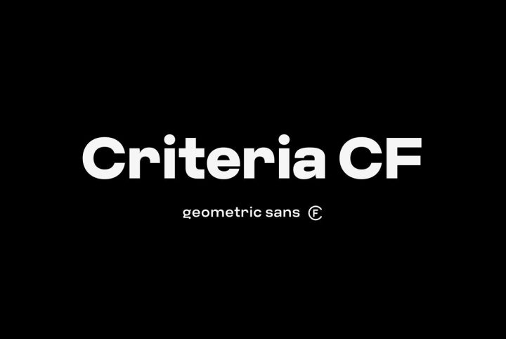
Based in Utah, Connary Fagen is a graphic designer and typographer who is well known for his incredibly versatile and beautiful typography. He’s earned quite a reputation for stellar type design and one only needs to look at his portfolio to see why.
Connary has a solid background in UI, web design, branding, and identity, all of which have provided him with the solid foundation from which he’s built a career upon. During his time spent working in the graphic design industry, Connary found plenty of opportunities to explore letter design. Most (if not all) graphic designers are familiar with the challenges that emerge when you can’t find the perfect font for a given project. Sometimes it just makes sense to take things into your own hands – literally – and design new letters from scratch.
Early on in his career, Connary had taken note of the effect typography had on his own work. That led him to explore type design in part to learn more about the mechanics behind it, but also to develop original letter sets to suit his own projects. As time passed, his knowledge and skill flourished in tandem, and he eventually began releasing his type designs to the retail market.
“That I’ve had any measure of success in this field surprises and humbles me,” Connary told us. That success, however, is what pushed him further into the field. His work has been licensed by major companies and used by countless designers around the world. He’s consistently been among the top ten fonts of the year on YouWorkForThem, including taking the record-breaking top four spots in our Top Ten Fonts of 2017.
Despite his success, Connary remains ever modest. “It’s a crowded market, with thousands of typefaces to choose from, so I’m grateful for every customer,” he said. “I put a great deal of care and attention into each typeface, and I take it seriously, but it’s also fun and relaxing work.”
Connary’s work tends to favor conciseness over ornamentation, with an emphasis on clarity and definition. His letter sets offer a high degree of legibility and they’re designed to work beautifully in a wide array of project types. Before any type design is released, however, Connary essentially puts it through the wringer – testing it to its limits to ensure that it is the best it can possibly be before its put into the hands of graphic designers.
His work never stops there, either. Connary is known to revisit his past work to tweak or expand it, offering free updates and bug fixes to his customers as they are released, offering long term support with every purchase.
One of his more recent releases is Artifex CF, a serif type design that enhances the reading experience. Artifex was designed to be “easy on the eyes,” a letter set that virtually melts into the page or screen. Soft serifs aid reading flow without embellishment, making this a gorgeous and intelligent choice for long-form texts. Connary wanted this family’s italic sets to be a little more upright than is typical; this allows for text emphasis without visual distraction.
Artifex is a classy and sophisticated addition to text-heavy projects of all kinds, including editorials, body copy, text blocks, publishing, presentations, and even corporate communications that need a touch of warmth. That said, its heavier weights also serve well in display applications, titling, and subheadings, offering “a medium-contrast design and details that scale gracefully,” Connary said.
Artifex is available in Extra Light, Light, Regular, Book, Demi Bold, Bold, Extra Bold, and Heavy, with corresponding true italics for each.
Artifex CF offers a number of OpenType features that include capitals to small caps, fractions, alternates, standard and discretionary ligatures, ordinals, lining figures, proportional figures, oldstyle figures, tabular figures, and small caps for greater versatility. It extends multilingual support to Basic Latin, Western European, Euro, Baltic, Turkish, Central European, Romanian, and Pan African Latin for fantastic global accessibility.
While Connary still accepts commissioned projects, he offers 22 type designs through YouWorkForThem, an incredible collection of expertly-crafted serifs, slab serifs, sans serifs, and display fonts to suit a variety of design projects. Visit his portfolio to check out the rest of his work and if you love it as much as we do, bookmark it so you won’t miss out on any of his future releases!


