Emil Bertell lives a full life as a creator. He focused on multimedia coursework during his time at an arts-centric high school, which served as the foundation for all that he would explore later on. His very first font was released when he was just 16 years old and just one year later, he was featured in a book on type design, Freefonts! Designer Fonts Online. At that point, Emil really hadn’t received much in the way of formal type design training; it was just something he enjoyed and pursued on his own and in conjunction with his brother. Nevertheless, his talents were already beginning to blossom.
Emil has always been drawn to visual media and even during his mandatory military service for his home country of Finland, he found a way to incorporate his love for design by working for the army’s newspaper. Once he left the army, he studied graphic design and typography at the UIAH University of Art & Design in Helsinki. It opened an entirely new world for Emil and with so many varied interests, he took a break from designing fonts for a few years.
Emil went on to work as a freelance graphic designer, working on commissioned projects and festival posters. He really flourished as an illustrator, working on pencil illustrations for advertisements, posters, stamps, and magazines. When it came to designing festival posters, Emil would draw his own fonts by hand and eventually had the opportunity to draw illustrative lettering for the credits of a television show.
As time passed, Emil started getting back into font design and selling his work online under his foundry label, Fenotype. He revisited some of his older work, as well, adding more characters and basically improving upon their original designs.
Even though Emil is a professional type designer, he doesn’t feel like he’s “working,” at least in the sense that his work doesn’t feel like “work.” He loves what he does and enjoys the personal freedom that working in the industry affords. As a man with a family, he can plan his work around his life — and not the other way around. Emil especially looks forward to the moment when he can begin incorporating a new type design into promotional imagery because it pairs his love for type design with his love for poster creation.
Emil’s work embraces imperfection, at least to a small degree. He finds that if he over-polishes a type design, it can lose some of its more expressive qualities in the process. It’s a delicate balance, certainly, but his work is consistently beautifully put together and versatile.
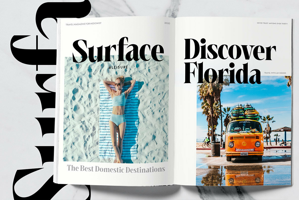
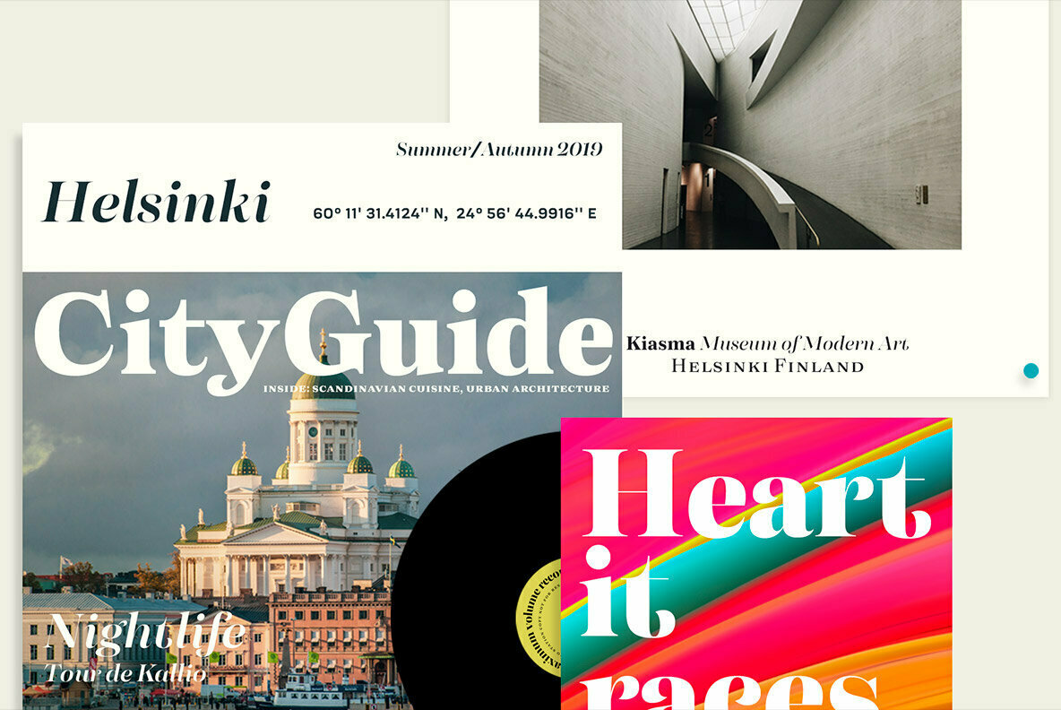
One of Emil’s most recent releases through YouWorkForThem is Lawrence, an elegant serif type design built with style in mind. Available in Regular and Bold, Lawrence is simply beautiful, featuring interlocking ligatures that add a whole new level of sophistication. It’s perfectly suited to advertising — particularly for the fashion industry — as well as product packing, editorial, branding, and identity projects.
Lawrence offers contextual alternates, dozens of discretionary ligatures, stylistic alternates, titling alternates, and gorgeous swash characters for greater flexibility. It extends multilingual support to Basic Latin, Western European, Euro, Catalan, Baltic, Turkish, Central European, Pan African Latin, and Afrikaans for designs aimed at a global audience.
Right now through September 26, Lawrence is on sale for 50% off of its regular price so it’s a great time to add this beautiful serif to your font collection!
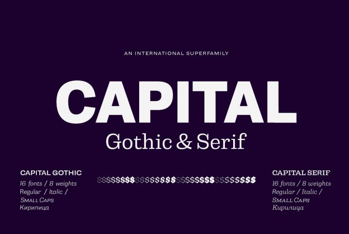
Emil Bertell currently offers more than 75 products through YouWorkForThem, including a range of serifs, sans serifs, scripts, and display types for design projects of all kinds. Visit his portfolio to view his complete body of work and bookmark it so you can check back for new releases in the future!


