Based in Estonia, Lewis McGuffie is a British type designer with a background in hand lettering and signwriting. As someone who is “happy as a butcher’s cat” when drawing letters, Lewis is doing what he loves most when he is crafting type designs.
Throughout his career, he’s worked on custom type designs, branding projects, and retail letter sets for the graphic design community. Lewis’ work relies heavily on extensive research that explores all aspects of typography: historical, regional, and physical. His background in sign painting not only lends itself to type design, but Lewis holds workshops on glass gilding, signwriting, and lettering by hand.
One of his most recent releases through YouWorkForThem is Cindie 2, an updated variation of his optical type, Cindie Mono.
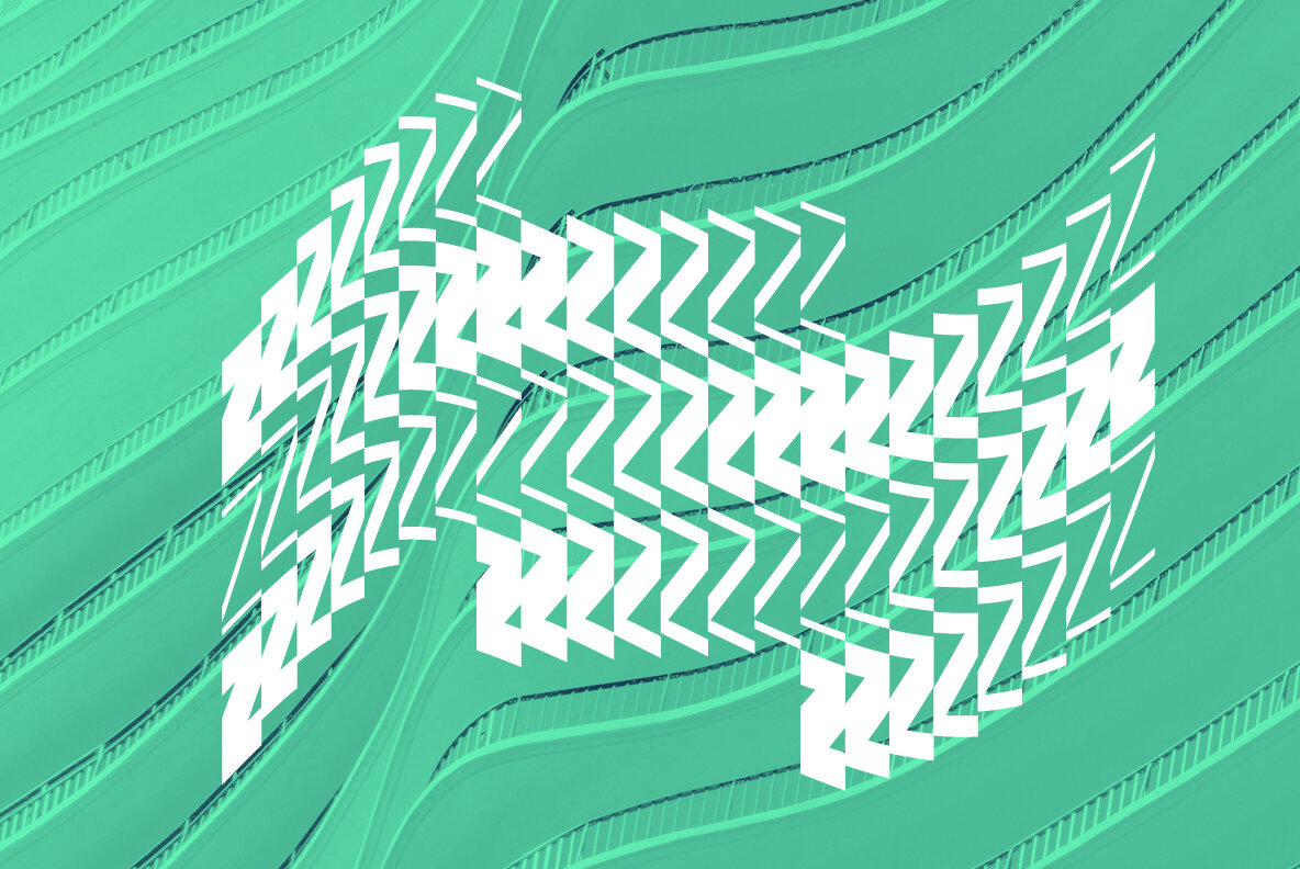
The Cindie family was initially inspired by the lettering styles often used in sight-testing posters found in optometrists’ offices, eventually morphing into a “half-broken Commodore 64 and the computer from the 1985 movie ‘Weird Science’ hooked up to a dot-matrix printer spitting out reams of mechanical but distorted mono-lettering.”
Cindie 2 retains the same monospaced stacking feature of its predecessor, upgraded to offer both upper and lowercase characters for greater versatility. Some letters have been redrawn from the original design, and this updated variation includes a script typeface accompaniment.
Cindie 2 contains a total of 26 monospaced widths that are incrementally wider than the next, which enables complex stacking of the entire family. To ensure versatility in stacked design layouts, the punctuation, spaces, and symbols are either 1/3 or 2/3 the width of a character. “This sounds complex,” Lewis explained, “but it makes the wider widths more practical to use and gives a designer more options for the mono-stacking system at the heart of Cindie.”
While Cindie 2 is offered in 26 widths, you don’t have to look any further than the alphabet to discover which widths will work best for your project: they’re arranged by increasing width from A-Z. The narrowest of the family is Cindie 2 A and the widest is Cindie 2 Z — labeling that makes it easier to gauge the best widths to suit your workflow.
Cindie 2 Script is not monospaced; instead, it is built on a system of contextual alternates. For this reason, Lewis advises that Cindie 2 Script works best when you keep your .calt feature on. The script works more like handwriting, presenting all-caps lettering written in a masculine hand. It pairs well with the monospaced variants of the Cindie 2 family, but it also stands comfortably on its own.
The range of widths available in Cindie 2 makes this family beautifully suited to design projects of all kinds, including displays and signage, advertisements, posters, headlines and subheadings, book covers, album artwork, logos, product packaging, merchandise, apparel, social media imagery, marketing materials, and mobile applications.
Cindie 2 provides case sensitive forms and superscript and extends multilingual support to Basic Latin, Western European, Euro, Catalan, Baltic, Turkish, Central European, Romanian, and Pan African Latin languages for design projects intended for a global audience.
Lewis McGuffie Type currently offers 11 products through YouWorkForThem, including a variety of sans serif, serif, and display designs. Visit his portfolio to take a look at the rest of his work and if you love what you see, bookmark it so you can watch for new additions in the future!


