The Importance of Fonts in YouTube Thumbnail Designs
When it comes to creating content for YouTube, it’s important to consider not only the quality of your video but also the visual elements that accompany it. Thumbnails are the first impression that viewers will have of your video, so it’s crucial to make them eye-catching and engaging. Choosing the right font for your thumbnail plays a big role in whether or not viewers decide to click and watch your video.
That’s where YouWorkForThem comes in. We offer personal and corporate level licensing for any YouTube font requirements you might need, from small personal brands to large corporate campaigns that might even go into television. With over 20 years of experience in licensing fonts, we have multiple options available not only in design but also in licensing choices for your project.
In this article, we’ll explore some of the best fonts for YouTube thumbnail design and provide tips for choosing the right font that aligns with your branding and content. By following these tips and considering some of the best fonts for YouTube thumbnail design, you can create attention-grabbing thumbnails that will help your videos stand out.
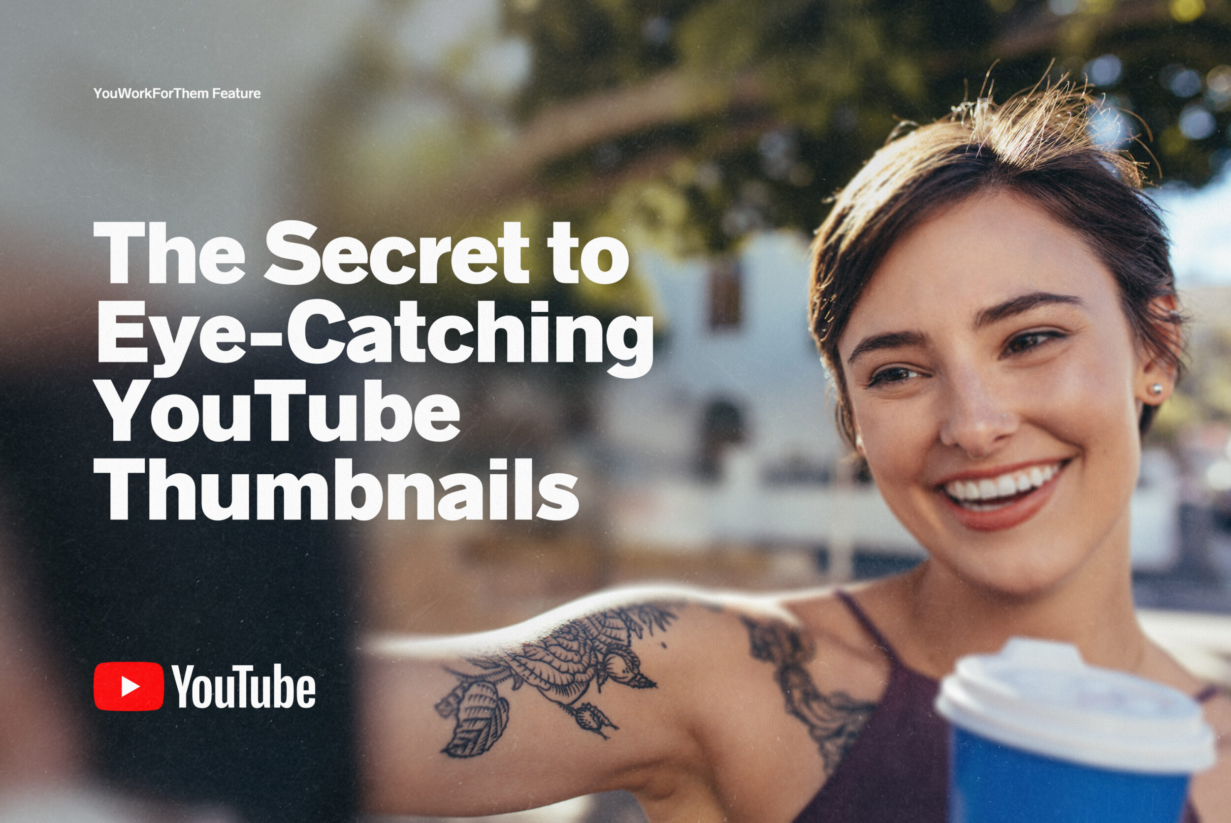
Cover Photo: Vlogger Taking Selfie by Jacub Lund
Our Top 5 YouTube Fonts for Thumbnail Designs
There are hundreds (or hundreds of thousands in regards to our catalogue) of fonts to choose from, but not all of them are suitable for YouTube thumbnails. Here are our top 5 font choices for YouTube thumbnails:


1. Bebas Neue Pro
Bebas Neue has a magnetic magic that has made it a global giant among fonts. Within its clean lines, there is something that corporations, artists, graphic designers, and viewers find irresistible. Whether in Roman or Cyrillic, uppercase or lowercase, people see it and are instantly hooked. Over the last decade, Bebas Neue has become an absurdly popular font family: when viewers are confronted with it, they click on it. It will most definitely make your YouTube thumbnail impossible to refuse.


2. Radnika Next Typeface
Radnika Next is broad, beautiful, and strong. Radnika’s commanding presence hums with subtle authority: whatever it represents must be looked it, investigated, partaken in. As such, it is ideal for YouTube thumbnails. When you are tired of hoping for clicks and likes, you need to demand them. Radnika Next is a great tool toward giving your visuals that type of strength. Maybe it’s the simple fact that in the digital format, Radnika Next looks absolutely excellent. A beautiful font, a track record of success, a blast to design with. And lethally effective toward making your YouTube thumbnail the ultimate clickable eye candy.


3. Cinderblock Font
Cinderblock is one tall wall of a font, because it’s inspired by masonry. And it’s a building that gets bigger with each iteration: each of the 8 heights is 25% taller than the previous one. That’s a visual legion singing in deep, loud voices marching out of your Youtube thumbnail into your viewer’s brain: and click, they’re watching. It’s bold, innovative winners like this that match your project and will set you apart from everyone else. We have found Cinderblock to be a huge success in creating thumbnails that reel them in and keep them there. You will love it!


4. TT Trailers
TT Trailers was originally conceived for the film industry, for big things like silver screens, posters, and bold titles. The font took off way beyond its intended use, and it started popping up on magazine covers, restaurant signs, and all over websites. This cinematic splash is ideal for YouTube thumbnails, as it makes every video you post have blockbuster appeal. TT Trailers is the visual equivalent of the booming bass voice of Don LaFontaine’s world-renown, “In a world…” trailers, and will give youR thumbnails the same Oscar-quality appeal!


5. YWFT Ultramagnetic
YWFT Ultramagnetic is one of the most widely-used YWFT exclusives of all time. From 2002-2006, YWFT Ultramagnetic ranked in our Top Ten, spending a majority of that time at Number One. YWFT Ultramagnetic has been used by Harley Davidson, Starbucks, Disney Channel, Best Buy, Nike, Wired Magazine, Architecture Magazine, and far too many websites, social media posts, and videos to even begin to contemplate. A lot went into YWFT Ultramagnetic, and we were confident the title would match the results. It does. As such, YWFT Ultramagnetic is perfect for YouTube thumbnails: with the gravitational pull of a black hole, this super popular font will distinguish your video and grow views, clicks, and likes exponentially!
Tips for Choosing the Right Font for Your YouTube Thumbnail
Choosing the right font for your YouTube thumbnail can be a daunting task, but there are a few things you can keep in mind to make the process easier.

Photo: YouTube on Phone with Laptop by Nuchylee
Consider Your Branding
Your font choice should align with your branding and your content’s tone. If you have a more serious or formal brand, a serif font might be the way to go. If you’re more playful or modern, a sans-serif or display font could be a better fit.
Keep it Simple
While display fonts can be attention-grabbing, they can also be difficult to read in smaller sizes. It’s important to choose a font that’s clear and easy to read, even when it’s scaled down to thumbnail size.
Use Contrast
Contrast between your font and background image is key to creating an eye-catching thumbnail. If your background image is dark, a light-colored font will stand out more. Conversely, if your background image is light, a darker font will be more visible.
Test Your Design
Before publishing your video, make sure to test your thumbnail design to ensure it’s legible and attention-grabbing. You can use a tool like A/B testing to compare different designs and see which performs best.
Conclusion
Choosing the right font for your YouTube thumbnail can make all the difference in getting clicks and views on your videos. Whether you opt for a classic serif font or a modern display font, it’s important to choose one that aligns with your branding and content, and is easy to read at thumbnail size. By following these tips and considering some of the best fonts for YouTube thumbnail design, you will create attention-grabbing thumbnails that will make your videos stand out.
And if you’re looking for something truly unique for your next big project, we’re here to help. Contact us today to learn more about our special and custom corporate licensing options. Our team is ready and eager to serve you and help bring your creative vision to life!
Thank you for considering the best fonts for YouTube thumbnail design, and we can’t wait to see the amazing thumbnails you create.


