
Understanding Typography Terms
When you’re reading through the product descriptions for fonts on YouWorkForThem, you’ll often come across a number of strange terms that don’t necessarily mean a whole lot unless you actually work in the field of typography. For type designers, a “counter” isn’t just the place where the coffee pot lives, and the word, “terminal,” certainly isn’t referencing the closest airport or bus depot.
Typographic terms can seem especially confusing when you don’t know exactly what they mean, so in part three of “Exploring The Bones Of Typography,” we’re continuing with the most basic parts of a character’s structure. A number of typographic terms actually kind of correspond to parts of the human body, which can help to make them a little easier to remember.
(If you’re just joining the series, catch up on what you missed in Part One and Part Two!)
Anatomy of Characters in Type
Characters are comprised of linear elements known as “strokes,” which are exactly like your own pen strokes when you’re writing something down on paper. When you’re writing a letter, each and every line you draw to create that letter has a purpose, and it also has a name.
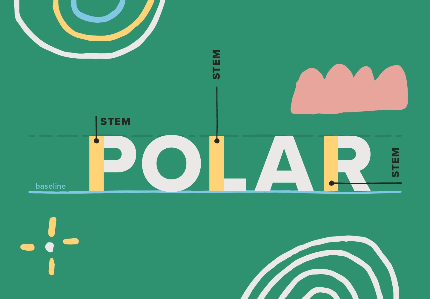
A “stem” is the main vertical stroke of a letter, such as the vertical lines found in the letters “T” “D” and “B,” or the main diagonal stroke in a letter that doesn’t have a straight vertical stroke, like in the letters “V” or “W.”
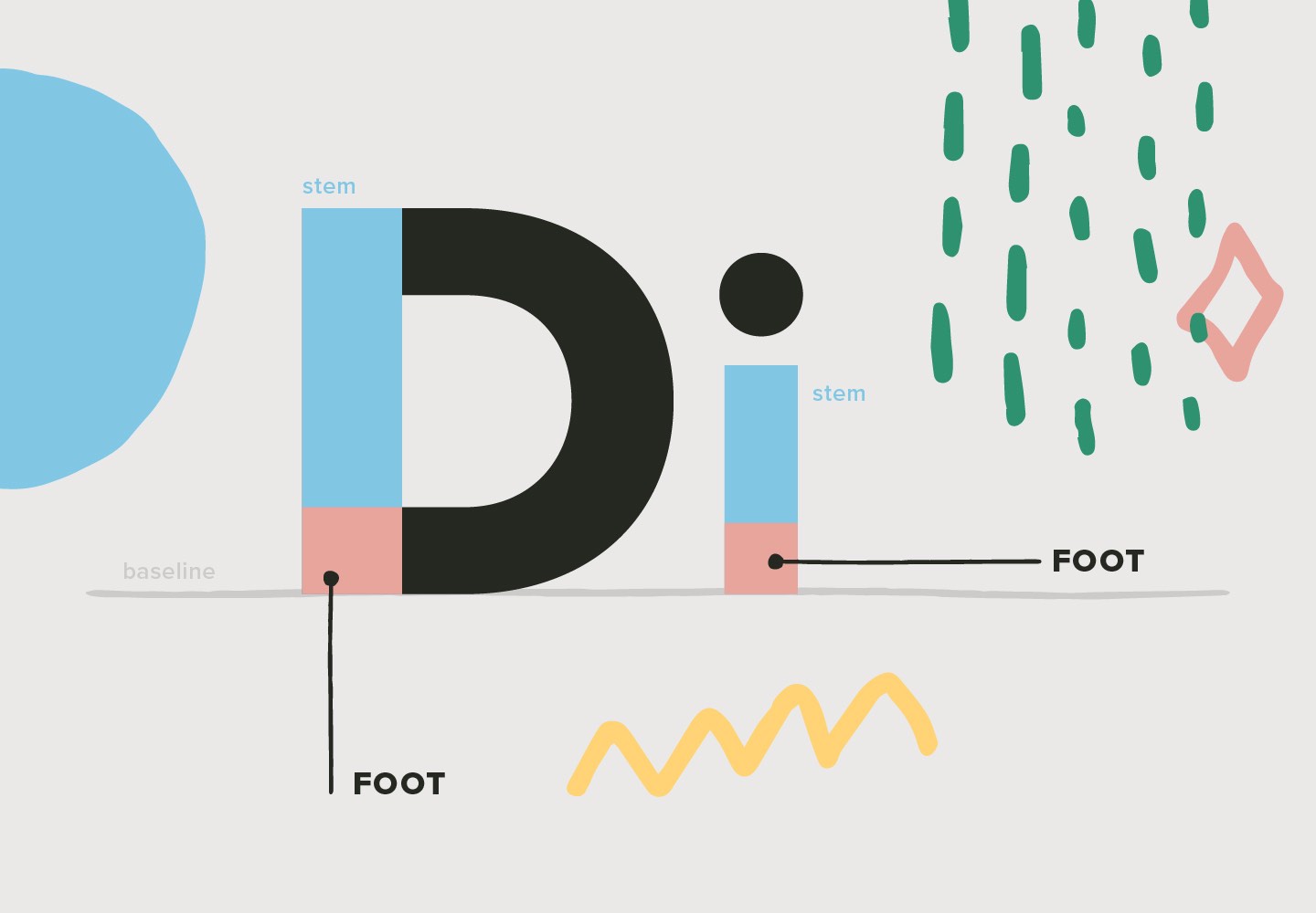
The “foot” is the bottom of the stem, which rests on the baseline.
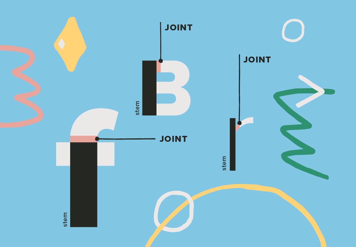
A “joint” is where a stroke meets the stem, seen in various letters like “f” “k” and “t.”
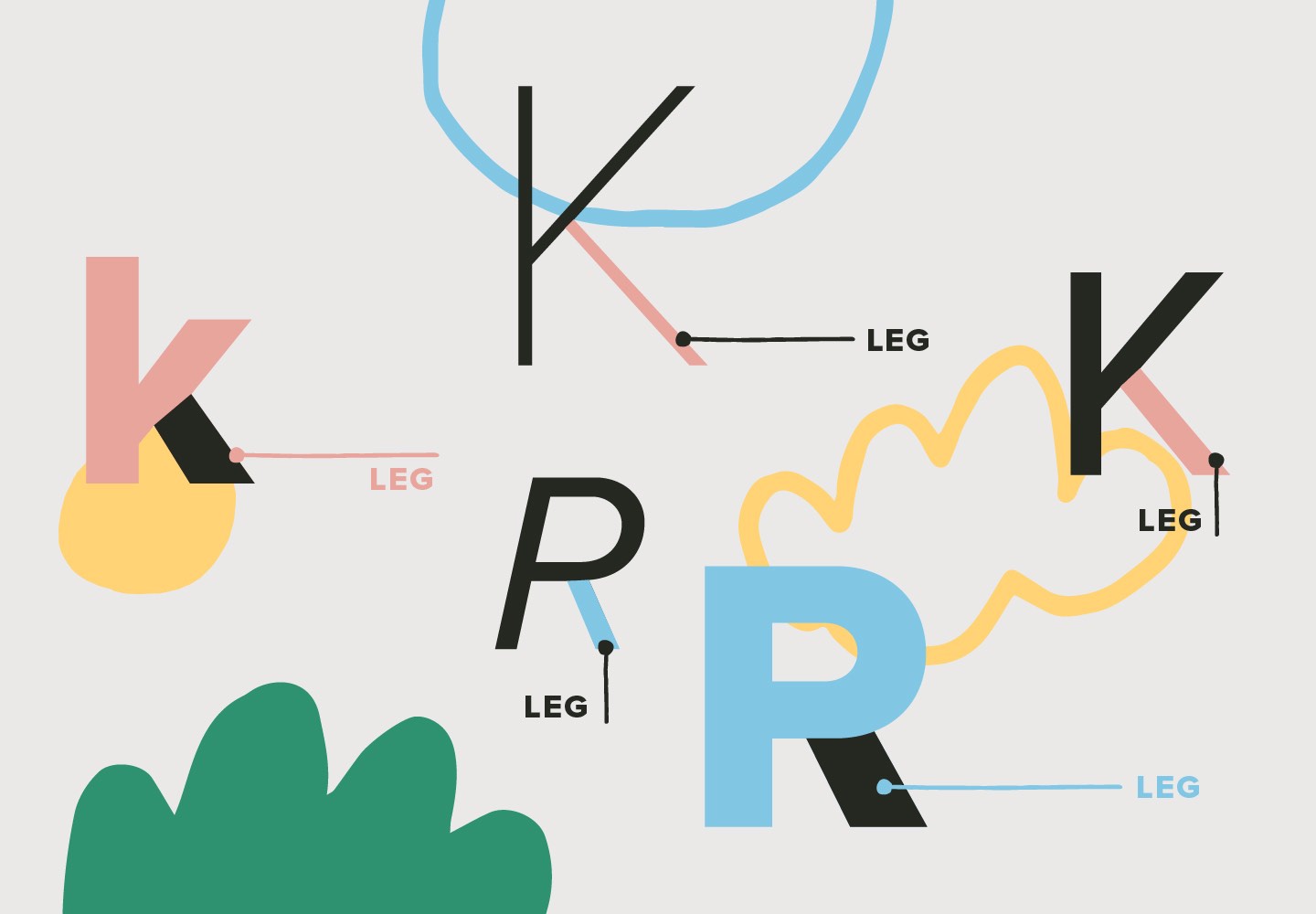
The “leg” (sometimes also called the “tail”) is a short downward angled stroke from the stem, like in the letters “k/K.” The descenders on letters like “p” “j” and “q” are also known as tails, because they sort of look like actual tails in your typography. (They just don’t wag unless they’re animated!)
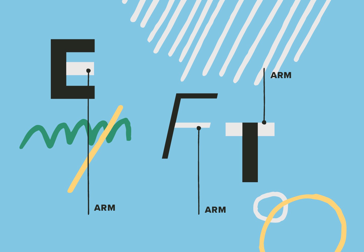
An “arm” is a horizontal or diagonal stroke that isn’t connected to the stem on at least one end. Good examples of arms include the letters “E” “F” and “T.”
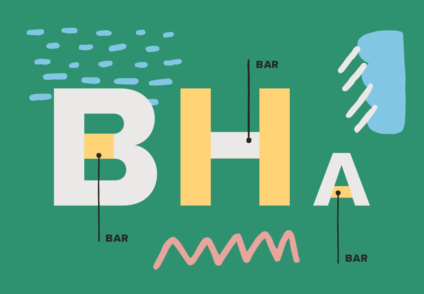
The “bar” is the horizontal stroke in letters like “H” and “A.”
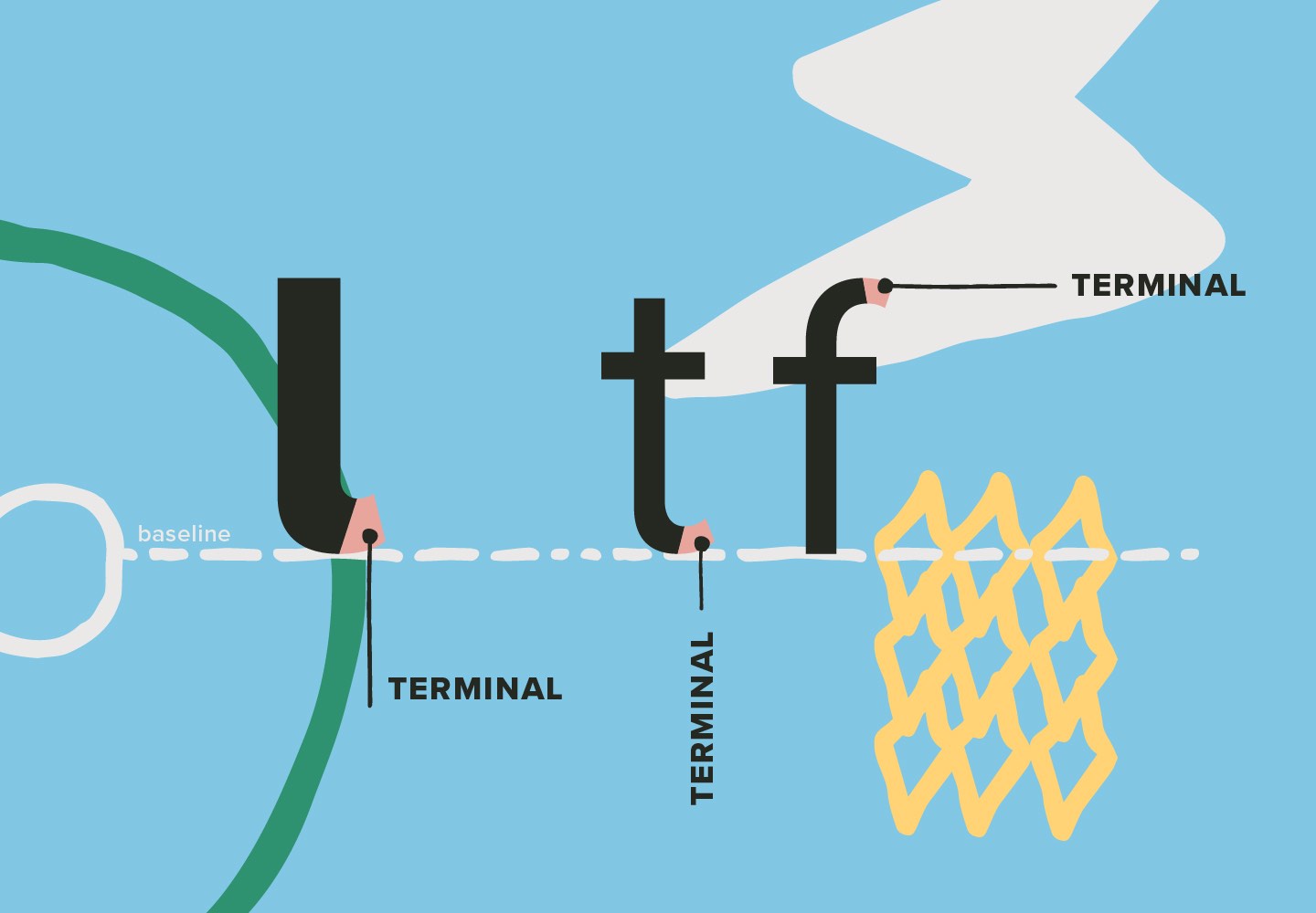
“Terminals” are found at the end of a stroke that isn’t ended with a serif, but some serif typefaces can also still have terminals. When they are circular in shape, they’re known as “ball terminals,” which can create a graceful finishing touch to certain strokes. A beautiful example of ball terminals on a sans serif font can be found in Bowling Script by Sudtipos. Mussica Italic by Corradine Fonts is a serif font that also features expressive ball terminals.
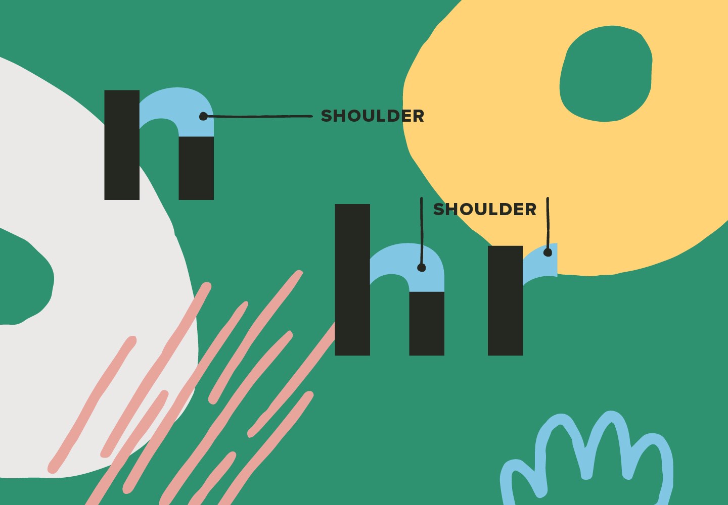
The “shoulder” of a character is a curved stroke that’s attached to the stem, like in the letter “h.”
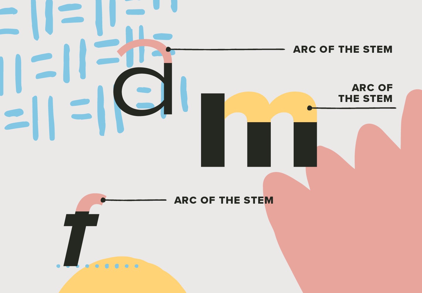
The “arc of the stem” is a curved stroke that is a continuation of the stem, as seen in letters like “f” or “j.”
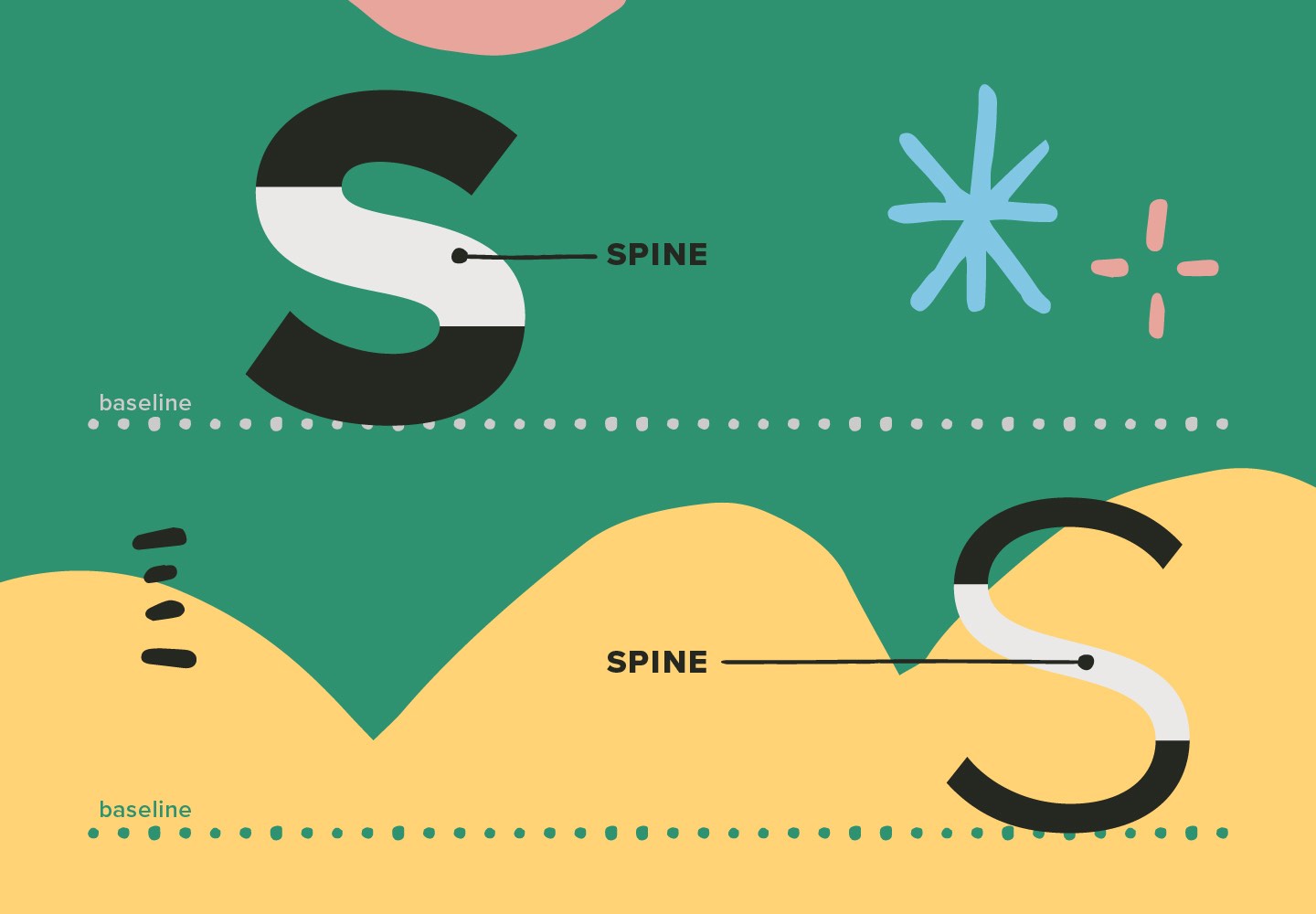
A “spine” is basically the backbone of the main curved stroke of the letters “s/S.”

The “apex” and “vertex” are the top and bottom points where two strokes meet, like in the letters “M” or “N.” To make your typography a little easier to remember, the pointed top of the letter “A” is the apex, while the pointed bottom of the letter “V” is the vertex.
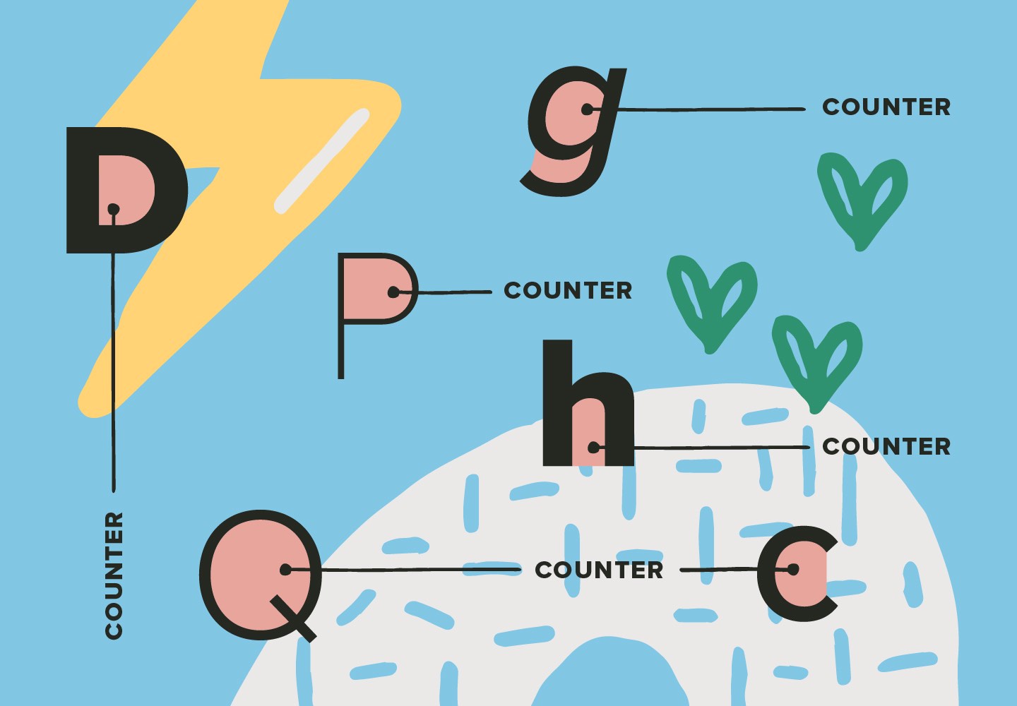
A “counter” (also known as an “aperture”) is an area within a character that is either entirely closed or partially enclosed by the character’s form. An “open counter” is any partially open white space, found in characters like “c” or “h.” A “closed counter” occurs in any character that has an interior white space that’s fully enclosed. Examples of closed counters typically occur in letters like “b/B” “d/D” and “o/O,” among others, although some type designs may use open counters on those letters as an interesting stylistic choice.
Some characters will actually have more than one counter (open or closed, or both). These are known as “double-story” structures, often seen in letters like “g” “e” and “a” in certain fonts. The letter “e,” for instance, usually has a closed counter on top, and an open counter on the bottom.
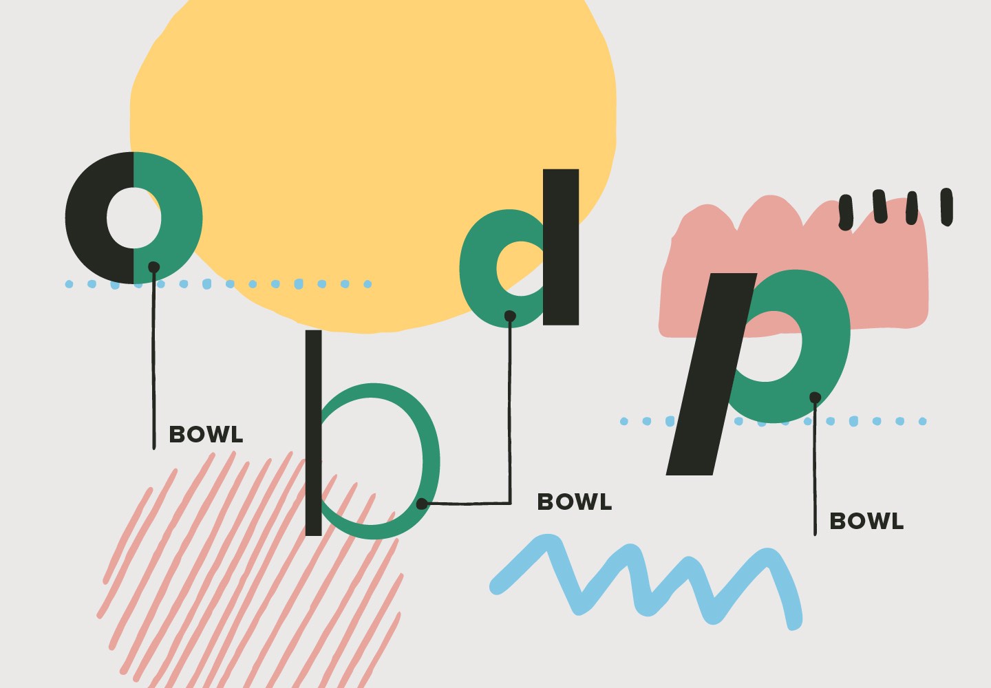
A “bowl” is a curve that creates a counter, and it can be either round or oval, depending on the letter’s design. Examples of bowls can be seen in letters like “b” “d” “p” and “q.”
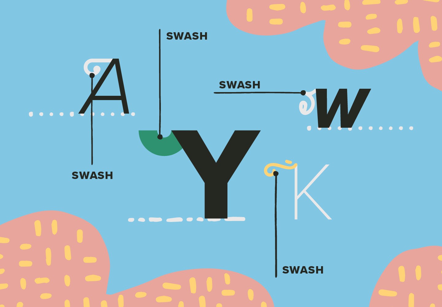
“Swash” characters can be found in a number of fonts, and they are those fancy flourishing details that aren’t serifs or terminals. They’re typically used as decorative accents, and they can be made available as either alternate characters, or detached curls and furls that you can add to letters yourself as you see fit. Heck, we even offer a Swash Collection of 1000 swashes that can be applied to any font you choose!
Wrapping Up “Exploring The Bones Of Typography”
With that, we bring to a close Part Three of our “Exploring The Bones Of Typography” series on YouWorkForThem. For those of you who have very little (or no) experience in typography, we hope that you found this series to be a helpful crash course on the subject.
And if you’d love to learn more about the history of typography, stay tuned! In the very near future, we’re going to start digging into specific design styles and their key elements, their histories and evolutions over time, and some of their representative typefaces!


