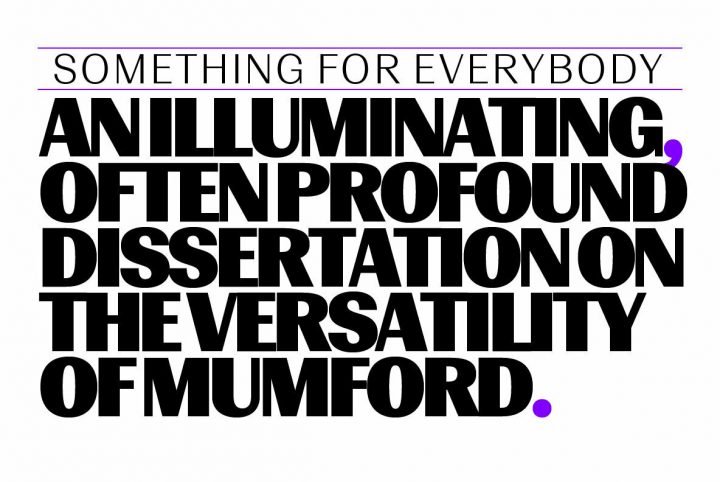
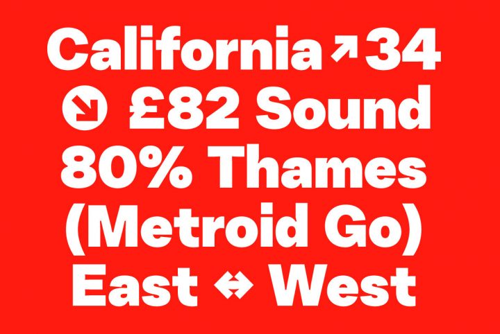
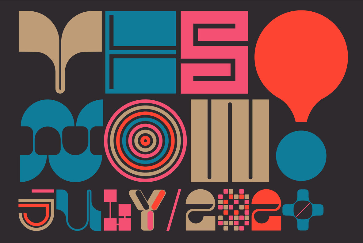
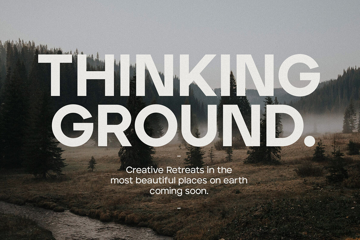
Regarding the Quirk display font, the designer states, “Quirk is extremely versatile by way of stackable characters. Can your font do that? It surely can . . . if this is your font. Quirk is super fun to work with, pairs well with bold sans serif fonts and is perfect for all purposes. What’s not to love?” Indeed, the smooth, flowing power of this masterful display font adds punch and visibility to any project: social media posts, digital artwork, poster design, logo design, corporate communications, package design, branding projects, visual identity, educational materials, and more. That’s Quirk. Versatile, attractive, easy-to-use excellence.
Quirk comes to us from The Routine Creative. Founded in 2016 by Alex Cottles, this studio is world-class at brand identity design. Alex and his colleagues value long-term relationships with friendly clients, and we are pleased our partnership is aligned with these values. The Routine Creative, in their name, recognizes the value of structure and control, while simultaneously welcoming creativity’s opposite nature: wild, uncontrollable, the destroyer of structure and standard expectations.
In their words, The Routine Creative (Instagram) is, “a representation of the ever-blurred lines between work and life.” And that’s why their products and display fonts are perfectly executed within this philosophy: easy to use, versatile, and impeccably executed. While at the same time, they are creative, new, groundbreaking, defying expectations. This is our type of excellence, and we look forward to more from this wonderful studio. Put Quirk to work, and you will see what we mean.
