“Humanism” is generally understood as a stance that values the power of human beings over dogma or superstition. It follows that something labeled as humanist would reflect those values–that the human creation is paramount.
However, while the word itself is certainly related, a “humanist” typeface is something very different. Rather than being named for the contrast of dogmatic belief vs. the paramount status of the individual, “humanist” in this context refers to something very specific–the lettering style that came about in the Renaissance, based upon organic human calligraphy.
New: Explore The Top Humanist Fonts for Digital Design
We’ve put together this amazing collection of fonts, over 37 fresh designs ready for download today.
The first typefaces that are considered humanist appeared following the invention of movable type. They were based on the handwriting of the medieval scribes of Italy, featuring softly rounded shapes, based upon a lighter, flowing script. They replaced the claustrophobic “Black Letter” forms of writing that were the norm prior to the Renaissance, bringing a lighter organic flow to the writing.
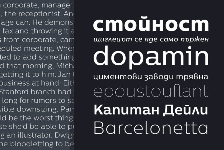
Whether serif or sans, humanist typefaces tend to look more like they are done by a human hand, with a natural, organic expanding and contracting of the strokes as if the letters were drawn calligraphically. They tend to have an axis that resembles calligraphy that is drawn at an angle with a pen nib.
Mark Simonson, designer of the extraordinary Proxima Nova family, defines a humanist font as being based in some way upon the humanist hand, with Palatino and Optima being the classic modern examples, along with Gill, Syntax, and Frutiger.
“It makes me think of church and classicism and ‘pretty’ writing,” says Simonson. “I’m more into vernacular and modern things. Humanist sans fonts got really trendy in the ’90s, and Proxima Sans (which became Proxima Nova) was kind of a reaction to that.”Mark Simonson
Stefán Kjartansson, designer of Black Slabbath, Cumulus and Foam and Cinderblock waxes a bit more poetic. “Long before it had its own documentary, Helvetica was uncool–and we’re talking like Mitt-Romney-wearing-dad-jeans uncool.”
Kjartansson goes on to detail his own experience, saying, “The first time I heard the term ‘humanist’ in the context of typography was in the form of Erik Spiekermann’s Meta, a sans serif that was the perfect non-Helvetica typeface for a job I worked on when I was fresh out of school. It had the discipline of the Akzidenz-Grotesk faces while being less sculpted, with a much softer, expressionist and crafted touch. A bit later, in 2001, with the help of my friend Rodrigo Xavier Cavazos, I designed my own sans serif typeface, called Reykjavik.”
Kjartansson finishes with the summation that “Maybe humanist typography will make a comeback in the next style cycle. Maybe it already has.”
Cover graphic uses Humanist 521 BT by Paratype.


