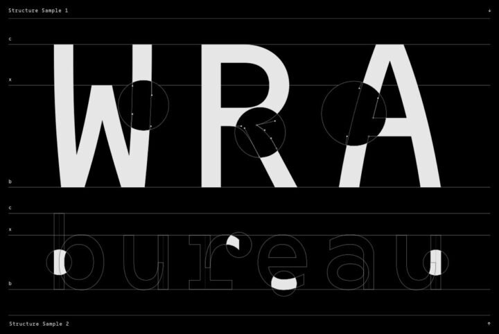
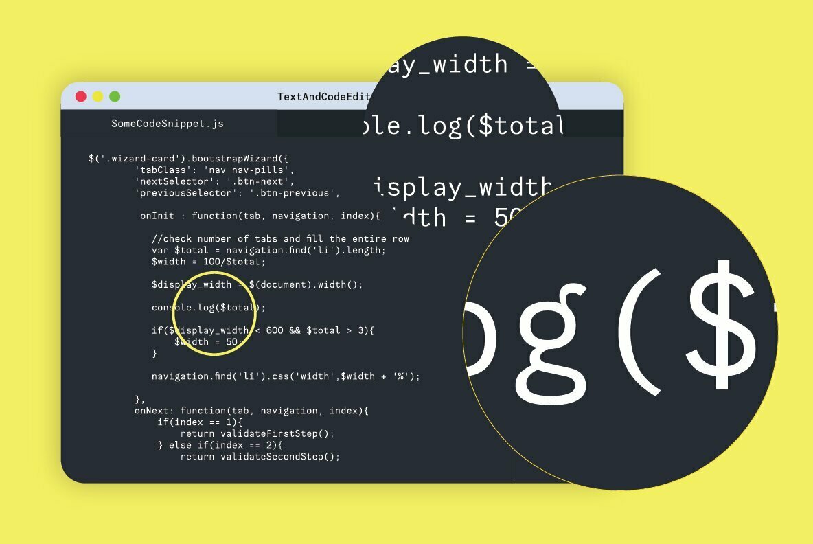
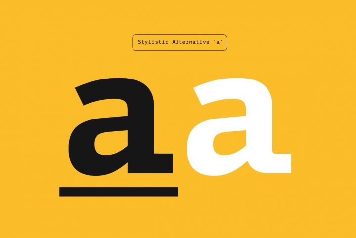
Aprex Mono is a classic monospace font updated with digital smoothness. It perfectly blends classic and modern aspects. Aprex Mono is a monospaced industrial version of the Aprex Sans typeface, with extensive multilingual support. Drawing inspiration from a basic sans serif glyph structure, this...
mono
October 14, 2022
A Great Monospaced Font for App Developers
Iverse Mono from Minor Praxis is a monospace font, which means that its characters all occupy the same amount of horizontal space. The classic example of a monospace font is Courier, the font of typewriters and film scripts: 12 point Courier is usually required so script readers understand that ...
September 20, 2022
OBO Star – A Flexible Fat Font for Vintage Designs
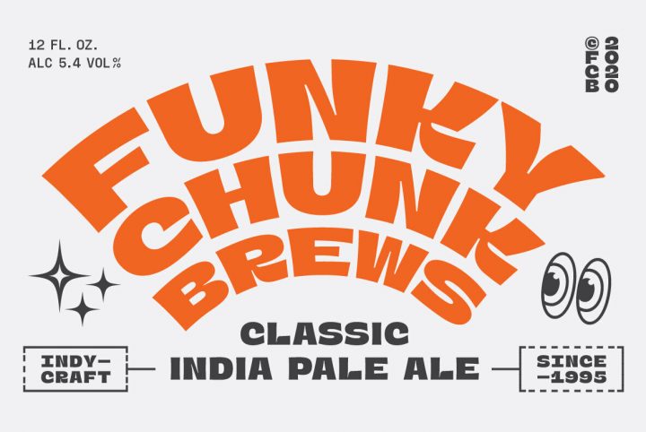
OBO Star is a fat display typeface with, "a not so subtle groove factor," in the words of designer Juri Zaech. With no ascenders or descenders, OBO Star works horizontally, vertically, or mixed like crosswords. Please visit the product page to fully understand just how flexible this funky font i...
December 2, 2020
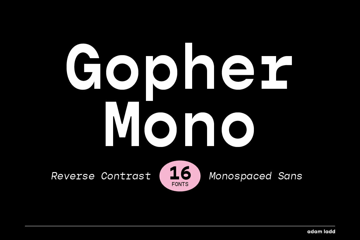
Gopher Mono: A Monospaced Reverse Contrast Sans Serif From Adam Ladd
Based in Cincinnati, Adam Ladd is a prolific typographer and graphic designer who has been working in the visual art industry for nearly 20 years. He spent about a decade working as a designer and art director, focusing on the layout and design direction for several magazines. As anyone who’s wo...
November 10, 2020
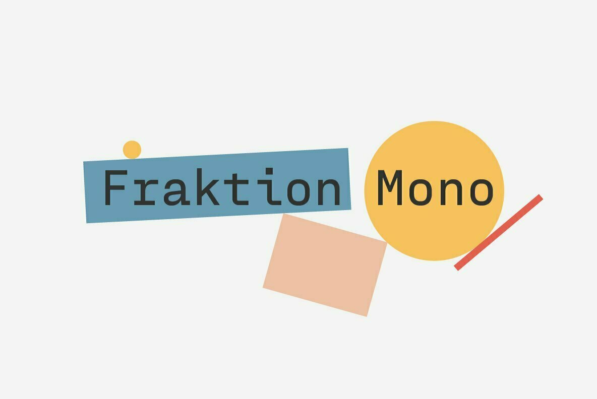
Fraktion Mono: A Squarish Monoline Sans Serif From Juri Zaech
Juri Zaech is an accomplished graphic designer, art director, and typographer who began his career during a typography apprenticeship in a design studio back in the 90s. Eventually, he went on to attend Miami Ad School in Hamburg and later spent many years working for larger design agencies thro...
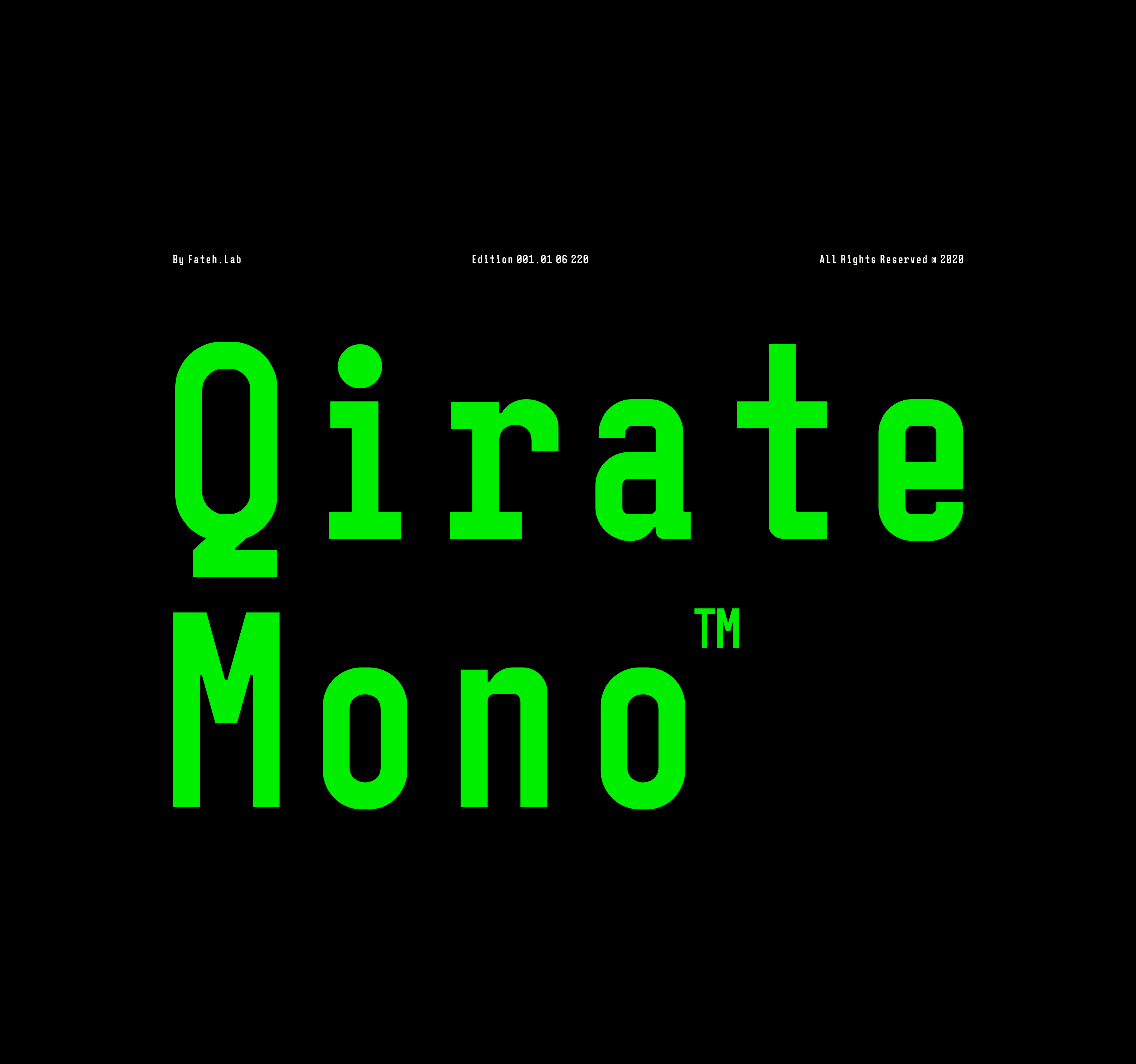
Living with his spouse and son in Indonesia, Wisnu Cipto Wibowo is a type designer and illustrator who releases work under the studio label, Fateh Lab. Aside from working on his own font projects, Wisnu works as a freelance illustrator for several brands and products. The one thing that draws Wi...
“A home for underdogs,” Harmnessless Type is an independent studio and foundry based in Bandung, Indonesia. Established by Akbar Ar-rohman, Harmnessless Type crafts contemporary and technologically-driven type concepts for an international design marketplace. One of the foundry’s most recent rel...
Based in Estonia, Lewis McGuffie is a British type designer with a background in hand lettering and signwriting. As someone who is “happy as a butcher’s cat” when drawing letters, Lewis is doing what he loves most when he is crafting type designs. Throughout his career, he’s worked on custom typ...
Established in 2015 by designer and typographer Sean Coady, Vintage Type Co. celebrates history through its exploration of typography and design. As creative director of Vintage Type Co., Sean understands the importance of typography, citing it as the very foundation society was built upon. He m...
February 11, 2020
A Monospaced Sans Serif From Akufadhl: Generisch Mono
Fadhl Waliy Haqq's has been interested in hand-lettering and calligraphy since childhood. Growing up in Surakarta, Indonesia, he didn’t fully explore his passion for the craft until he was older, taking on the endeavor of teaching himself how to create fonts from scratch around 2012. A few years...
Emil Bertell got his first taste of graphic design while attending an arts-driven high school. Multimedia courses allowed him to explore typography at an incredibly young age, inspiring him to create and release his first font at just sixteen years old. Even as a teenager, Emil understood the im...
Located in Newcastle upon Tyne, The Northern Block was created by Jonathan Hill in 2006. Known for their anti-establishment approach to type design, The Northern Block flawlessly incorporates comprehensive functionality into each of its letter sets. The final result is a seamless blend of artist...
