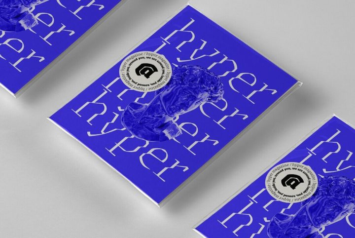
A Dynamic Digital Font from an Ancient Tradition
The letterforms that we now accept as the historical standard for printing latin alphabets were developed in Italy around the end of 1400. Deriving from Roman capitals and from italic handwriting, they soon replaced the blackletter letterforms that were used a few years before by Gutenberg for his first moveable types. Between these two typographical traditions there's an interesting and obscure middle ground of historical oddballs, like the Pannartz-Sweynheym Subiaco types, cut in Italy in
pixel
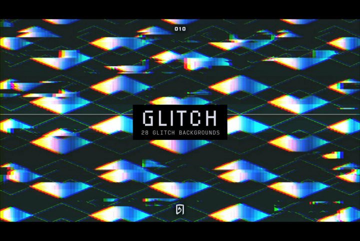
Glitch 010: Go and Glitch No More
Tharanas Chuaychoo is an absolute master at taking the visual and aural exhaust of the technical world and turning it into hypnotic pieces of art. Televisions gone awry and damaged digital screens appear to feature prominently in Chuaychoo's work, but they are not merely colorized or reorganized renditions. Chuaychoo makes art from that mysterious and slightly uncomfortable zone where technical byproducts mate with the human psyche, a place where dreams are imbued with the scorching fuzz of
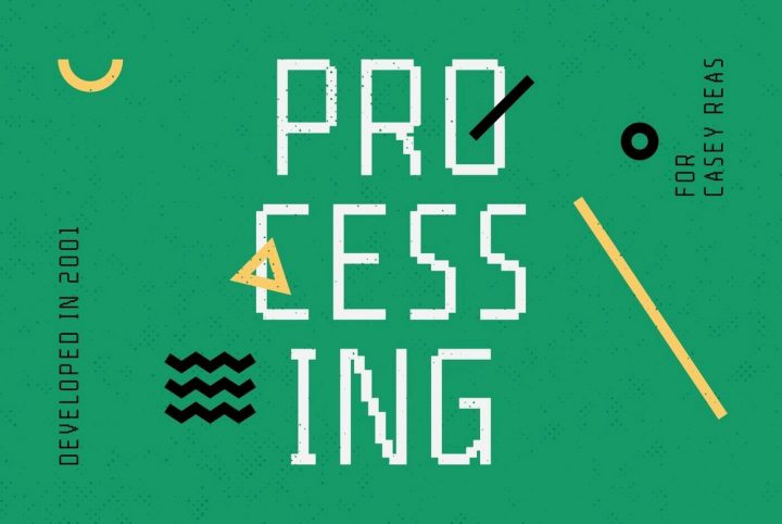
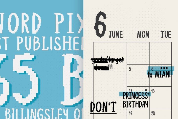
A Timeless Bitmap Font Family: YWFT Processing
For as far as our computer technology has come over recent decades, there's something inherently familiar and comfortable about bitmap graphics, no matter how old you are. For those of us who were kids back in the 80s, playing (and dying of dysentery) on the Oregon Trail as we sat in front of school computers, bitmap lettering and graphics are like revisiting some of the best parts of our childhood. For those younger whippersnappers who grew up with Xbox and Playstation, old school bitmaps
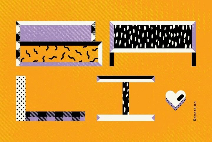
Go Wide Or Go Home: YWFT Reversion
It might be said that the greater the width, the more loudly typography speaks. If that's true, YWFT Reversion screams from the rooftops and echoes around the world. When you want to make a statement that absolutely can't be ignored, you gotta go big, and you gotta go wide. YWFT Reversion carries itself with an unusually broad stance, yet it offers a surprising amount of versatility. Designers can use it as-is, crafting billboards, posters, and headlines that grab the viewer's attention
A Nostalgic Celebration Of 8-Bit and 16-Bit Gaming: YWFT Edger
Over the last decade, and particularly since Minecraft's release in 2011, pixel art's popularity has experienced a continuous upswing around the globe. The trend has been a welcomed source of nostalgia for Gen-Xers, many of whom repeatedly died of dysentery while playing The Oregon Trail at school (although as most of us will agree, food poisoning from the school cafeteria would have been a far worse way to go). Broken wagon wheels and sick oxen aside, idyllic memories of classic gaming
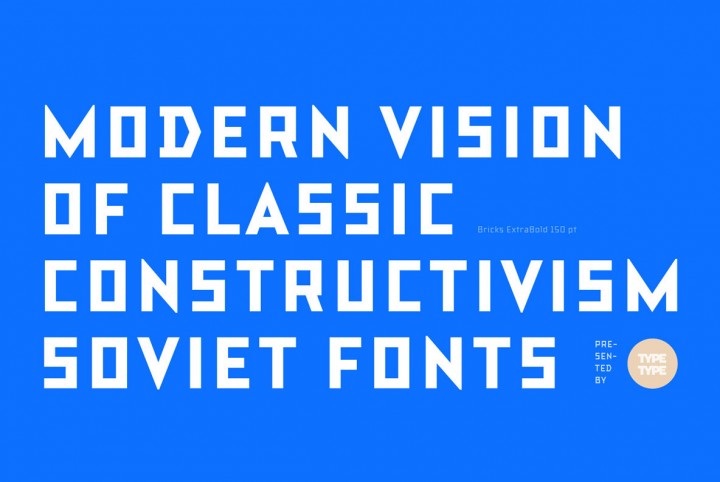
Soviet Constructivist Type by Russian Designers TypeType
Do you love the early Soviet visual culture as much as we do? Well, you're just in luck...TypeType has gone back a hundred years and approached the constructivist era style of type design with a modern twist. They've created an extensive and powerful new font family that consists of the simplest triangle and rectangle forms, titled TT Bricks. This new font family includes 16 styles: Hairline, Thin, Light, Regular, Medium, Bold, ExtraBold, Black and Italics. Regardless of its Soviet
35 Abstract Images for $20
This week we posted another huge image collection, and at a great price point too! A massive collection of 35 abstract and heavily stylized images great for graphic design related projects, download this collection of 35 Abstract Images for just $20. This is a perfect collection for startup studios & freelancers as it provides high quality quality images that work great for backgrounds, websites, book covers, motion graphics, presentations and many other design mediums. Typically