The late Tom Petty famously sang, “It just seems so useless to have to work so hard and nothin’ ever really seems to come from it.” YouWorkForThem begs to differ with that sentiment because if our Top Ten Fonts of 2017 list is anything to go by, hard work does pay off, although perhaps not right away or even as fast as we might like. The real key to success, in whatever form it takes, is to keep at your endeavors, even – and especially – when things get tough. You never know what greatness you’ll achieve until you try, and you keep trying.
Just ask Connary Fagen, the type designer who took a record-breaking top four spots in our Top Ten Fonts of 2017 list. Just a single type design from 2016’s list ranked in 2017’s top ten: Greycliff CF, which moved up from third place to first in a year’s time.
YouWorkForThem is excited to announce our Top Ten Fonts of 2017, ranked by sales alone.
1. Greycliff CF
Connary Fagen takes the gold this year with Greycliff CF, a timeless geometric sans serif. The bones of Greycliff’s classic architecture are instilled with wisdom, influence, strength, and warmth, capturing the viewer’s attention without feeling overbearing. Seven weights with corresponding obliques offer extensive OpenType features and multilingual support, providing designers with a high degree of flexibility in their work. Greycliff is well suited to headlines, editorials, publishing, corporate communications and letterhead, logos, web copy, mobile applications, and so much more.
2. Integral CF
An intense sans serif that exudes strength and confidence, Integral CF takes second place, clutching the silver in its capable hands. “From the beginning, the idea was to push myself to go bold,” Connary said in regard to Integral’s design. “I wanted to design a typeface that could express big, huge emotions, be visually captivating, and be very functional and legible.” Integral CF’s powerful posture is well suited to titling, displays, posters, book covers, and any project that needs to pack a visual punch.
3. Vanguard CF
Released on YouWorkForThem midway through 2017, Vanguard CF placed third, claiming the bronze. Connary described Vanguard as “a kind of sibling typeface to Integral,” exploring height over width. The resulting type design favors a taller and more narrow posture, allowing designers to convey an important message when horizontal space is limited. Vanguard is available in eight weights that range from Thin to Heavy, with corresponding obliques for each. Extensive OpenType features and multilingual support make Vanguard an exceedingly versatile font to work with.
4. Manifold CF
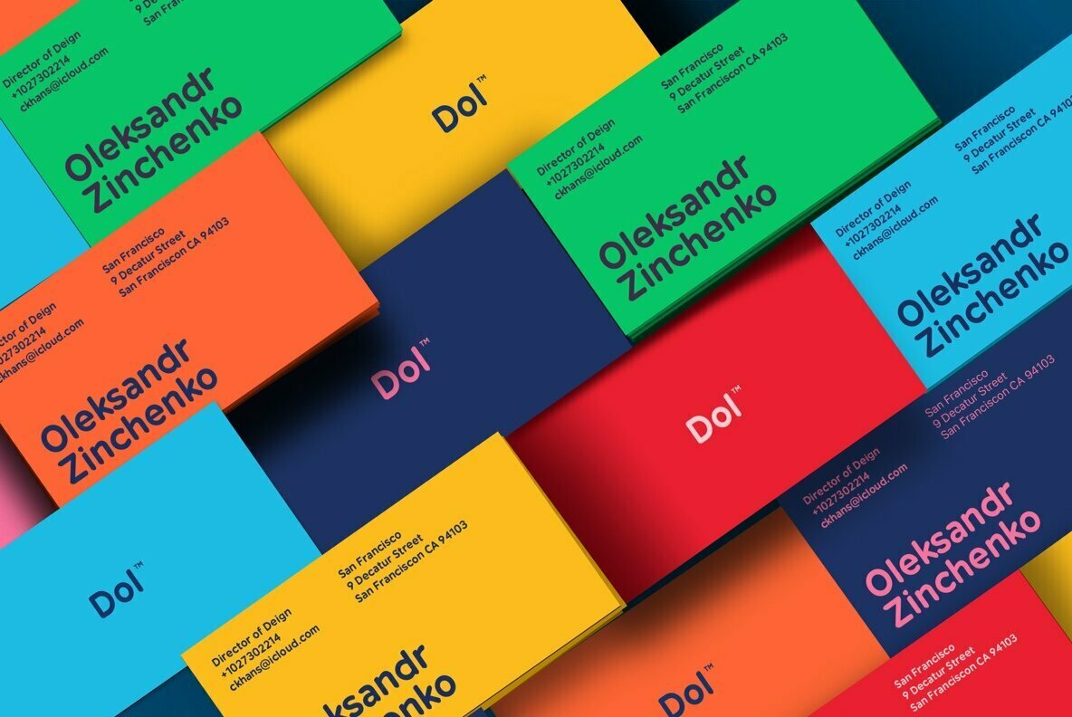
With architecture inspired by computer displays and terminals, Manifold CF blends an austere structure with modern design aesthetics. A type design whose subdued demeanor is surprisingly invigorating, Manifold is a straightforward type design that’s well suited to everything from headlines, body copy, advertising, product packaging, branding, web content, and mobile applications. Six weights with corresponding obliques are accentuated by OpenType features and multilingual support that covers both the Russian and Ukrainian Cyrillic alphabets, making Manifold an especially great choice for international design projects.
Designed by Samuel Oakes, Oakes Grotesk is heavily steeped in contemporary, corporate appeal. Clean legibility is a hallmark of Oakes Grotesque, a modern sans serif type design that’s beautifully suited to corporate communications, letterhead, white papers, web copy, presentations, e-publishing, headlines, editorials, product packaging details, package inserts, and advertising.
6. Northwell
We don’t think any top ten fonts list would be complete without at least one type design from Set Sail Studios. Northwell brings a touch of intimacy to every message it conveys through its handwritten script letterforms. Northwell presents itself with a dry-brushed texture, making it a perfect type design for projects that need a decidedly hand-drawn look, including greeting cards, branding, labels, advertising, product packaging, social media images, logos, apparel, and merchandise.
Designed by Horizon Type, Acherus Grotesque is a strong geometric sans serif with a softer side. Recently licensed by Dick’s Sporting Goods, Acherus Grotesque carries itself with a balance that conveys a message with warmth and confidence. Available in eight weights with corresponding italics for each, Acherus Grotesque is packed with OpenType features and multilingual support that provide designers with a lot of flexibility in their projects.
8. Cerebri Sans
Designed by Hanken Design Co., Cerebri Sans is a solid type design that found its inspiration in early geometric and grotesque lettersets. The understated humanist details within Cerebri Sans’ architecture offer an element of warmth that keeps it from coming across as harsh or unfeeling. Designed to be subtly nuanced, Cerebri Sans prizes legibility and reader comfort above all, making it a perfect addition to text-heavy design projects that include headlines, editorials, publishing, advertising, corporate communications, infographics, presentations, white papers, educational materials, web content, and mobile applications.
9. Odudo
Designed by Thom Niessink, Odudo is a contemporary sans serif type design rooted in classic geometric architecture. The balanced proportions of each letter convey messages with clarity and intent, with legibility being a key characteristic of this type design. Odudo is well suited to displays, signage, logos, branding, headlines, editorials, advertising, corporate communications, web content, and mobile applications. Four weights with corresponding italics for each offer designers a great deal of flexibility in their work.
10. Radnika
Hanken Design Co. rounds out our top ten with Radnika, a fresh and modern sans serif workhorse family of 18 fonts. Radnika’s architecture calls upon elements of the expressive typefaces of the 19th century and the more serious, authoritative typefaces of the 20th century. The result is a type design that is strong and amiable at the same time, making it well suited to a variety of projects that include headlines, editorials, corporate communications, white papers, presentations, letterhead, advertising, web copy, and mobile applications.
We’re looking forward to seeing what greatness comes out of this new year. As Petty so brilliantly put it, “Wherever you walk tonight, I wish you the best of everything. In the world.”
Here’s to a happy and successful 2018, for everyone.


