Typographic terms can seem downright confusing when you don’t know exactly what they mean, so we thought it would be fun to do a three-part series that really digs into the bones of typography. Through a little digital archeology, we’re going to explore the structure of letters and drop a little useful knowledge on the subject of typography. We hope that this guide will help laymen to better understand a bit about type design, and it might even help those aspiring typographers who aren’t sure where to start.
Decoding Typography Terms: Fonts vs. Typefaces
In Part One, we’ll begin with the very basics. As the series progresses, we’ll cover more on the specifics of font structure and much of its terminology.
While the terms “font” and “typeface” are often used interchangeably these days, they actually meant two different things before the digital era came along. During the bygone days of printing presses and metal type, a typeface referred to a letter’s design, like Garamond or Helvetica. A set of numbers, letters, and punctuation that shared similar design features would make up an entire typeface.
The word “font,” however, referred to a specific size, style, and weight of the typeface. For instance, in metal typesetting, Helvetica would be the typeface, but 12 point italic Helvetica would be the actual font. In the olden days, a specific font would be crafted from wood or metal for printing purposes, but the modern world is a digital place and fonts are now digital files. It takes two seconds to change a letter’s size with the click of the mouse. So “font” and “typeface” have kind of become synonymous with one another.
Understanding Characters, Point Size, and Weight
Typefaces and fonts are made up of “characters.” A character is any symbol – including numbers, letters, and punctuation – within a font. Sometimes a font also includes “alternate characters,” additional variations of existing characters that are often used for decorative or accent purposes.
“Point size” refers to the size of the characters. Smaller point means that the text will be smaller, and larger point means that (you guessed it) the text gets bigger. The term, “point,” is actually a unit of measurement. In one inch, there are approximately 72 points, so a 72-point font would be about one inch in size in print.
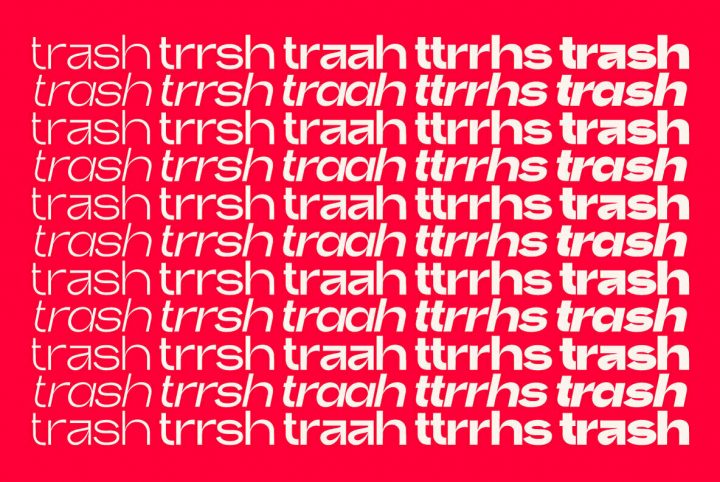
The “weight” of a font refers to its physical stature, much like the way that weight affects our own physical statures. Fonts can be thin or heavy, and anywhere in between. A number of terms may be used to describe a font’s weight, and some of these include (from lightest weight to heaviest) Hairline, Thin, Light, Book, Medium, Bold, Heavy, and Black.
Roman and Italic: The Different Styles of Typeface
While “roman” typically refers to the upright version of a typeface, “italic” refers to the right-slanting version of a font’s character set. Regular italics are also known as “obliques,” and they are merely a tilted version of the original lettering. “True italics” means that each italic letter was individually designed and drawn as an italic, which often gives them a bit of a script quality.
“Script” typefaces are those which are based on actual handwriting. Some great examples of script typefaces include Bayshore from Set Sail Studios, Sant’Elia Script from Yellow Design Studio, and Harper Script from Hustle Supply Co. Because script typefaces are based on handwriting, they are typically emotive with beautiful variations in their lettering.
“Serif” is not just a typeface category. Serifs are short, decorative lines that extend from a letter’s main body. For example, TT Tricks from TypeType has lovely serifs that hang from its uppercase letter T. Serifs tend to improve readability by effectively leading the reader’s eye along the line of type, which is why you’ll typically find them in newspapers, books, and other printed publications.
The word “sans” means “without,” so it stands to reason that the term “sans serif” relates to fonts that do not have serifs. A great example of a sans serif font is Visby CF from Connary Fagen. Without the decorative detailing of serifs, sans serif fonts have a visual simplicity that adds an element of clarity and conciseness to documents and designs. They also tend to perform very well in small point, making them great for design projects with tiny text, or those intended for viewing on mobile devices.
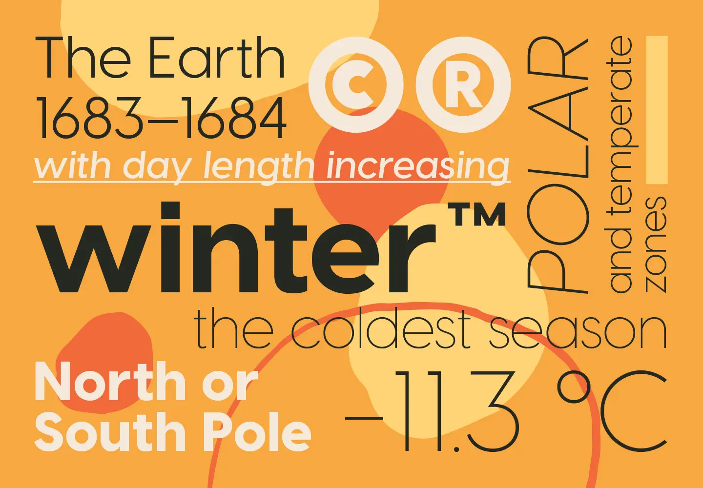
Display fonts are those that are designed to perform well in large point, like what you would see being used in a headline, a poster, or on a business sign. While many typefaces can work as display fonts when a heavier weight is chosen, some typefaces are not so easily legible in smaller sizes. A typeface that is considered to be a display font may not perform so well in projects of a smaller visual size, but as life goes, there are always exceptions to the rule.
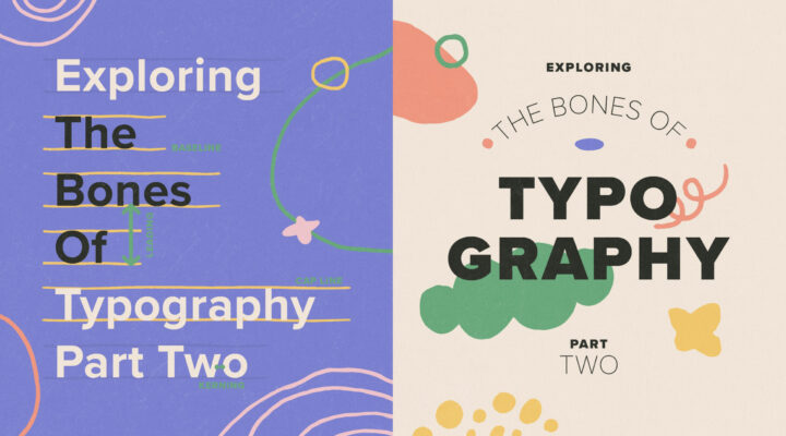
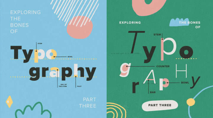
Up Next: Spacing and Placement in Typography
You never know what a font can do until you give it a whirl. In Part Two of the “Exploring The Bones Of Typography” series on YouWorkForThem, we’re going to dig into the spacing and placement of characters in a typeface, so we hope you’ll stay tuned!


