TT Ricks from Type Type is a sharp font both figuratively and literally. It has a polished, sly quality that recalls the spirit of the fairytale Puss and Boots. In fact, the ‘k’ from TT Ricks has a distinct visual echo of a famous illustration from the timeless Italian tale. Detailing like that makes for a memorable collection, straight across the board. It’s a strong font that resonates. It has historical depth, yet inspires toward tomorrow.
This initial impression is reflected by the designers TypeType, who state, “TT Ricks is a flamboyant elzevir-type serif, for which the words “cute” or “calm” are not a fitting definition.” Instead the font is smart, aggressive, trim and aristocratic. It is a memorable character, a visual antagonist that will make your work unforgettable and distinct.


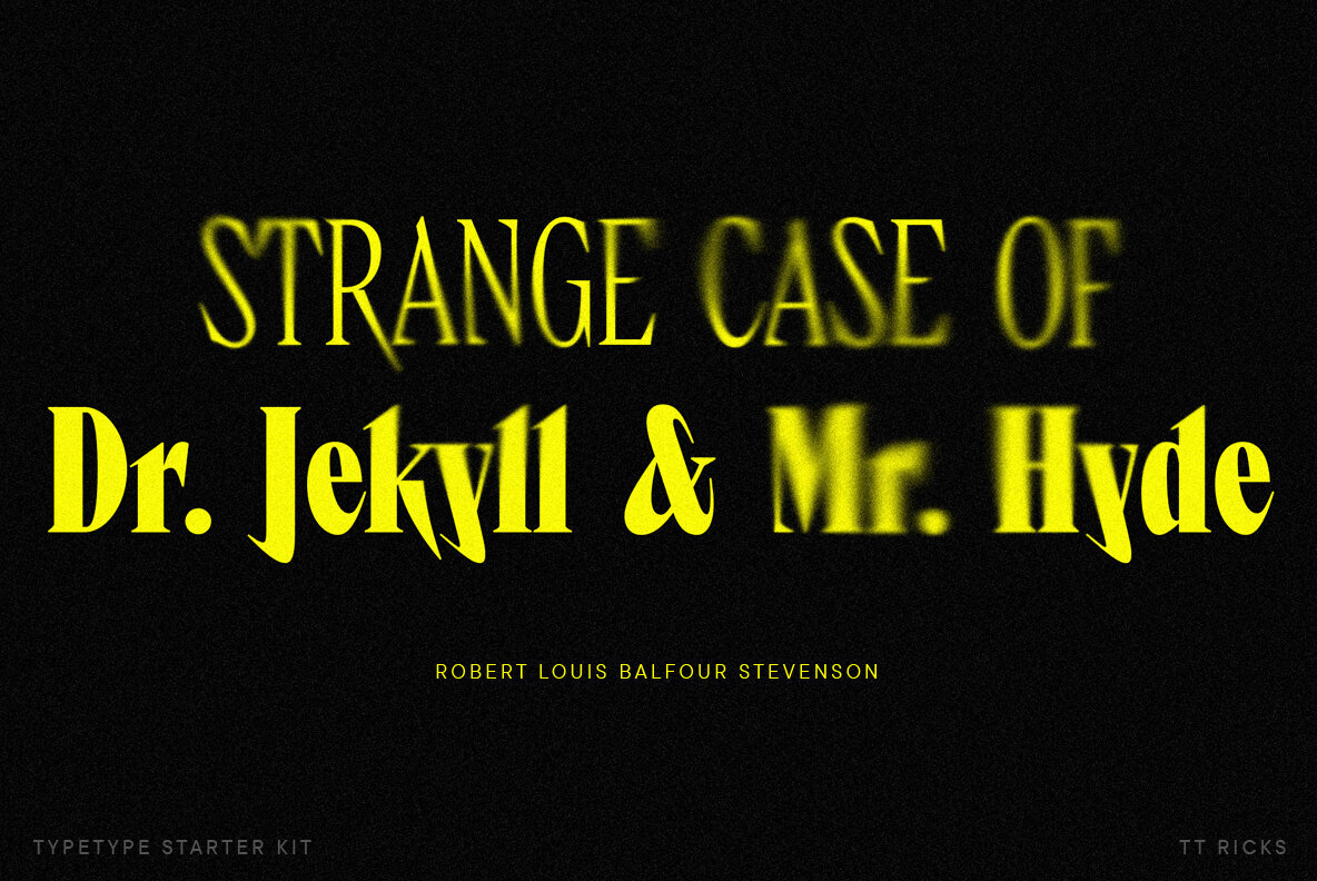
TT Ricks was inspired by the 1892 font “De Vinne,” from designer Gustav F. Schroeder. With strong contrasts and sharp serifs, TT Ricks has an active, aggressive appearance. Its all-around sharpness has citrus bite and sporty appeal. The dashing descenders and ascenders power this kinetic feel, further fuelled by the needle-like stroke endings.
TypeType would further point out the font’s strong contrast, noticeable sharp serifs, and narrow letterforms with a pronounced displacement of flows in the arches. They further spotlight the letters R K k and their alternates, and indeed: that k struck us before we were aware of the specificity of the designer’s intent. Kudos to a vision perfectly realized.


TypeType designed TT Ricks to “entertain the reader’s eyes,” and the biting font thoroughly achieves this. With its modern flamboyance and hints of Gothic ancestry, TT Ricks is an unforgettable beauty. The viewer’s memory will not relinquish those sharp points, so make sure your message is perfectly worded. As such, TT Ricks is a fabulous display title typeface, ideal for packaging, books, posters, fashion and film. Additionally, you can ornament the project with TT Ricks icons that reiterate the font’s intelligent spirit.
TT Ricks is emblematic of the “killer combinations” of design, quality, and useful features one expects from TypeType. This is a rigorous, disciplined foundry with exacting standards. TypeType was founded in St. Petersburg, Russia in 2013 by Ivan Gladkikh. In addition to designing fonts, Gladkikh is also instrumental in teaching the art of typography in Russia. And recently, TypeType opened their first office in the United States. Congratulations to Ivan and his team from YouWorkForThem.
Of course TypeType’s success is not wild good luck: it is the result of their reflective, considerate process and hard work. The same ethics and result will most definitely define your project whenever you choose TypeType products. Just ask any of their 35,000 clients in 110 countries. TypeType is a team we trust, and we highly recommend them.


