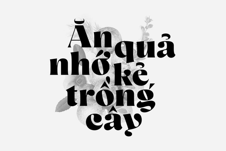
The first Art Deco type was created by Cassandre in 1929. It was called Bifur, and its brilliant combination of thick and thin illustrates how simplicity can be endlessly complicated, full of visual depth and emotive power. Bifur evokes intelligence, cutting-edge, forward thinking. It perfectly complements the analogous architectural and artistic movements of the time while remaining modern today. Its force and appearance are timeless.
Connary Fagen’s appreciation of Art Deco has led to his own creation in the style: Wavelry CF. Fagen states that the font, “combines the tone and flow of Art Deco with updated, clean letterforms and a modernized construction.”
This factual, reserved description depicts professional modesty befitting of anyone. Well done, Connary. On the other hand, typography isn’t a team sport in the sense that one’s excellence is under competitive scrutiny every time the game is played, second to second. As such, perhaps Mr. Fagen, working in solitude, is increasingly inured to his own marvellous outcomes.
We are not, and neither are you. Waverly CF is an Art Deco marvel which easily complements the grandeur of Prague’s Kavárna Obecní dum or New York’s amazing 570 Lexington Avenue. Another New York skyscraper? Look more closely.
Similarly, Waverly CF features astounding details and flourishes that get more powerful and interesting as we drill down. For instance, the brilliant uppercase Q combines clinically perfect geometry with a lascivious sweeping tail. This astute combination evokes a remote, statuesque conservatism belied by sly imagination or wild risk. As such, this gorgeous Q alone could be the unforgettable logo of the quintessential brand. Of what? That’s your decision. But you most certainly have your Q.
But singling out the Q does not indicate bias. Rather, it was an “eeny, meeny, miny, moe” choice, as the generous selection of swashes and alternative letterforms make choosing a favourite impossible. “The Fagen Dilemma,” as it is known scientifically (Quadarium Fagen). In Waverly CF’s case, the possibilities offered by Rs, Es, and Zs are nearly confounding, and again, that’s a random control group. Waverly CF’s vast geography is amazing from pole to pole.
The result is precisely described by Fagen: “perfect for artwork and logos.” Fact. Once again, we find ourselves contemplating all the things that Waverly CF could inspire: elegant perfumes, romantic dramas, chic hotels, strutting models. This is a strong, hard hitting product, full of artistry and practical possibility.
Practical Possibility. We like to have fun with these fonts because they are the beautiful results of incredibly hard work. That said, Fagen’s track record instantly defuses any need to trim the adverbs and adjectives. Connary Fagen is one of the most successful typographers in the world. We’ve had as many as four Fagen fonts in our annual “Top 10” list…at the same time. His client list includes Versed, Current, The New York Philharmonic, Coachella, MTV, Animal Planet, Miami Heat, Diabetes Canada, and Netflix.
In other words, although we like letting Connary know how much we love his work, the aforementioned client list and positive descriptions are there to communicate genuine practical possibility. When you use Waverly CF or any Connary Fagen font, whatever you are doing will look great. Furthermore, Fagen is tuned in to the zeitgeist to a nearly paranormal level. Do you think the global prevalence of his fonts (look) is the result of insanely good luck or soul-selling of some kind? No. It’s because the fonts are masterpieces and they are applicable across mediums. It’s that simple. When you choose one of his fonts, bang, you’re there.


