The Legacy of Gotham Font
Gotham font, a geometric sans-serif typeface, emerged in 2000. American designer Tobias Frere-Jones, with Jesse Ragan, crafted it. The Hoefler & Frere-Jones foundry released it. Gotham’s design draws inspiration from mid-twentieth-century architectural signs. It boasts a broad design, a high x-height, and wide apertures.
Since its inception, Gotham has gained high visibility. It has graced many notable platforms. Barack Obama’s 2008 presidential campaign used it. So did Michigan State University’s branding. The Australian Labor Party’s 2016 federal election campaign also featured it. The One World Trade Center in New York even has it on its cornerstone. Moreover, it’s the current font on MPAA title cards for U.S. film trailers.
GQ magazine initially commissioned the Gotham font. The editors desired a “geometric structure” sans-serif. They wanted it to exude a “masculine, new, and fresh” vibe for their magazine. Frere-Jones found inspiration for the typeface in Manhattan. He walked block-by-block, camera in hand, seeking source material. The font’s basis lies in the lettering of older buildings.
The Evolution of Typography: Beyond Gotham
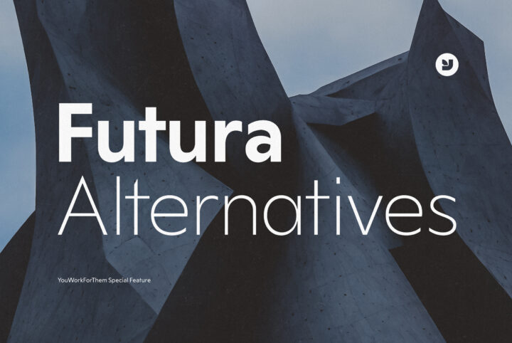
As the design world has evolved, so have Gotham font alternatives. At YouWorkForThem, we recognize the need for modern, affordable alternatives to iconic fonts like Gotham. Our curated Gotham Alternatives Collection showcases a range of Grotesk sans serif font designs. These serve as modern alternatives to the iconic Gotham font.
These fonts offer a fresh perspective on Grotesk sans serif design. They also provide extensive design options. These cater to today’s diverse designer needs. Whether you’re a seasoned designer seeking a fresh take on a classic style, or a newcomer looking for affordable design resources, our collection offers a wealth of options to explore.
Top 5 Gotham Font Alternative Features
1. Chronica Pro: A Balanced Typeface for Professionals
Chronica Pro, a contemporary font family, is a perfect blend of balance and quality. Crafted meticulously for high-end professional use, it caters to various needs, from editorial design to brand creation. With 18 fonts, Chronica Pro embodies a humanist spirit in a geometric body, supporting international communication in Central, Western, Cyrillic, and Eastern European languages.
2. Valid: A Blend of Bauhaus and Modernity
Valid is our latest addition, a sans-serif typeface that marries Bauhaus design principles with a modern geometric twist. It’s a versatile font, ideal for a wide range of design projects. With its unique blend of traditional and modern design principles, Valid offers a clean, minimalist design that is both elegant and efficient.
3. Hando: Neo Grotesk with a Futuristic Touch
4. Alliance: A Testament to Grotesk Tradition
Alliance, a font family with 28 weights and 14 uprights, draws inspiration from the Industrial era types of the late 19th century. It features mono linear strokes and a good amount of contrast between the stroke thickness of each weight. Alliance No.2, a display typeface, combines contrasting shapes, making it ideal for use in large sizes.
5. Dopis: A Universal Neo Grotesque Typeface
Dopis is a neo grotesque family available in four weights and in two widths. It’s a universal and neutral typeface, fully applicable in every situation. Dopis contains an extended Latin character set with Cyrillic support, making it a versatile choice for a wide range of design projects.
The YouWorkForThem Advantage
Choosing YouWorkForThem for your typography needs comes with numerous advantages. We provide fast, easy instant downloads on all purchases, ensuring you can start using your new fonts as soon as possible. Our cash back rewards program offers additional value, making your design resources even more affordable.
With a 20+ year history of providing design resources for digital designers, we’ve built a reputation for quality and reliability. Our easy personal and corporate level font and stock art licensing means you can use our resources with confidence, knowing you’re fully compliant with licensing regulations.
As an independently owned company, we understand the needs of creative professionals and are committed to providing the best resources to help you succeed. Our selection of modern designs, easy licensing, and affordable rates make us a top choice for personal and corporate use.
Charting a New Course: The Exciting World Beyond Gotham Font
In the ever-evolving world of design, staying on top of trends while maintaining a unique aesthetic can be a challenge (follow us on Instagram). Fonts play a crucial role in this process, and finding the right one can make all the difference. While Gotham has made its mark in the history of typography, there are numerous modern alternatives that offer fresh and exciting possibilities.
At YouWorkForThem, we’re committed to helping designers navigate this landscape by providing a wide range of high-quality, affordable fonts. With our Gotham Alternatives, you can find a font that not only meets your design needs but also helps you stand out from the crowd. Explore our collection today and discover the perfect font for your next design project.
