Where are you on the museum-goer spectrum? Do you arrive before opening time, and later the guards have to chase you out a minute after closing? Or is the art simply a necessary torture, a thirst-inducing gauntlet you suffer through to maximize satisfaction when you finally land in the museum bar? Are you either of the aforementioned, and you’ve had the unique pleasure of attending the museum with the person on the spectrum’s opposite end?
Oh, but that spectrum is big. There are those of you that couldn’t care less if it’s a Kirchner or the door to one of the museum’s fuse boxes, yet you meticulously inspect every square thing on the walls, hands behind back, brow furrowed…a dedicated art lover in every respect. And some of you didn’t think you liked art much, but then something happens in one of the rooms—you see that painting that speaks to you, and everything changes. There you are, week after week, “the one that’s always on the bench in front of the…” In front of the what?
Who you are on that spectrum substantially influences how you respond to a museum’s details: its giant front steps (happiest going up or down?), its distinguished scents, creaking floors, the ebb and flow of crowds that are often as interesting as the exhibits themselves. And the final stop nearly everybody loves: the gift shop. It’s an inventory riot full of art cards, that Scream bag you always wanted, clothes, wooden toys, key chains and gum, and all those gorgeous books and magazines: the museum guides, artist collections, children’s books, photo books, books about modernism and antiquity, academic periodicals, hip magazines.
What they all have in common is they all look and feel just that much better. The books are patio bricks, big slabs that make you wonder if your coffee table can support them. Their size, beauty, and singularity encapsulate the museum experience. Same the magazines. They are sturdier, with dense spines, heavy paper, and high price tags. Their covers are thick, proclaiming permanence. The cover design and titles are always a cut above. Whether you want to look like an art lover or actually are, these magazines demand to be bought, at least one or two. Some people are so enamored, they decide to publish one themselves, or at least try and add that “museum feel” to whatever the project: posters, editorial work, branding and advertising, or simply a bold header.
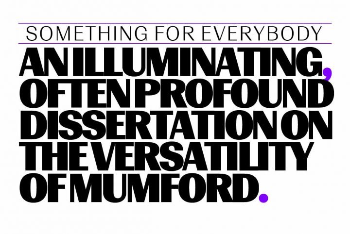
If you’re looking for the absolutely perfect font to get your magazine, book, or academic journal into your favourite museum shop, or for any project requiring that cultured aesthetic, Konstanz is the choice. This smart yet sporty sans serif is indeed inspired by both the look and spirit of those one-of-a-kind books and magazines you find in museums, galleries, design exhibitions, and the worlds of architecture, theatre, and classical music.
While indicating grotesque, Konstanz recollects Bauhaus and Futura, giving it the precise solid background to help you express artistic worlds. Konstanz includes 8 weights with matching italics and a diverse, flexible stylistic set. From the W Type Foundry in Santiago, Chile, Konstanz is perfect for that cover feature comparing 1970s Berlin to resurgent Detroit, that poster for the George Grosz exhibition, guides to the big Soho opening, your revamp of the airline magazine, the logo for your new line of pastels or paints. Visit the museum with Konstanz today.


