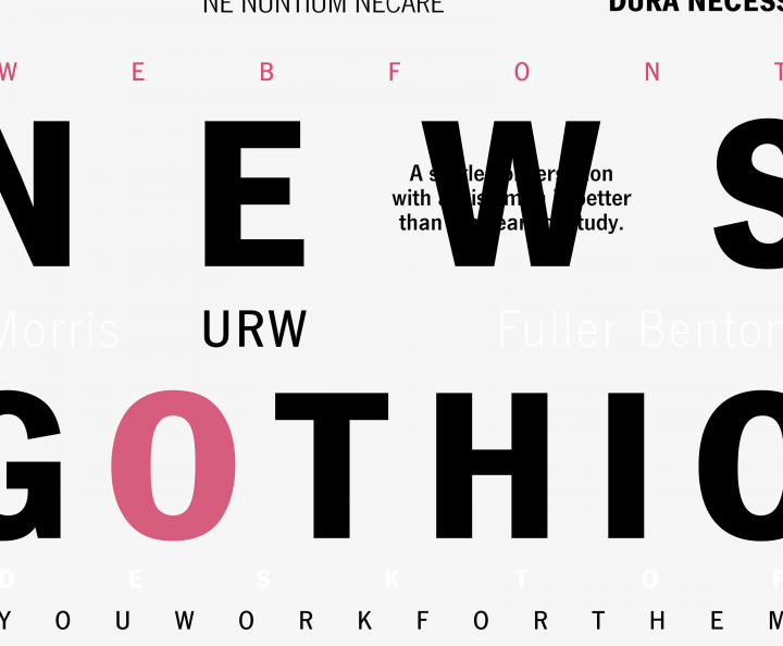
The Classic Elegance of News Gothic Font Crafted by Morris Fuller Benton in 1908, News Gothic font is a quintessential realist sans-serif typeface, born out of a need for clarity and legibility in a rapidly industrializing world. During this era, the rise of mass media and print publicati...
advertising
January 14, 2024
Grotesque Fonts: What They Are and Which Are The Best
In typography, grotesque fonts (or grotesk) are roughly synonymous with "sans serif." Serif typefaces feature short, decorative lines that extend from a character's body, like Times New Roman, Palatino, or Garamond. In use since the 1460s, serif fonts were the publishing norm until the 1800s. By...
In the realm of typography, Grotesk fonts, also known as sans-serif fonts, hold a significant place. They are the embodiment of modernity, simplicity, and versatility. Their clean lines and unadorned forms make them a go-to choice for designers worldwide. From branding to web design, these fonts...
May 21, 2023
Eveleth’s Font Style: A Key to Prego’s Success
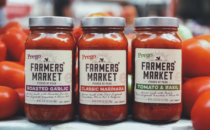
In the dynamic field of design, the right font style frequently emerges as the secret sauce, the magic touch that endows a brand with its distinctive identity. Amidst the myriad of typefaces, Eveleth Font from Yellow Design Studio uniquely stands out, lending an air of authentic nostalgia and vi...
Aprex Mono is a classic monospace font updated with digital smoothness. It perfectly blends classic and modern aspects. Aprex Mono is a monospaced industrial version of the Aprex Sans typeface, with extensive multilingual support. Drawing inspiration from a basic sans serif glyph structure, this...
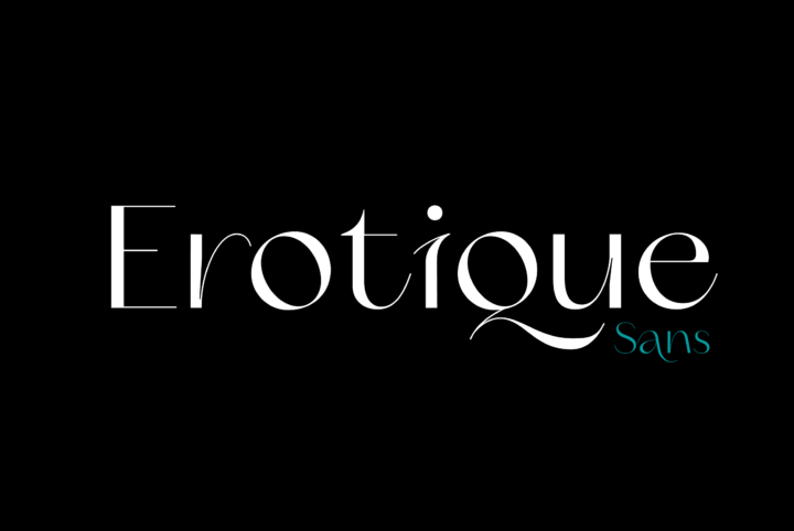
Introducing Erotique Sans: The Ultimate Typeface for Fashion and Beauty Design In the world of fashion and beauty, presentation is everything. From clothing brands to cosmetic products, the right font can make all the difference in how your designs are perceived. Imagine a world where the Vogue ...
March 7, 2023
Sharpen Your Cutting Edge with This Cool Geometric Font
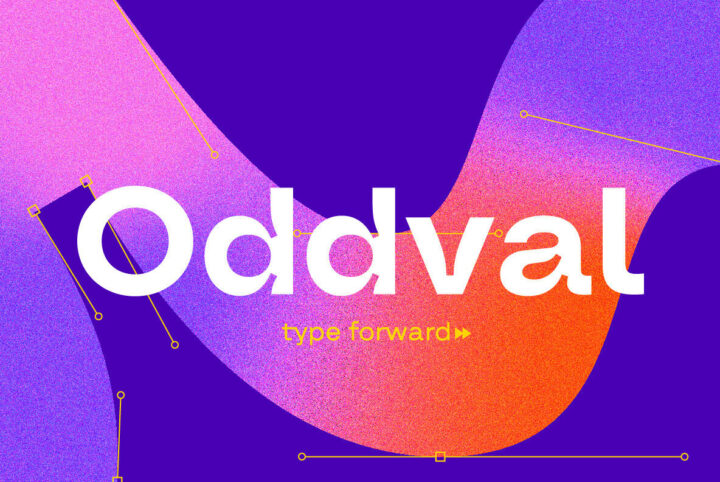
Oddval is a distinctive geometric font that harnesses the power of mathematical precision and clean lines to create an unrivaled visual experience. Its geometric elements lend a sense of stability and structure, making it the perfect choice for modern branding jobs that require a contemporary an...
February 6, 2023
Get the Torn & Ripped Paper Look with Photoshop Textures
A Comprehensive Guide to Using Ripped Paper Photoshop Textures The art of adding texture in Photoshop has become an essential skill for graphic designers and digital artists. Among the plethora of techniques, the torn paper effect is a popular choice that adds a rustic, edgy, and vintage ...
November 18, 2022
Klagia: An Ideal Retro Font for Tomorrow’s Digital Designs
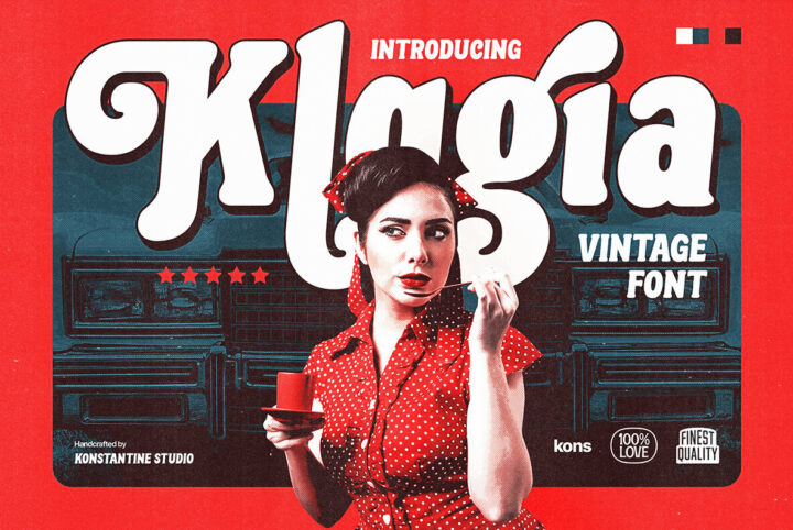
Vintage products and retro designs can look back, but the objective is using these designs to forge into the future. Today's uncertainties make retro hot. Plus it's cool—funky 1970s designs have timeless appeal, as do the modern spins they inspire like Klagia from Konstantine Studio. Klagia is t...
Sans Atwic Modern is a clean, simple sans serif typeface. It has a universal and neutral look due to repeated vertically cut end strokes, and letters with similar width. The lowercase has a higher x-height and open-end strokes, ensuring better legibility in smaller sizes. Atwic has several alter...
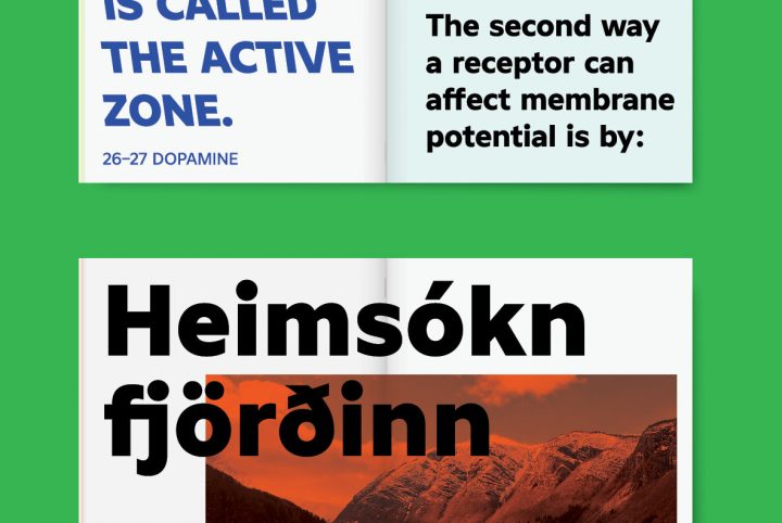
Inspired by classic grotesque fonts like Venus and Akzidenz-G, the brilliantly executed sans serif font Nomina proves there is plenty of room to be creative and distinct within a highly usable font. Nomina's clever details distinguish the font, while in no way impeding Nomina's smooth readabilit...
September 30, 2022
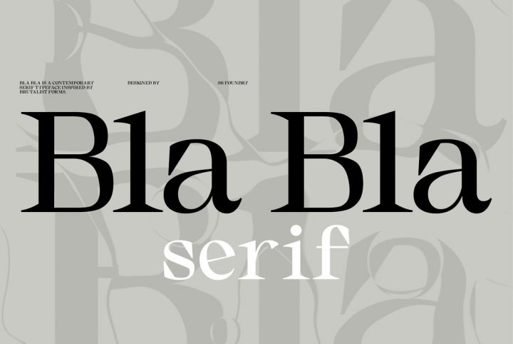
Bla Bla: Your Next Display Serif Font
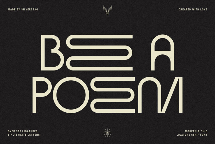
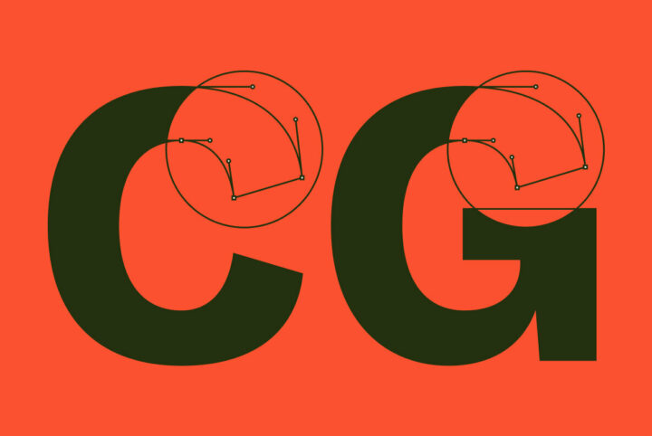
Bla Bla is a contemporary serif typeface inspired by brutalism, featuring large open counters and attractive, rounded forms. Organic curves with their gentle repetitions create a powerful and harmonious effect. This stylish modern family is perfect for communication and branding projects. Bla Bl...

